
Your landing page’s weakest score is Trust.
How Paid (Stripe Issuing for agents alternative) — Lithic ranks
- 1.
Paid (Stripe Issuing for agents alternative) — Lithic71
- 2.
Skyfire66
- 3.
Nekuda66
- 4.
Agentcard63
- 5.
Payman56
Trust
52FairProof that the product is real, competent, and safe to try.
| Trust read | |
|---|---|
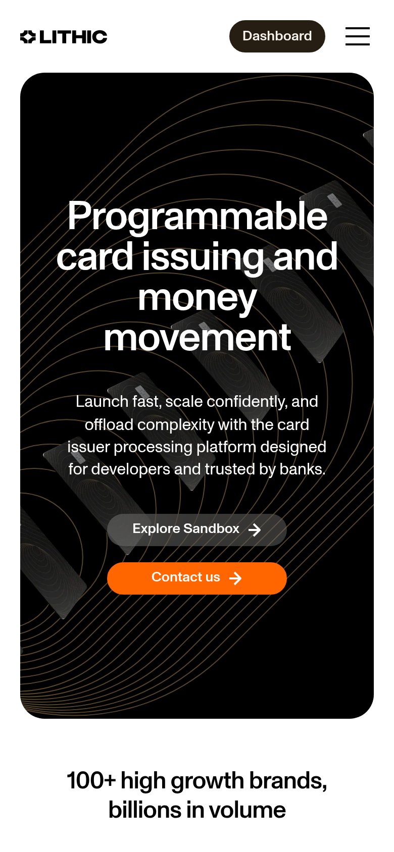
| Paid (Stripe Issuing for agents alternative) — Lithic | "100+ high growth brands, billions in volume" (mobile capture) |
| "BACKED BY Y COMBINATOR" badge in the footer trust strip | |
| No visible trust signal identified. | |
| Security stack diagram naming Okta, Auth0, Cequence, Imperva, and Datadog | |
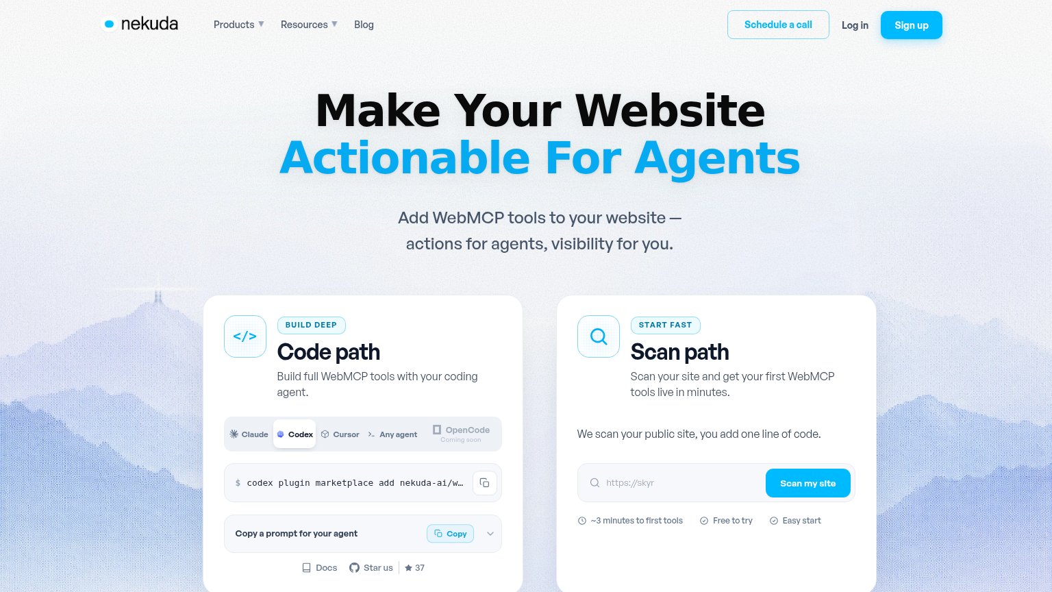
| Interactive "Scan path" card with live "Scan my site" input and "~3 minutes to first tools / Free to try / Easy start" c |
CTA
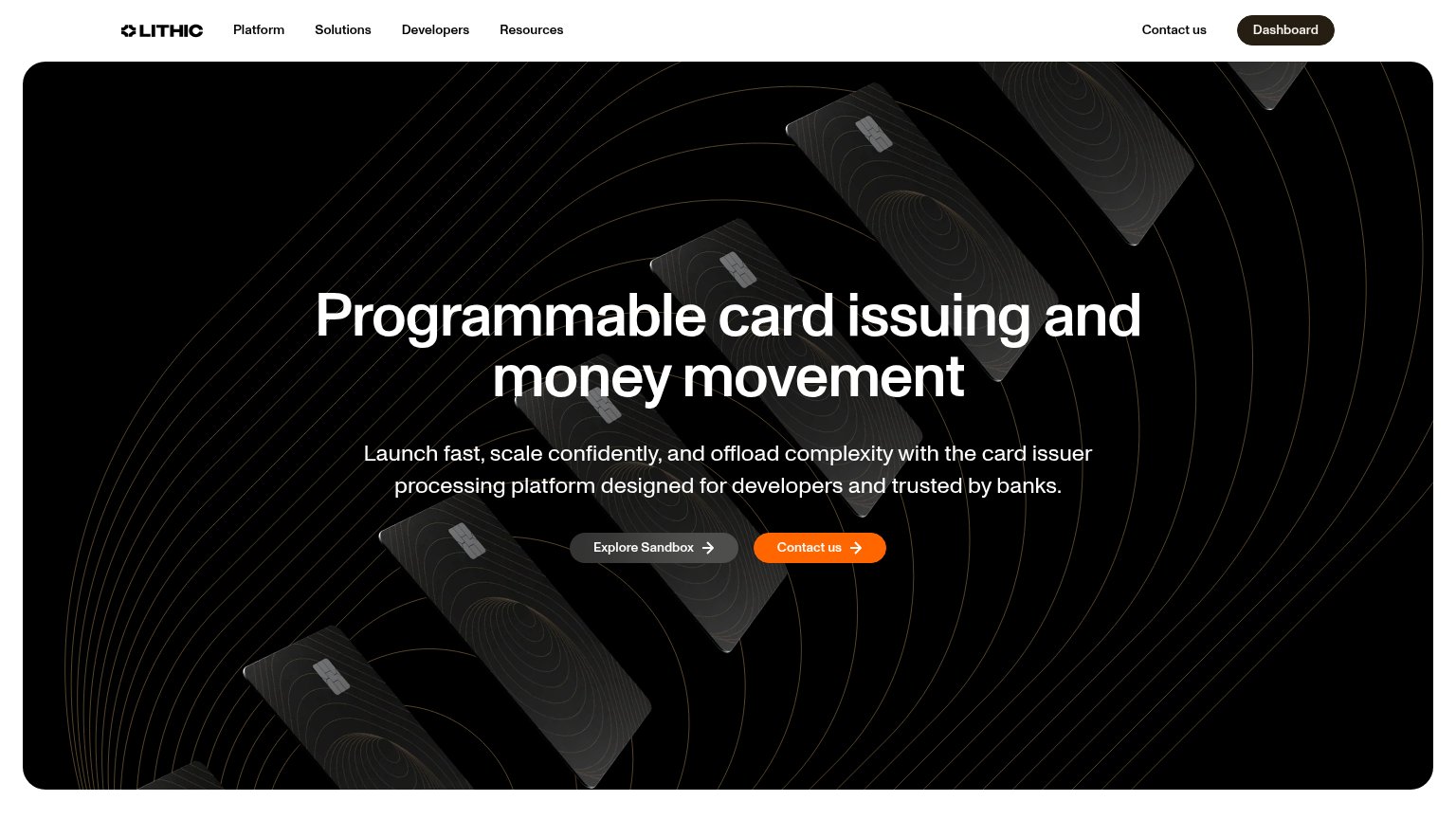
72FairCopy, size, verb, cost-feel — does the primary CTA earn the click?
Problems
- orange emphasis on 'Contact us' instead
- muted gray fill undersells sandbox
- 'Contact us' duplicated in nav and hero
- sandbox payoff not stated
Mobile web
72FairThe phone experience as a first-class citizen.
What works
What to improve
Value props
76FairTitle, subtitle, hero — do they sell the product's true value?
Paid (Stripe Issuing for agents alternative) — Lithic’s headline
Programmable card issuing and money movement
Launch fast, scale confidently, and offload complexity with the card issuer processing platform designed for developers and trusted by banks.
Working
Could improve
Information hierarchy
82StrongDoes the design help or inhibit what the page is trying to say?
What works
What to improve