
Your landing page’s weakest score is Trust.
How Agentcard ranks
Trust
48PoorProof that the product is real, competent, and safe to try.
| Trust read | |
|---|---|
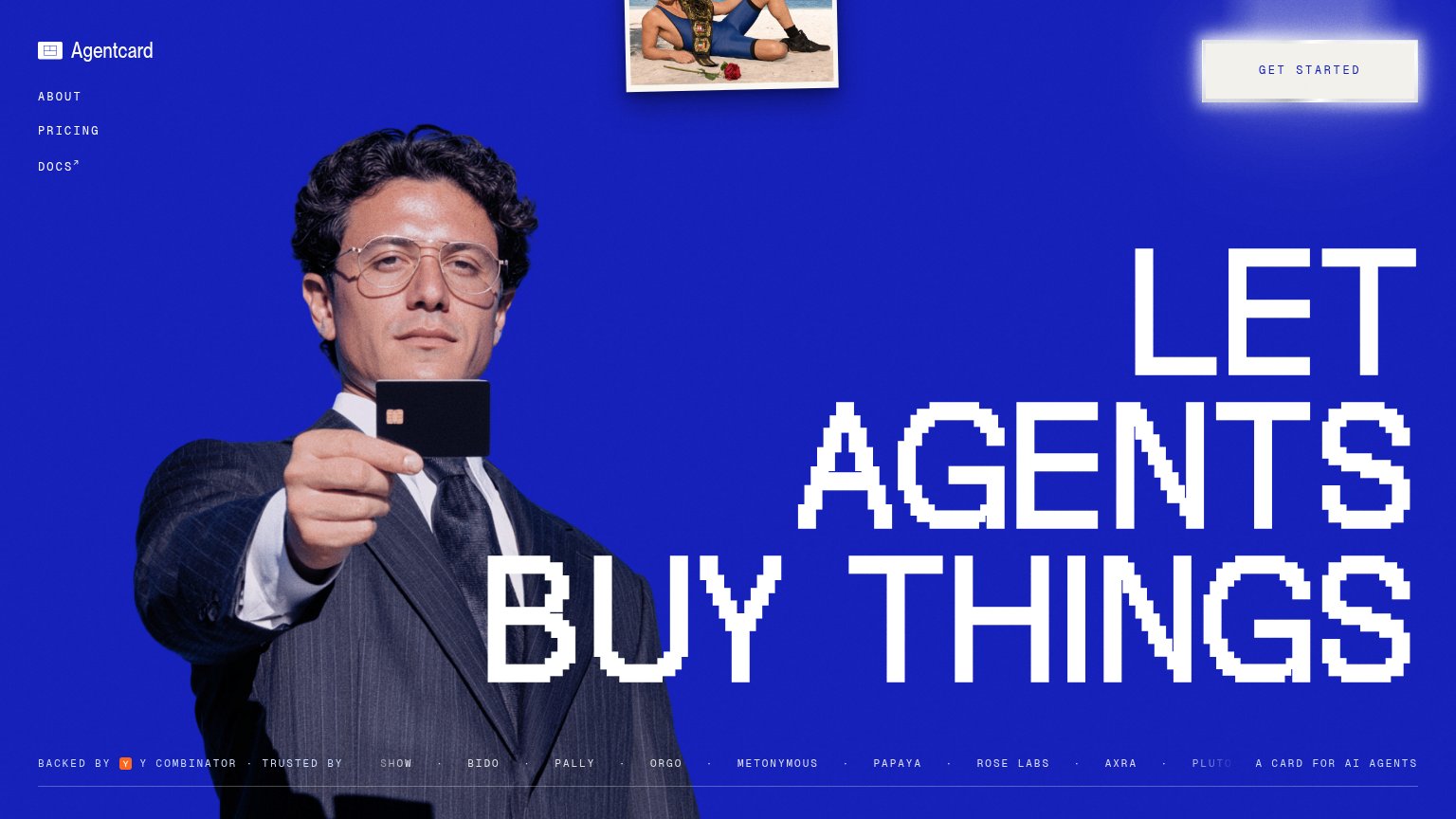
| Agentcard | "BACKED BY Y COMBINATOR" badge in the footer trust strip |
| No visible trust signal identified. | |
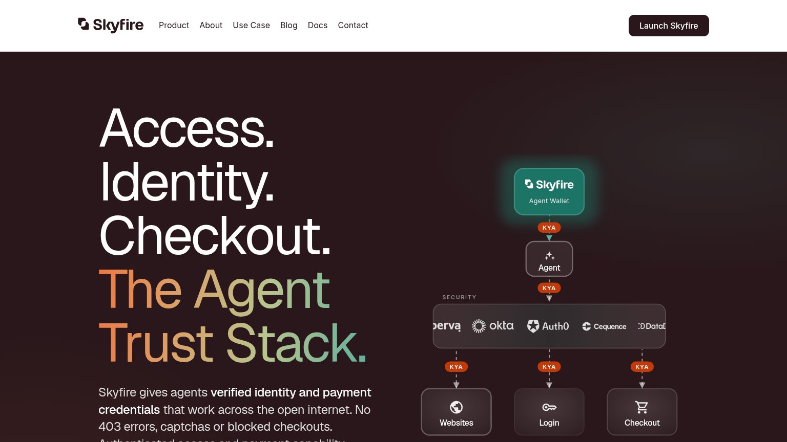
| Security stack diagram naming Okta, Auth0, Cequence, Imperva, and Datadog | |
| Interactive "Scan path" card with live "Scan my site" input and "~3 minutes to first tools / Free to try / Easy start" c | |
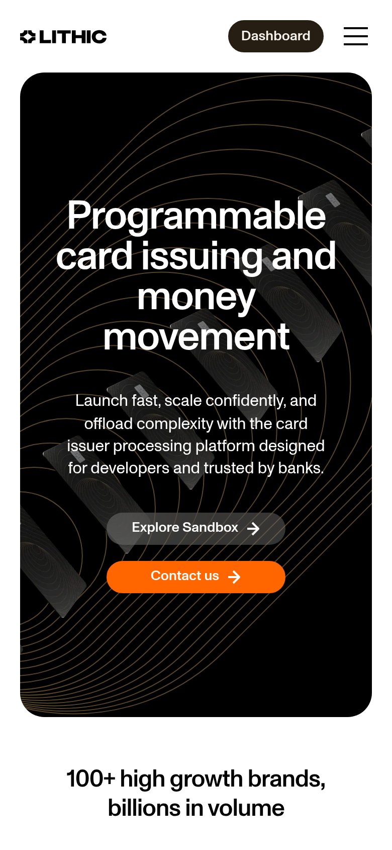
| "100+ high growth brands, billions in volume" (mobile capture) |
Mobile web
54FairThe phone experience as a first-class citizen.
 123
- Headline over photo — "LET AGENTS BUY THINGS" is pushed to the bottom of the fold and overlaps the suit and card photo, cutting legibility of the pixel type.
- Get Started button — Primary CTA keeps desktop proportions — a small boxed button floating top-right instead of a full-width, thumb-height bar.
- Tagline pair — "BACKED BY Y COMBINATOR" and "A CARD FOR AI AGENTS" stack in small type over the dark suit, low-contrast and easy to miss.
Information hierarchy
68FairDoes the design help or inhibit what the page is trying to say?
What works
What to improve
CTA
72FairCopy, size, verb, cost-feel — does the primary CTA earn the click?
How Agentcard compares
Recommended rewrites
Value props
72FairTitle, subtitle, hero — do they sell the product's true value?
Agentcard’s headline
LET AGENTS BUY THINGS
A CARD FOR AI AGENTS
Working
Could improve