
Your landing page’s weakest score is Trust.
How FluentU ranks
Trust
52FairProof that the product is real, competent, and safe to try.
| Trust read | |
|---|---|
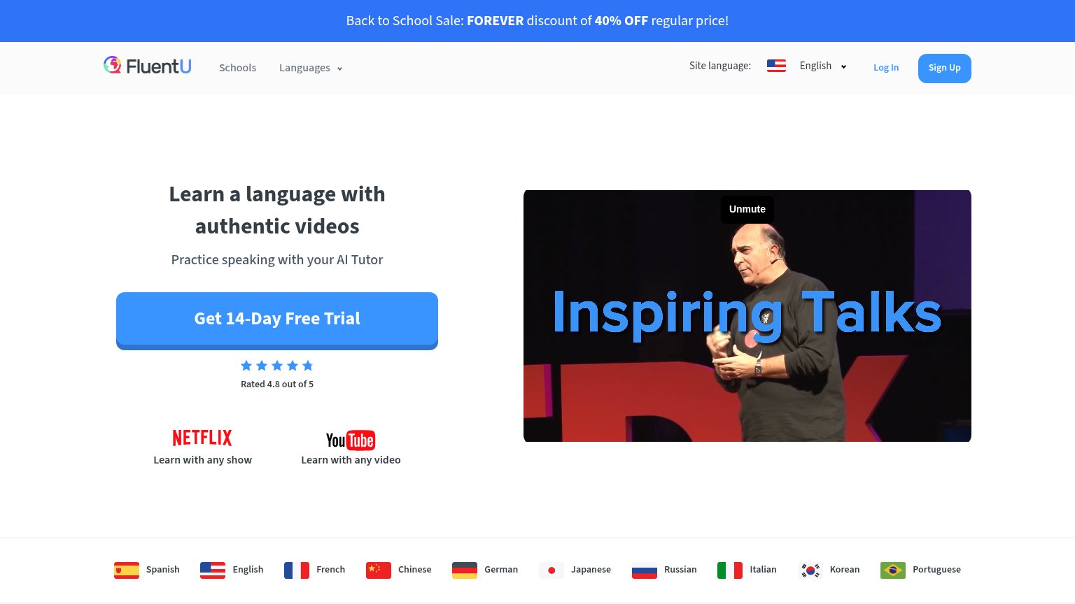
| FluentU | "Rated 4.8 out of 5" star rating beneath the free-trial CTA |
| No visible trust signal identified. | |
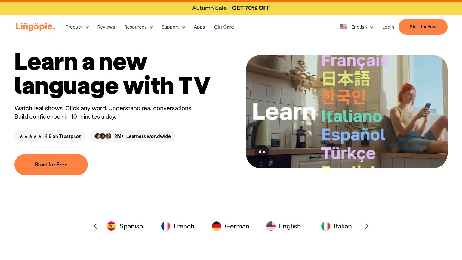
| "★★★★★ 4.8 on Trustpilot" badge next to "2M+ Learners worldwide" with learner avatars | |
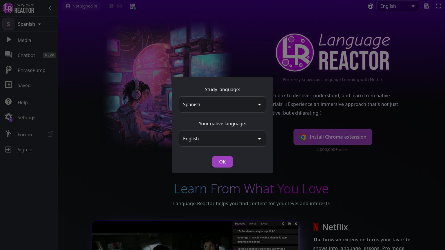
| "2,000,000+ users" beneath the Install Chrome extension button |
Mobile web
58FairThe phone experience as a first-class citizen.
 123
- Broken video error — A black 'We couldn't verify the security of FluentU's connection' error block sits mid-fold where the demo video should play, wasting the largest element on the page.
- CTA below first viewport — The 'Get 14-Day Free Trial' button is pushed under the headline, logo strip, and broken video — visitors must scroll to reach the primary action.
- Netflix/YouTube logo stack — Two large logo blocks with wrapping captions crowd the space between the headline and the CTA, delaying the action.
Value props
68FairTitle, subtitle, hero — do they sell the product's true value?
FluentU’s headline
Learn a language with authentic videos
Practice speaking with your AI Tutor
Working
Could improve
Information hierarchy
72FairDoes the design help or inhibit what the page is trying to say?
What works
What to improve
CTA
84StrongCopy, size, verb, cost-feel — does the primary CTA earn the click?
How FluentU compares
Recommended rewrites