
Your landing page’s weakest score is Information hierarchy.
How Language Reactor ranks
- 1.
Lingopie82
- 2.
Doomersion68
- 3.
FluentU67
- 4.
Language Reactor60
60Growth scoreupdated
category scores
category scoresShowHide
Information hierarchy
52FairDoes the design help or inhibit what the page is trying to say?
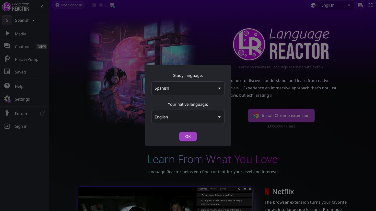 1234
- Language picker modal — Blocks the value-prop copy and hero, and its purple OK button competes with the primary CTA for the first click.
- Truncated value-prop paragraph — Copy reads as fragments ('olbox to discover…') because the modal occludes it, so the pitch never lands.
- Left sidebar nav — Eight equal-weight links (Media, Chatbot, Forum, Sign in) leak attention before the install CTA.
- OK modal button — Styled identically to Install Chrome extension, creating two same-weight purple CTAs in the fold.
Mobile web
52FairThe phone experience as a first-class citizen.
 12
- Language selection modal — Blocks the entire fold with setup chrome and no conversion CTA — only 'OK' is tappable.
- Clipped body copy — Text fragments ('n', 'th') peek out beside the modal, showing the value copy is obscured, not adapted.
Value props
62FairTitle, subtitle, hero — do they sell the product's true value?
Language Reactor’s headline
Learn From What You Love
Language Reactor helps you find content for your level and interests
Working
Could improve
CTA
64FairCopy, size, verb, cost-feel — does the primary CTA earn the click?
How Language Reactor compares
Recommended rewrites
Trust
72FairProof that the product is real, competent, and safe to try.
How Language Reactor compares
Trust read