
Your landing page’s weakest score is Trust.
How Doomersion ranks
- 1.
Lingopie82
- 2.
Doomersion68
- 3.
FluentU67
- 4.
Language Reactor60
Trust
52FairProof that the product is real, competent, and safe to try.
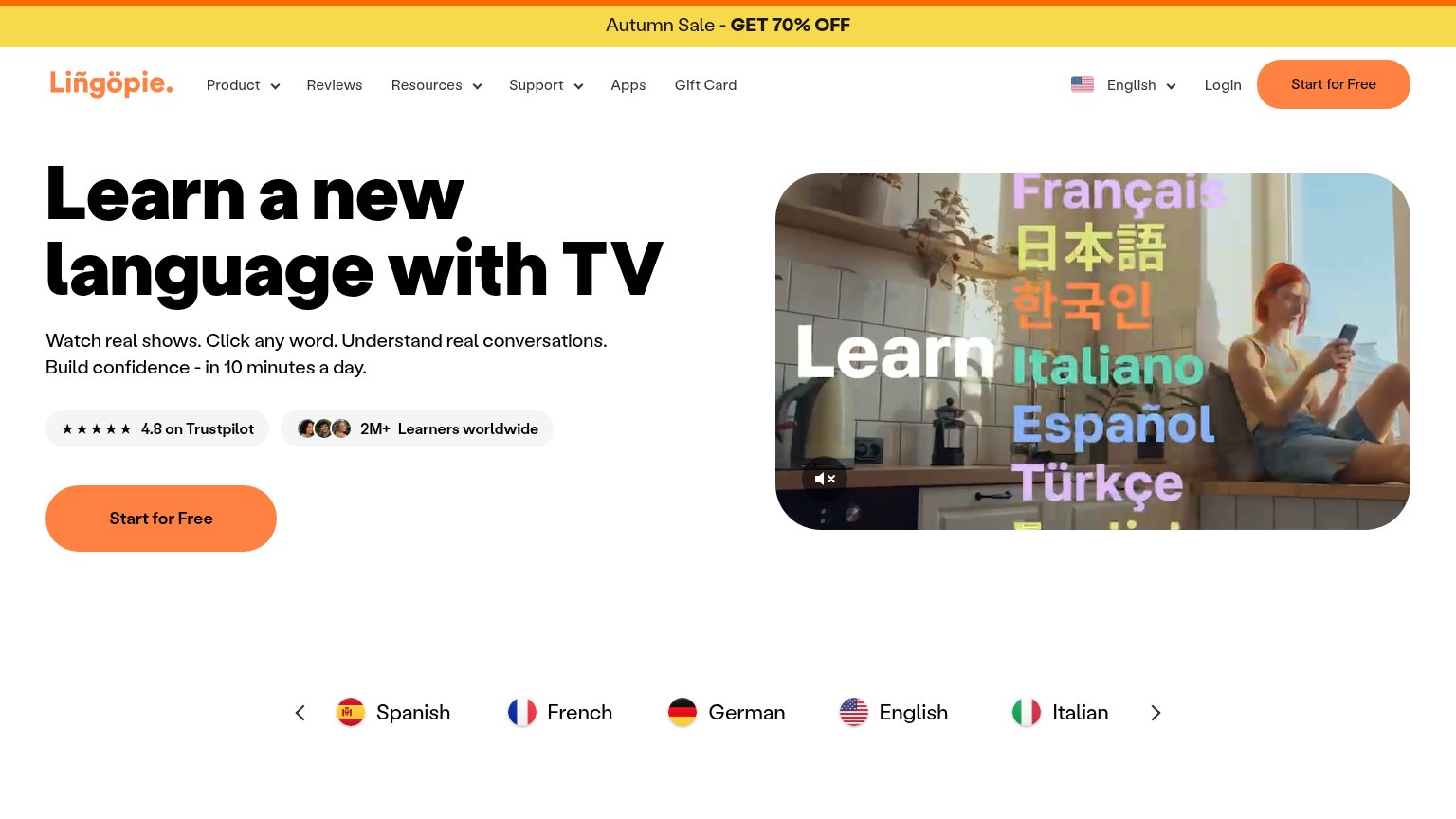
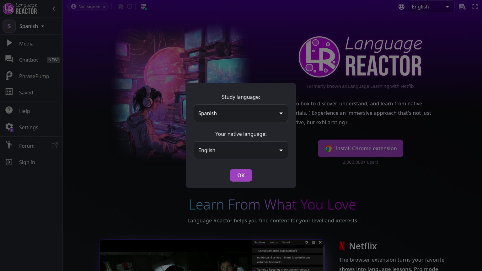
| Trust read | |
|---|---|
| Doomersion | No visible trust signal identified. |
| "★★★★★ 4.8 on Trustpilot" badge next to "2M+ Learners worldwide" with learner avatars | |
| "Rated 4.8 out of 5" star rating beneath the free-trial CTA | |
| "2,000,000+ users" beneath the Install Chrome extension button |
Mobile web
64FairThe phone experience as a first-class citizen.
 123
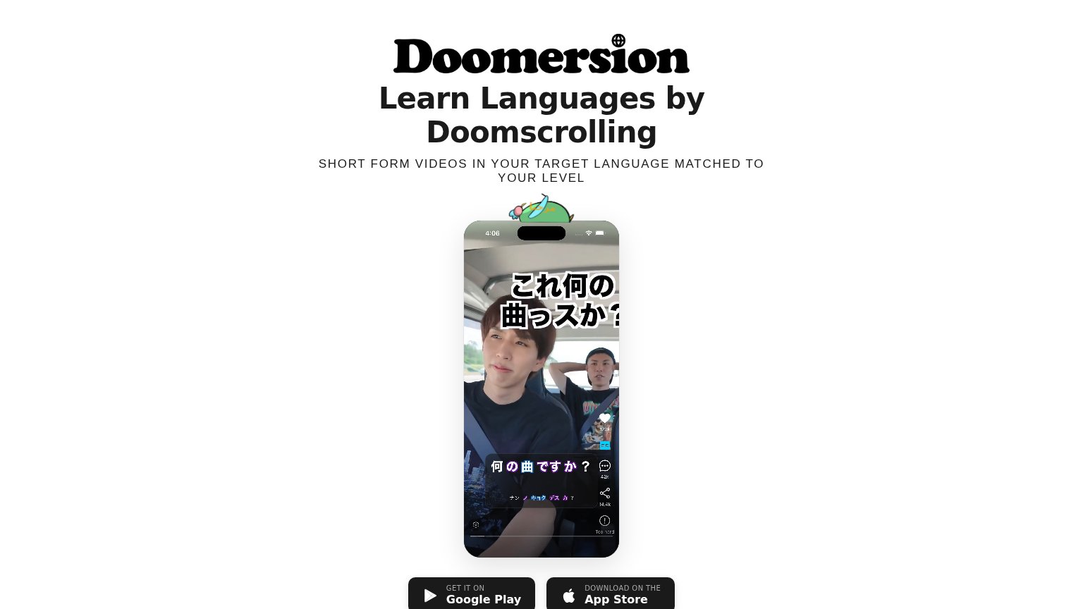
- App store buttons — Both primary CTAs sit below the phone mockup, pushed out of the first viewport by the tall video frame.
- Phone video mockup — The full-height mockup consumes most of the fold, displacing the Google Play and App Store buttons below the scroll line.
- Mascot overlaps mockup — The doodle mascot collides with the phone's status bar, reading as a rendering glitch rather than intentional decoration.
CTA
68FairCopy, size, verb, cost-feel — does the primary CTA earn the click?
How Doomersion compares
Recommended rewrites
Information hierarchy
78FairDoes the design help or inhibit what the page is trying to say?
What works
What to improve
Value props
78FairTitle, subtitle, hero — do they sell the product's true value?
Doomersion’s headline
Learn Languages by Doomscrolling
SHORT FORM VIDEOS IN YOUR TARGET LANGUAGE MATCHED TO YOUR LEVEL
Working
Could improve