
Your landing page’s weakest score is Mobile web.
How Kasisto ranks
Mobile web
44PoorThe phone experience as a first-class citizen.
 1234
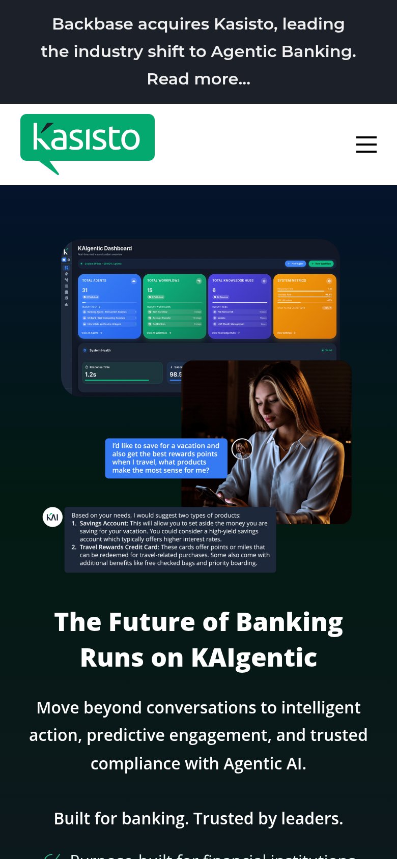
- Dashboard screenshot first — Desktop-density dashboard fills the fold before any headline or CTA; its labels are unreadable at phone size.
- Four-line announcement banner — The Backbase acquisition banner eats the top quarter of the viewport before Kasisto's own message appears.
- Oversized logo header — The logo header takes another large slice of the fold, pushing the value statement two screens down.
- Chat reply text block — The KAI response bubble renders long desktop-sized paragraph text too small to read on a phone.
CTA
58FairCopy, size, verb, cost-feel — does the primary CTA earn the click?
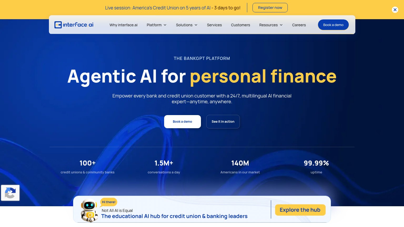
Problems
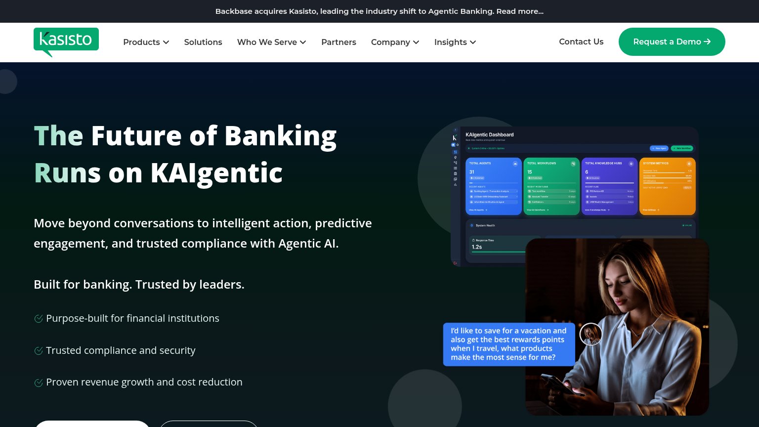
- no CTA above fold on mobile
- 'Request' feels costly, sales-gated
- hero buttons cut off at fold edge
- nav-only placement, small footprint
Trust
58FairProof that the product is real, competent, and safe to try.
How Kasisto compares
Trust read
Information hierarchy
61FairDoes the design help or inhibit what the page is trying to say?
What works
What to improve
Value props
68FairTitle, subtitle, hero — do they sell the product's true value?
Kasisto’s headline
The Future of Banking Runs on KAIgentic
Move beyond conversations to intelligent action, predictive engagement, and trusted compliance with Agentic AI.
Working
Could improve