
Your landing page’s weakest score is Mobile web.
How Interface.ai ranks
- 1.
Eloquent AI74
- 2.
Decagon67
- 3.
Interface.ai62
- 4.
Sierra62
- 5.
Kasisto58
62Growth scoreupdated
category scores
category scoresShowHide
Mobile web
48PoorThe phone experience as a first-class citizen.
 1234
- Webinar pop-up modal — Covers the headline and 'Book a demo' CTA mid-fold, hijacking the first viewport for a secondary webinar registration.
- Top promo banner — Sticky yellow 'Live session' bar with its own 'Register now' button eats roughly 180px before the logo even appears.
- Obscured Book a demo — The primary CTA is dimmed behind the modal overlay and cannot be tapped until the pop-up is dismissed.
- reCAPTCHA badge overlap — A misplaced reCAPTCHA widget floats over the '100+' stat block, cluttering the left edge of the content column.
Information hierarchy
62FairDoes the design help or inhibit what the page is trying to say?
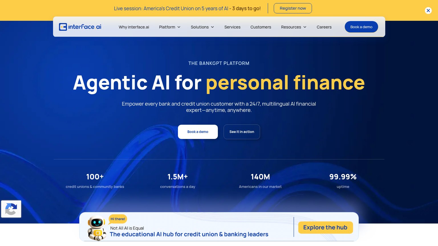 1234
- Yellow webinar banner — Brightest element on the page pulls first attention to 'Register now', an exit path competing with the demo CTA.
- Twin hero CTAs — 'Book a demo' and 'See it in action' share nearly equal size and weight, splitting the primary action's authority.
- Explore the hub strip — A third bright-yellow CTA at the fold's base adds another same-loudness exit before the demo action.
- Nav with three dropdowns — Seven nav items plus dropdown chevrons offer many leak paths at equal weight above the hero.
CTA
62FairCopy, size, verb, cost-feel — does the primary CTA earn the click?
How Interface.ai compares
Recommended rewrites
Trust
68FairProof that the product is real, competent, and safe to try.
How Interface.ai compares
Trust read
Value props
72FairTitle, subtitle, hero — do they sell the product's true value?
Interface.ai’s headline
Agentic AI for personal finance
Empower every bank and credit union customer with a 24/7, multilingual AI financial expert—anytime, anywhere.
Working
Could improve