
Your landing page’s weakest score is Trust.
How Juno ranks
Trust
58FairProof that the product is real, competent, and safe to try.
| Trust read | |
|---|---|
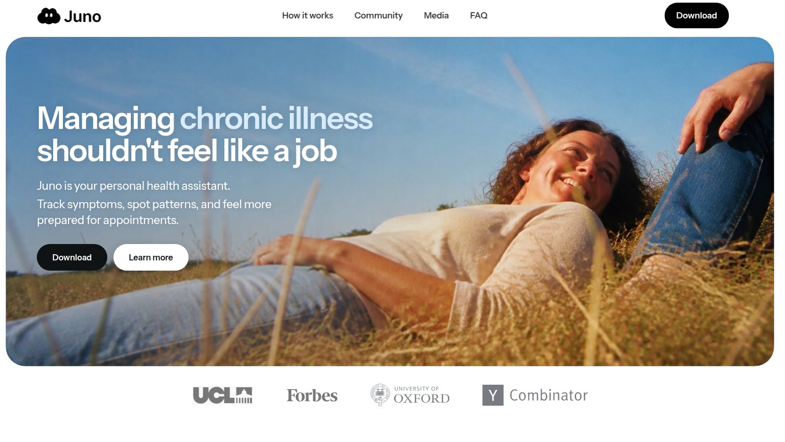
| Juno | Logo strip featuring UCL, Forbes, University of Oxford, and Y Combinator below the hero |
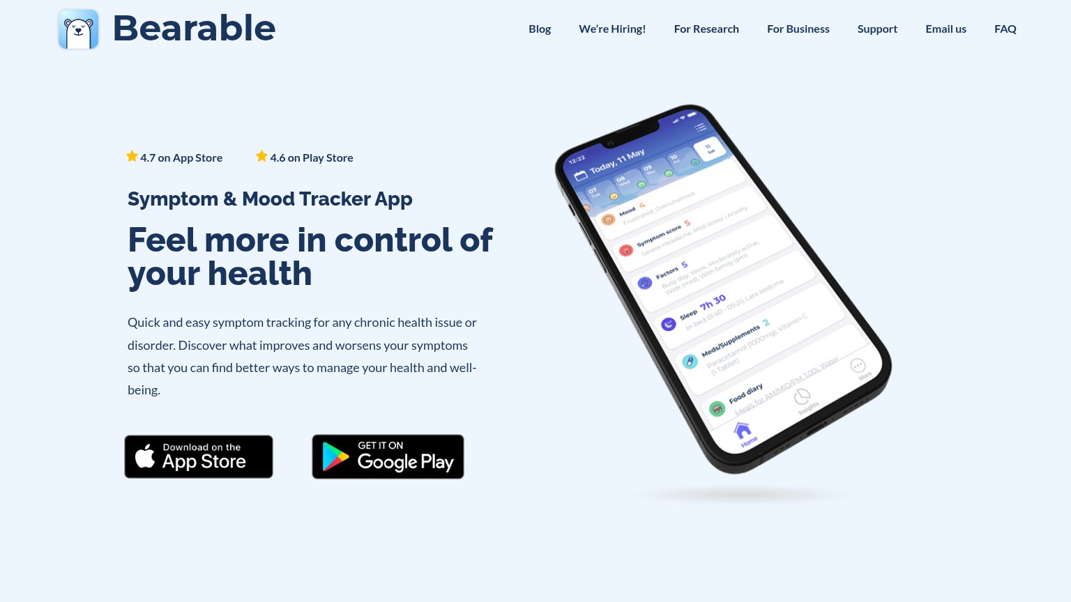
| "4.7 on App Store" and "4.6 on Play Store" star ratings above the headline | |
| Detailed app UI screenshots showing a health records table with entries like 'Quest Diagnostics Lipid Panel' and a profi | |
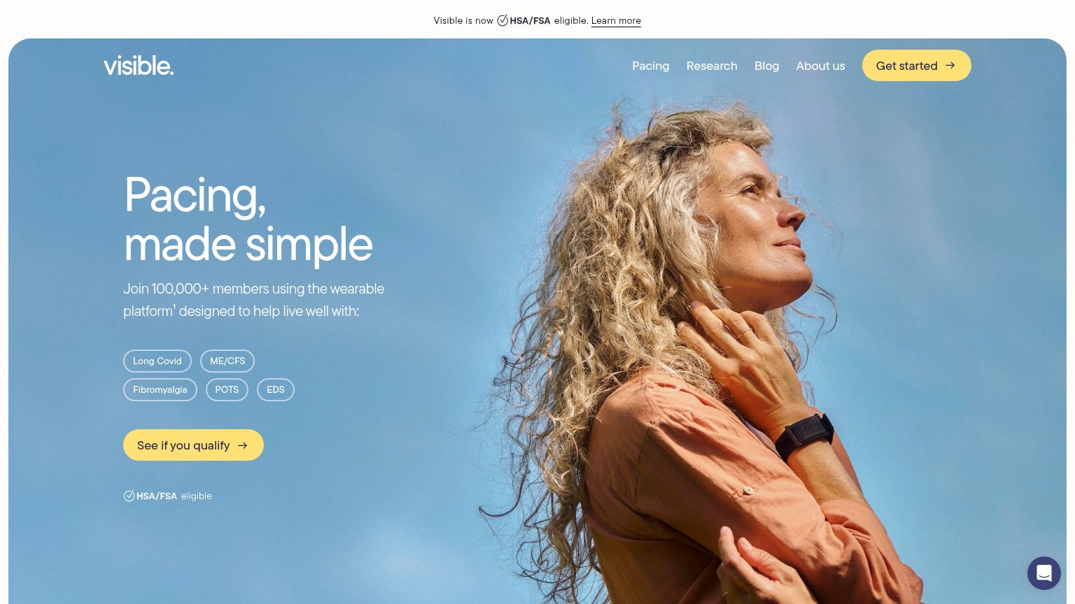
| Join 100,000+ members using the wearable platform¹ | |
| Product mockup showing symptom-tracking UI with specific stats like "23% of days in remission" and "47 total doses of Pr | |
| 4.8/5 ★ rating • 500K+ users |
Mobile web
70FairThe phone experience as a first-class citizen.
 12
- Hero Download button — Primary CTA sits ~1,100px down the tall hero card, below the first viewport for most phones.
- Learn more button — Same size and width as Download, splitting tap emphasis between two competing actions.
CTA
72FairCopy, size, verb, cost-feel — does the primary CTA earn the click?
How Juno compares
Recommended rewrites
Value props
76FairTitle, subtitle, hero — do they sell the product's true value?
Juno’s headline
Managing chronic illness shouldn't feel like a job
Juno is your personal health assistant. Track symptoms, spot patterns, and feel more prepared for appointments.
Working
Could improve
Information hierarchy
78FairDoes the design help or inhibit what the page is trying to say?
What works
What to improve