
Your landing page’s weakest score is Value props.
How Guava Health ranks
- 1.
Visible76
- 2.
Guava Health71
- 3.
Juno71
- 4.
Bearable66
- 5.
CareClinic62
- 6.
Flaredown59
71Growth scoreupdated
category scores
category scoresShowHide
Value props
50FairTitle, subtitle, hero — do they sell the product's true value?
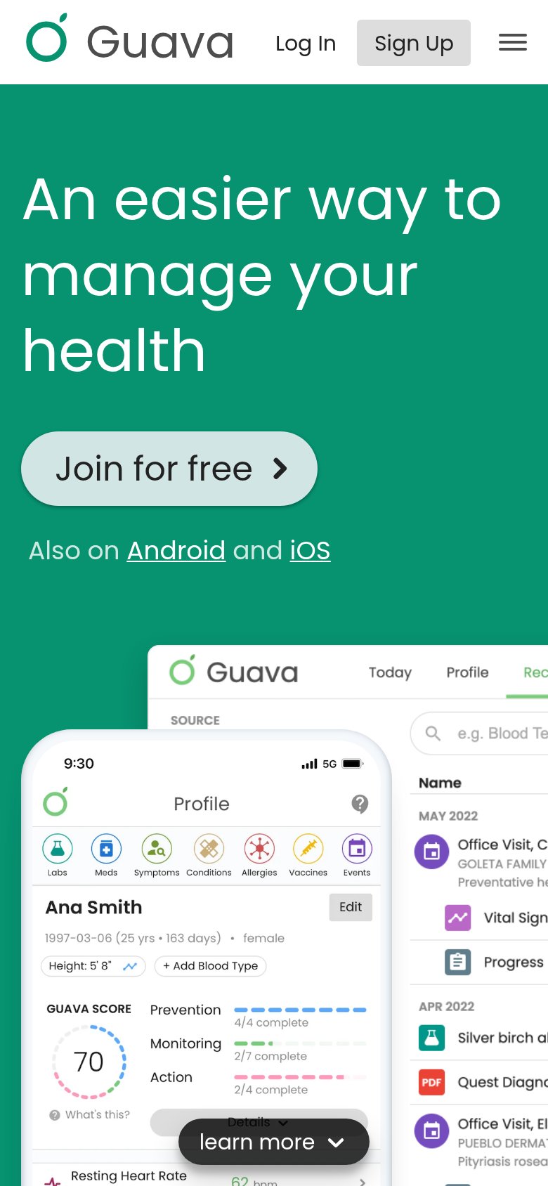
Guava Health’s headline vague
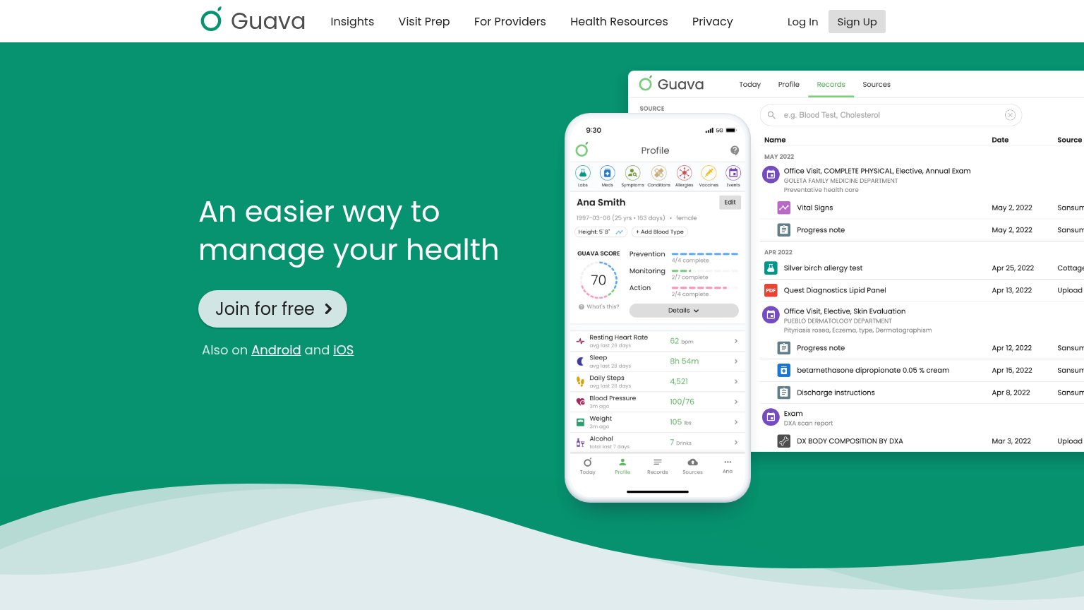
An easier way to manage your health
Working
- Screenshots demonstrate real product, not decor
- 'Join for free' removes price friction
- Clean, uncluttered fold keeps focus on CTA
Could improve
- Headline could caption any health app
- No subhead explaining what Guava does
- Zero numbers or proof points in the fold
Trust
54FairProof that the product is real, competent, and safe to try.
| Trust read | |
|---|---|
| Guava Health | Detailed app UI screenshots showing a health records table with entries like 'Quest Diagnostics Lipid Panel' and a profi |
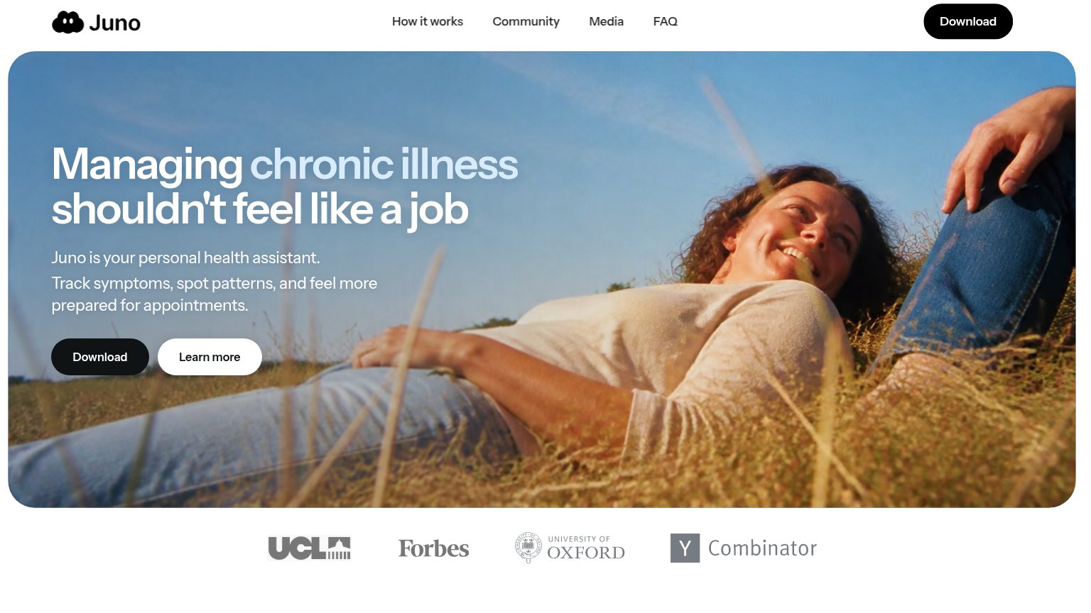
| Logo strip featuring UCL, Forbes, University of Oxford, and Y Combinator below the hero | |
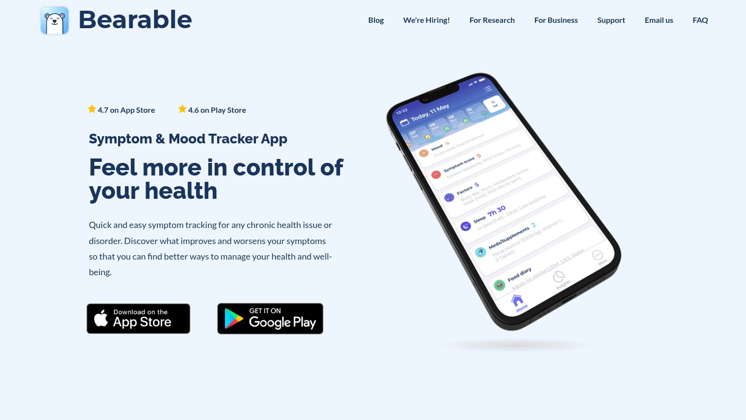
| "4.7 on App Store" and "4.6 on Play Store" star ratings above the headline | |
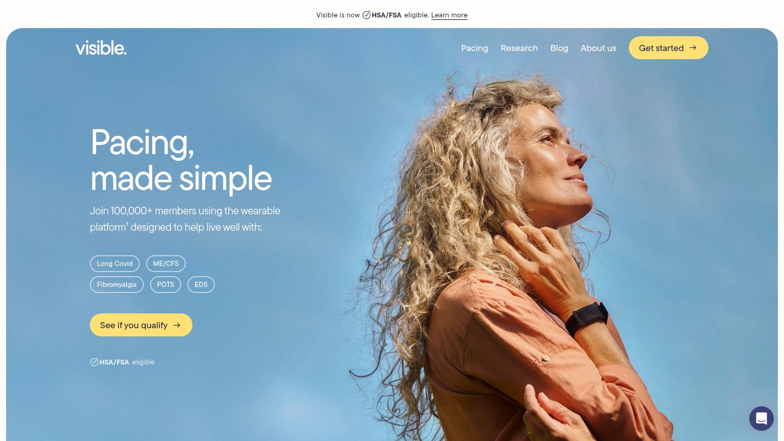
| Join 100,000+ members using the wearable platform¹ | |
| Product mockup showing symptom-tracking UI with specific stats like "23% of days in remission" and "47 total doses of Pr | |
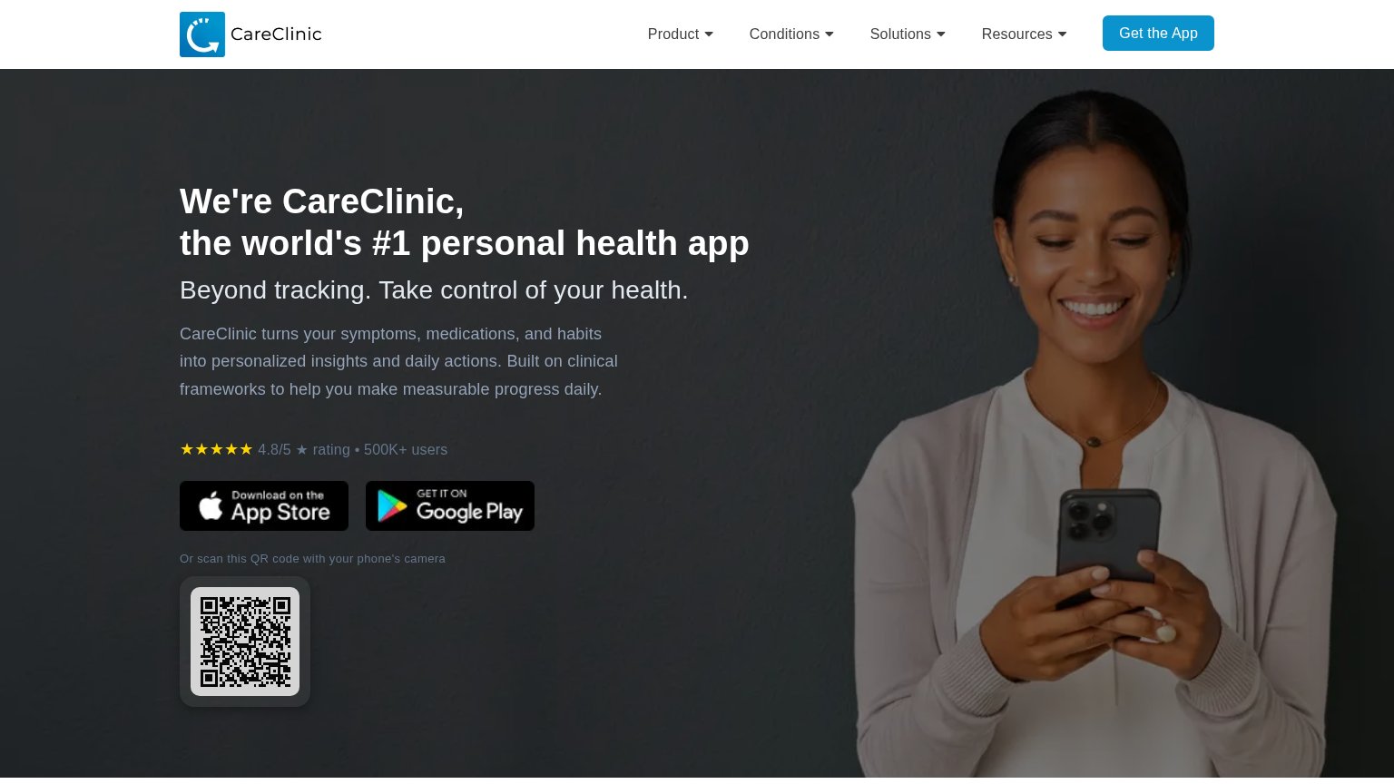
| 4.8/5 ★ rating • 500K+ users |
Information hierarchy
80StrongDoes the design help or inhibit what the page is trying to say?
What works
What to improve
Mobile web
85StrongThe phone experience as a first-class citizen.
What works
What to improve
CTA
86StrongCopy, size, verb, cost-feel — does the primary CTA earn the click?
How Guava Health compares
Recommended rewrites