
Your landing page’s weakest score is Mobile web.
How Bearable ranks
Mobile web
58FairThe phone experience as a first-class citizen.
 12
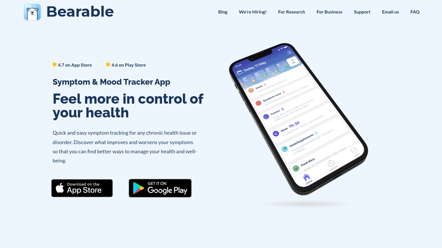
- Oversized phone mockup — The tilted device render consumes roughly half the first viewport, displacing the headline and download buttons downward.
- Headline wraps three lines — "Feel more in control of Bearable's health" scales down poorly, wrapping into three tall lines that stretch the fold further.
CTA
62FairCopy, size, verb, cost-feel — does the primary CTA earn the click?
Problems
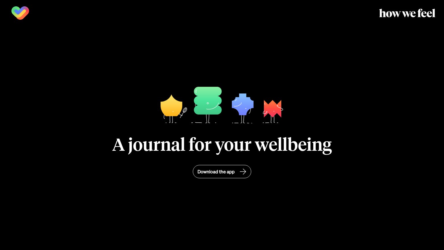
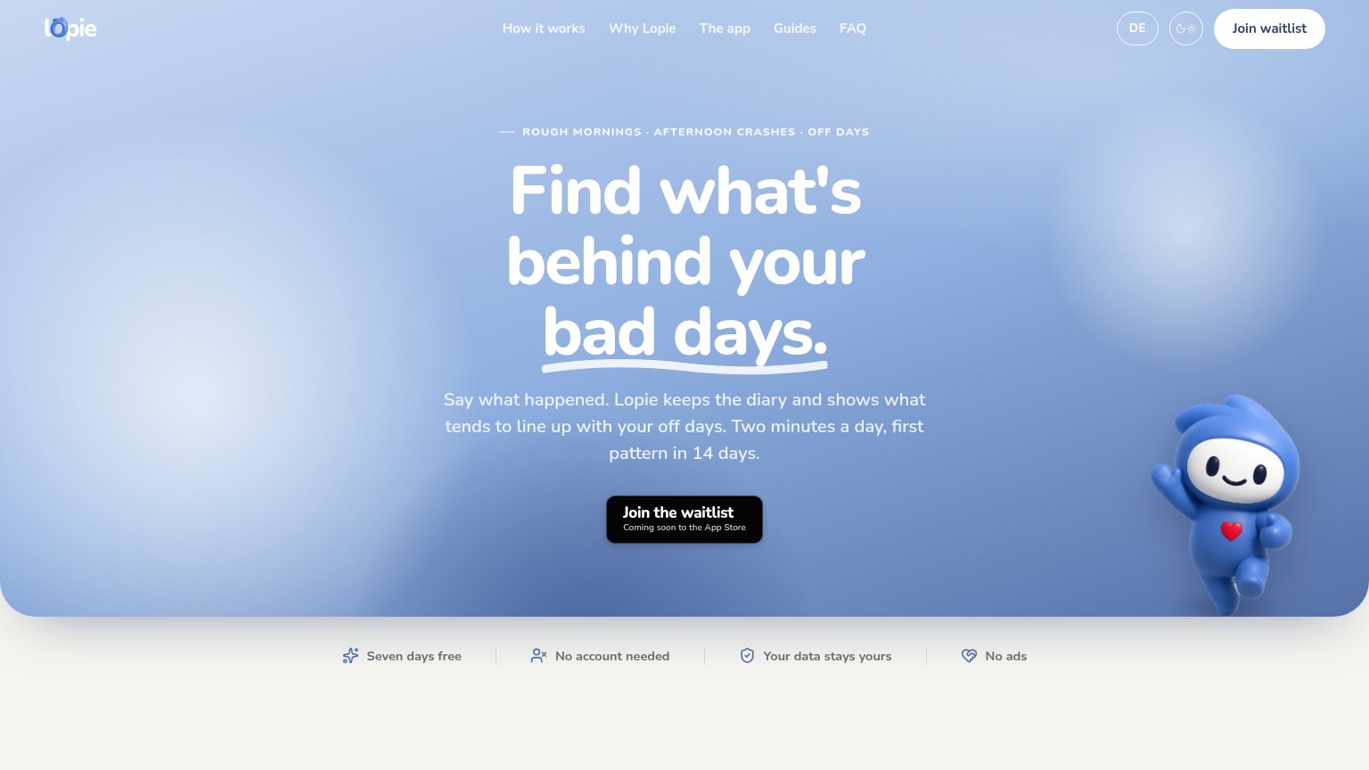
- no CTA in mobile first viewport
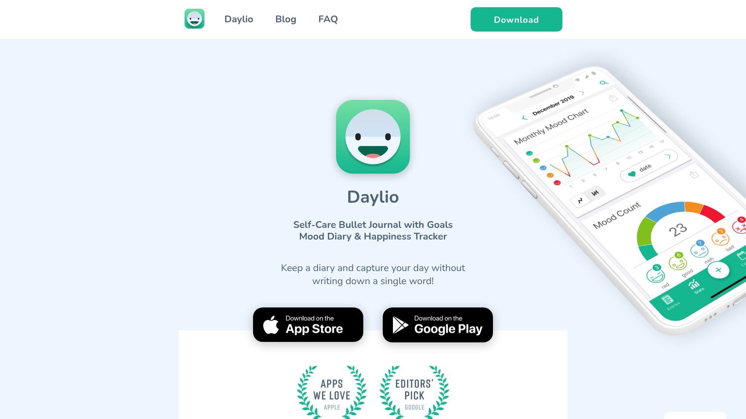
- two co-equal badges, no dominant action
- stock badges, no designed CTA
- no benefit or 'free' framing
Information hierarchy
68FairDoes the design help or inhibit what the page is trying to say?
What works
What to improve
Trust
68FairProof that the product is real, competent, and safe to try.
How Bearable compares
Trust read
Value props
76FairTitle, subtitle, hero — do they sell the product's true value?
Bearable’s headline
Feel more in control of your health
Quick and easy symptom tracking for any chronic health issue or disorder. Discover what improves and worsens your symptoms so that you can find better ways to manage your health and well-being.
Working
Could improve