
Your landing page’s weakest score is Trust.
How CareClinic ranks
Trust
58FairProof that the product is real, competent, and safe to try.
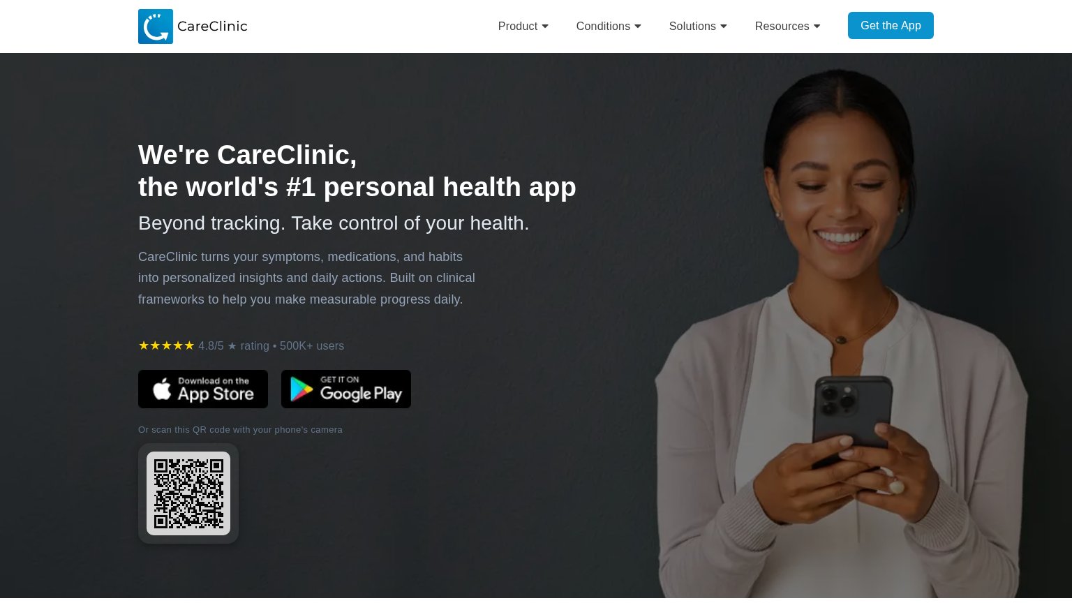
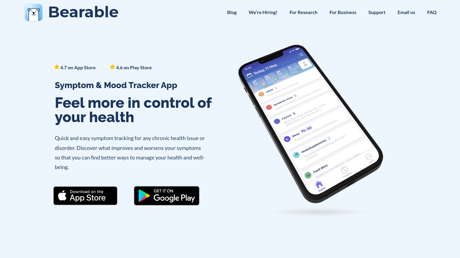
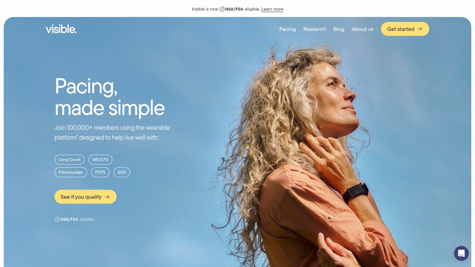
| Trust read | |
|---|---|
| CareClinic | 4.8/5 ★ rating • 500K+ users |
| Logo strip featuring UCL, Forbes, University of Oxford, and Y Combinator below the hero | |
| "4.7 on App Store" and "4.6 on Play Store" star ratings above the headline | |
| Detailed app UI screenshots showing a health records table with entries like 'Quest Diagnostics Lipid Panel' and a profi | |
| Join 100,000+ members using the wearable platform¹ | |
| Product mockup showing symptom-tracking UI with specific stats like "23% of days in remission" and "47 total doses of Pr |
Mobile web
58FairThe phone experience as a first-class citizen.
 1234
- Cropped store badges — App Store and Google Play buttons sit half-cut at the viewport edge, so the primary CTA is not cleanly tappable without scrolling.
- Oversized hero headline — Desktop-scale headline wraps into four heavy lines and eats most of the fold, displacing the CTA.
- Long intro paragraph — Five lines of body copy stack a second message between the value statement and the download action.
- Split badge pair — Two small side-by-side badges replace one full-width thumb-friendly CTA.
CTA
62FairCopy, size, verb, cost-feel — does the primary CTA earn the click?
How CareClinic compares
Recommended rewrites
Value props
62FairTitle, subtitle, hero — do they sell the product's true value?
CareClinic’s headline
We're CareClinic, the world's #1 personal health app
Beyond tracking. Take control of your health.
Working
Could improve
Information hierarchy
68FairDoes the design help or inhibit what the page is trying to say?
What works
What to improve