
Your landing page’s weakest score is Trust.
How IRBC ranks
Trust
58FairProof that the product is real, competent, and safe to try.
| Trust read | |
|---|---|
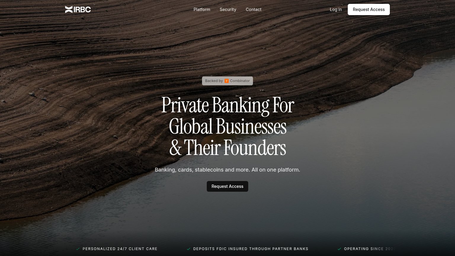
| IRBC | "DEPOSITS FDIC INSURED THROUGH PARTNER BANKS" ticker line |
| "Banking services provided through Choice Financial Group and Column N.A., Members FDIC." disclosure banner | |
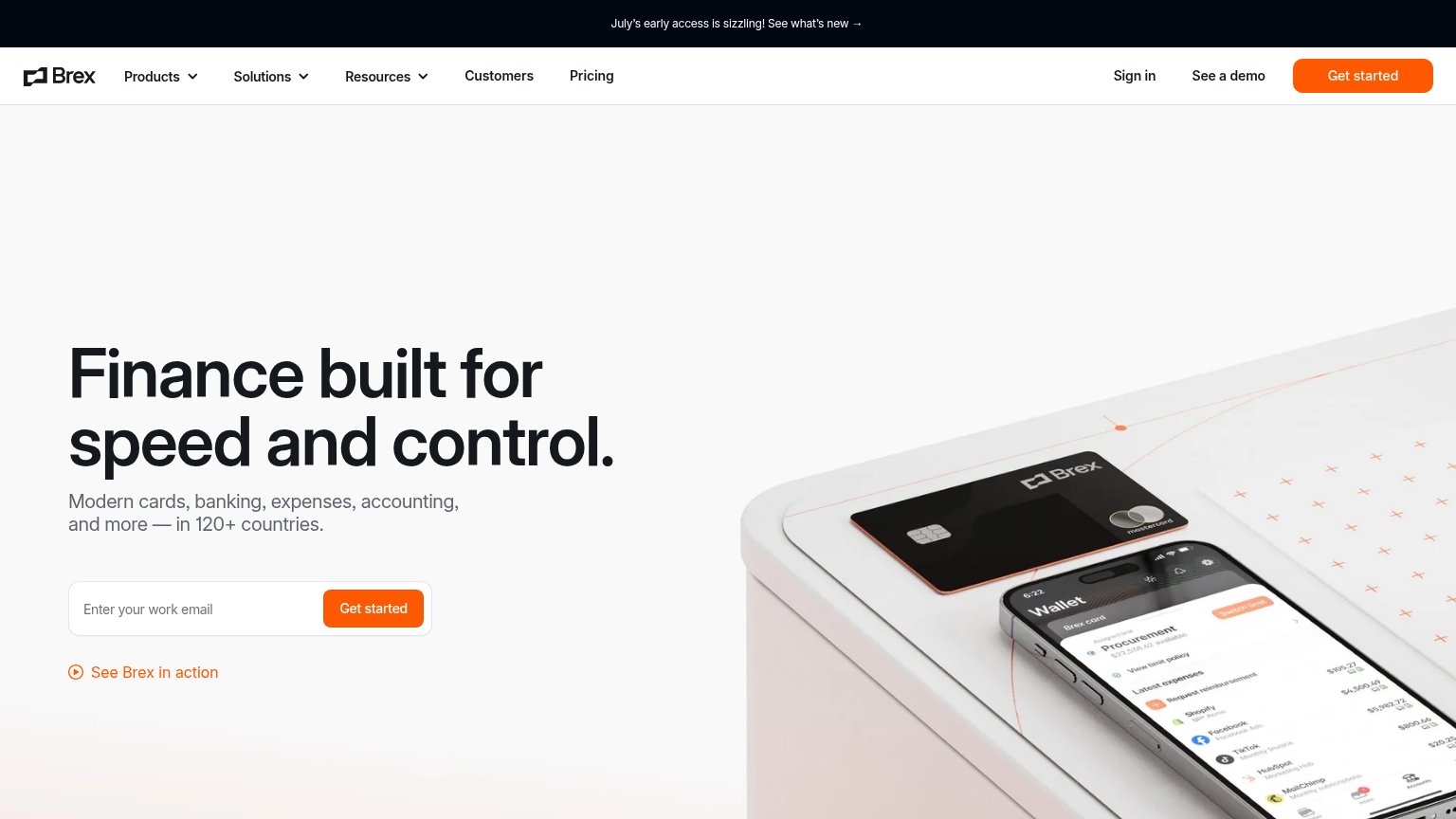
| implicit context Brex may benefit from pre-existing familiarity among its target audience. | |
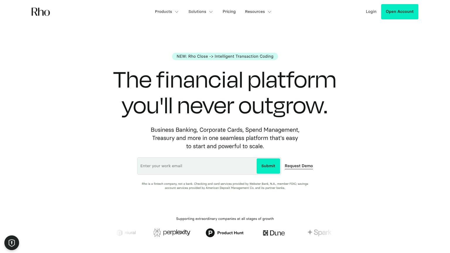
| Customer logo wall ("Supporting extraordinary companies at all stages of growth") with Niural, Perplexity, Product Hunt, | |
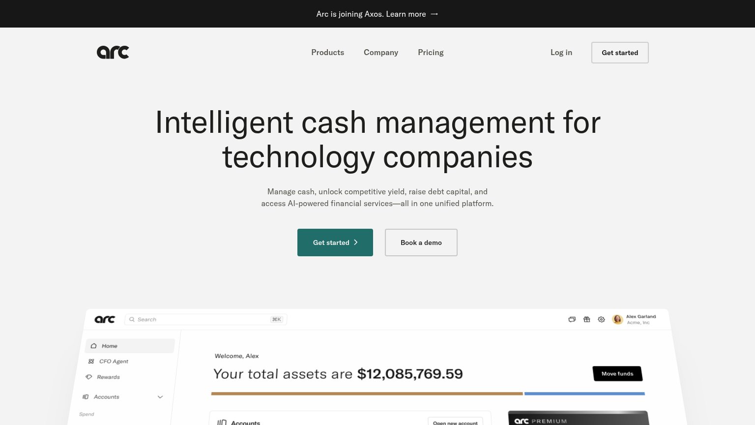
| Detailed product dashboard screenshot showing accounts, balances, treasury holdings, and a relationship manager card | |
| Customer logo row: Starknet, Braintrust, Pallet, Sydecar, Tempo, Aleo |
CTA
66FairCopy, size, verb, cost-feel — does the primary CTA earn the click?

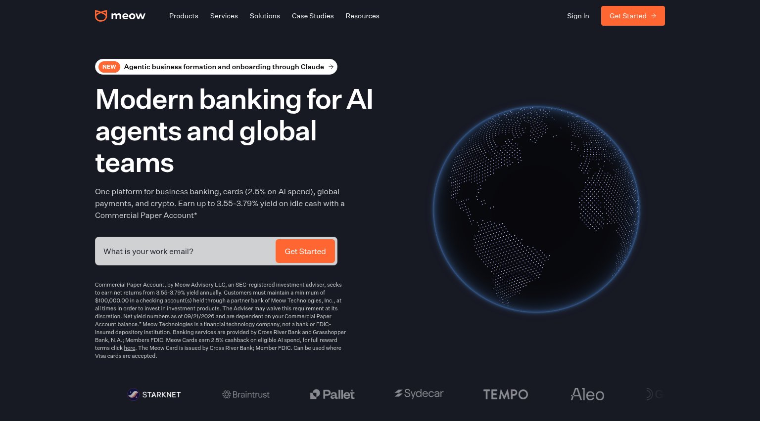
Problems
- 'Request' feels like waiting, not value
- hero button small vs. huge headline
- no payoff implied in label
Value props
70FairTitle, subtitle, hero — do they sell the product's true value?
IRBC’s headline
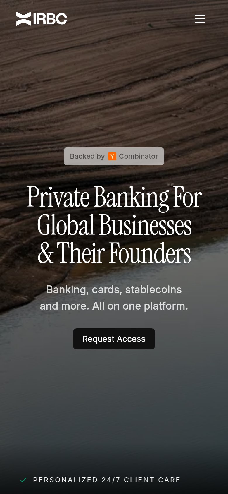
Private Banking For Global Businesses & Their Founders
Banking, cards, stablecoins and more. All on one platform.
Working
Could improve
Mobile web
82StrongThe phone experience as a first-class citizen.
What works
What to improve
Information hierarchy
86StrongDoes the design help or inhibit what the page is trying to say?
What works
What to improve