
Your landing page’s weakest score is Information hierarchy.
How IDeaS ranks
70Growth scoreupdated
category scores
category scoresShowHide
Information hierarchy
62FairDoes the design help or inhibit what the page is trying to say?
 1234
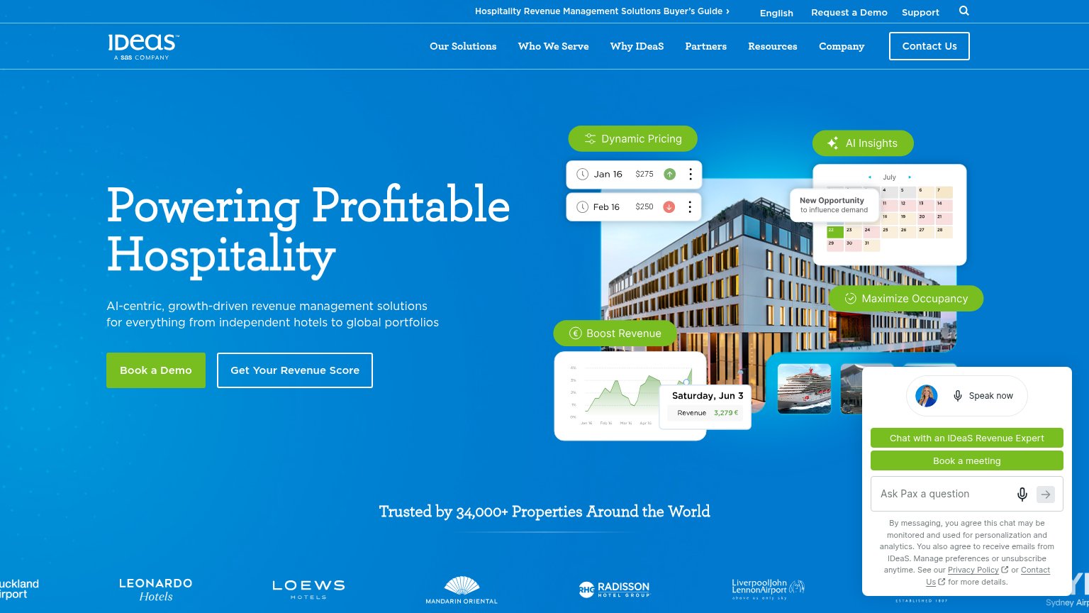
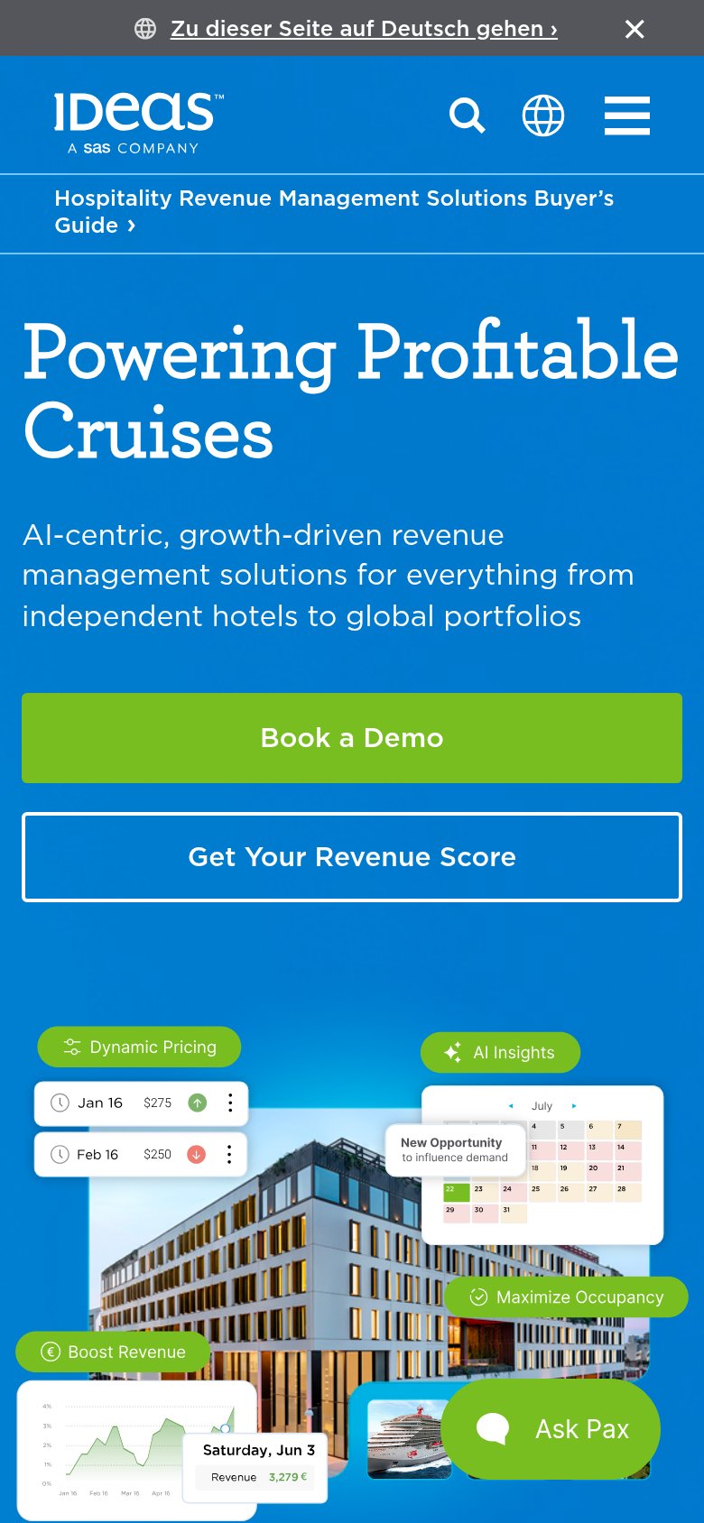
- Ask Pax chat widget — Auto-expanded chat panel with two green buttons and consent text competes directly with the hero CTAs at equal visual weight.
- Get IDeaS's Revenue Score — Outlined secondary button sits at nearly equal size beside "Book a Demo", splitting the fold's single action into two.
- Top utility bar — Buyer's Guide link, English, Request a Demo, Support, and search stack a second exit row above the main nav.
- Main navigation row — Seven nav items plus a boxed "Contact Us" button add eight more exits before the hero CTA is reached.
CTA
68FairCopy, size, verb, cost-feel — does the primary CTA earn the click?
Problems
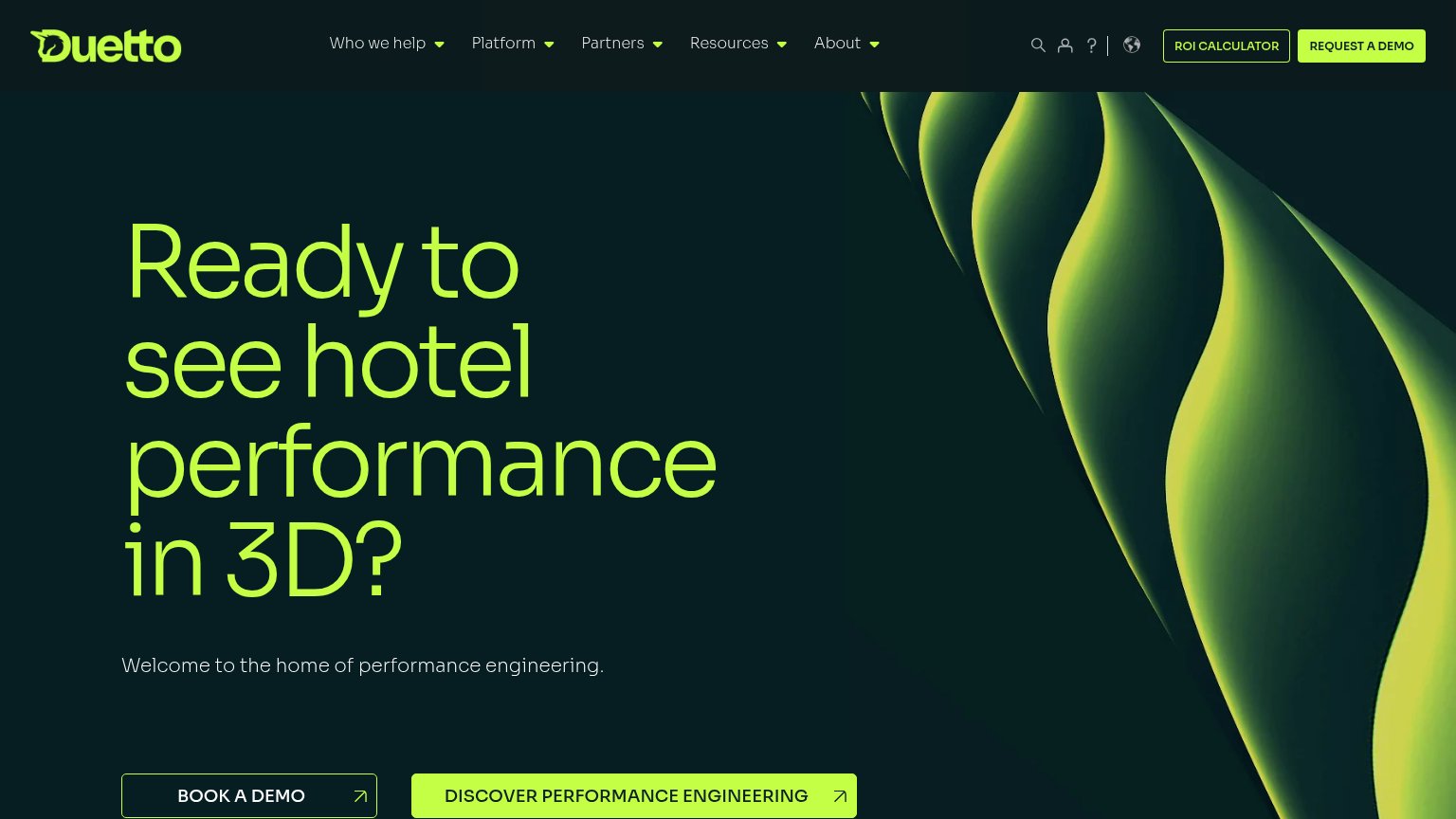
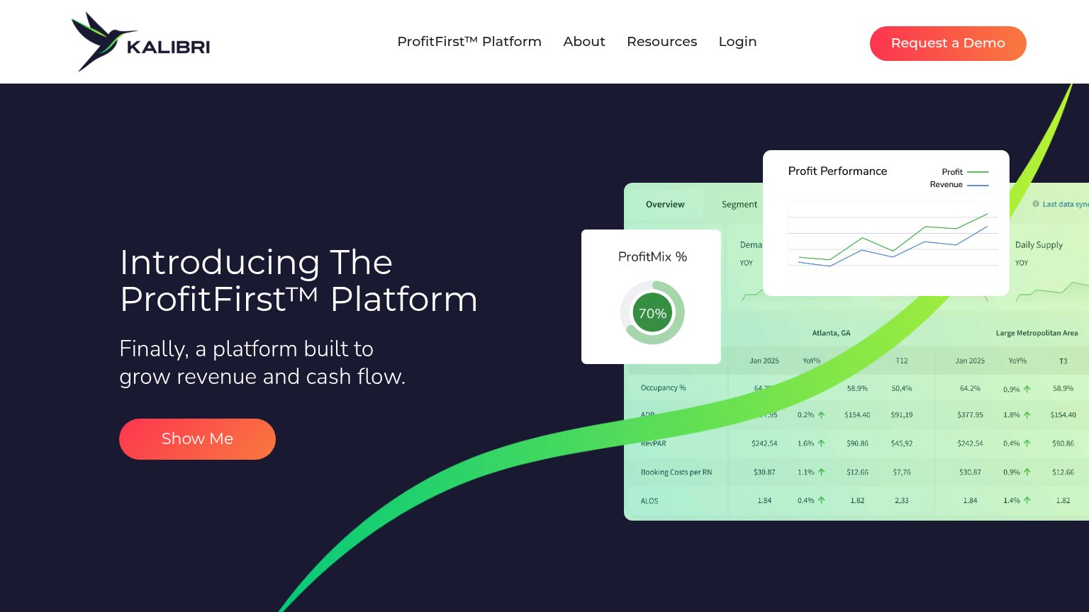
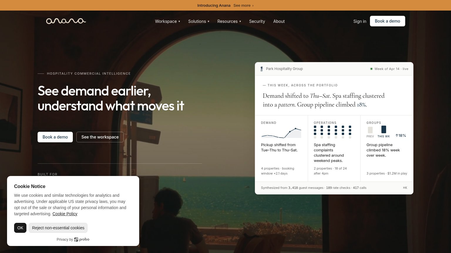
- high-commitment sales ask
- 4 demo/contact labels compete
- value CTA relegated to secondary
Value props
72FairTitle, subtitle, hero — do they sell the product's true value?
IDeaS’s headline
Powering Profitable Hospitality
AI-centric, growth-driven revenue management solutions for everything from independent hotels to global portfolios
Working
Could improve
Mobile web
72FairThe phone experience as a first-class citizen.
What works
What to improve
Trust
76FairProof that the product is real, competent, and safe to try.
How IDeaS compares
Trust read