
Your landing page’s weakest score is Information hierarchy.
How Helicone ranks
75Growth scoreupdated
category scores
category scoresShowHide
Information hierarchy
68FairDoes the design help or inhibit what the page is trying to say?
 1234
- Mintlify announcement banner — Bright blue banner is the highest-contrast element on the page and links visitors away before they read the headline.
- Log In button — Solid blue fill matches the primary CTA's style, splitting button-weight attention to the top-right corner.
- Nav link row — Seven nav items plus a GitHub counter give the fold roughly ten exit paths before 'Try for free'.
- Floating model logo cloud — Nine scattered logo tiles at varied angles create visual noise that competes with the headline's scan path.
Value props
72FairTitle, subtitle, hero — do they sell the product's true value?
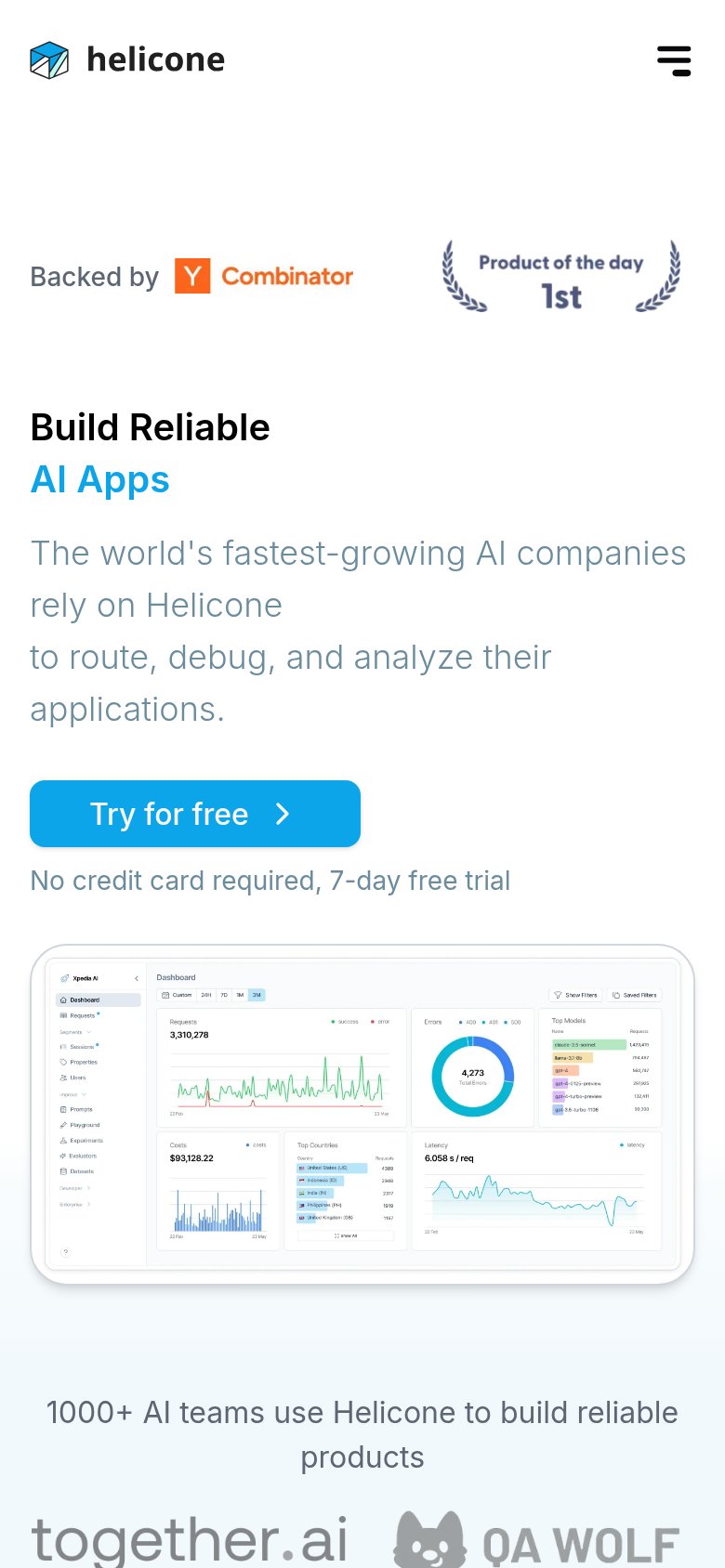
Helicone’s headline sells
Build Reliable AI Apps
The world's fastest-growing AI companies rely on Helicone to route, debug, and analyze their applications.
Working
- Outcome-led: 'Reliable' hits the core fear
- Verbs 'route, debug, analyze' say what it does
- Dashboard hero demonstrates, not decorates
Could improve
- Zero numbers in headline or subhead
- 'Fastest-growing' claim is unverifiable
- Category (LLM observability) never named
Mobile web
74FairThe phone experience as a first-class citizen.
What works
What to improve
Trust
78FairProof that the product is real, competent, and safe to try.
How Helicone compares
Trust read
CTA
85StrongCopy, size, verb, cost-feel — does the primary CTA earn the click?
How Helicone compares
Recommended rewrites