
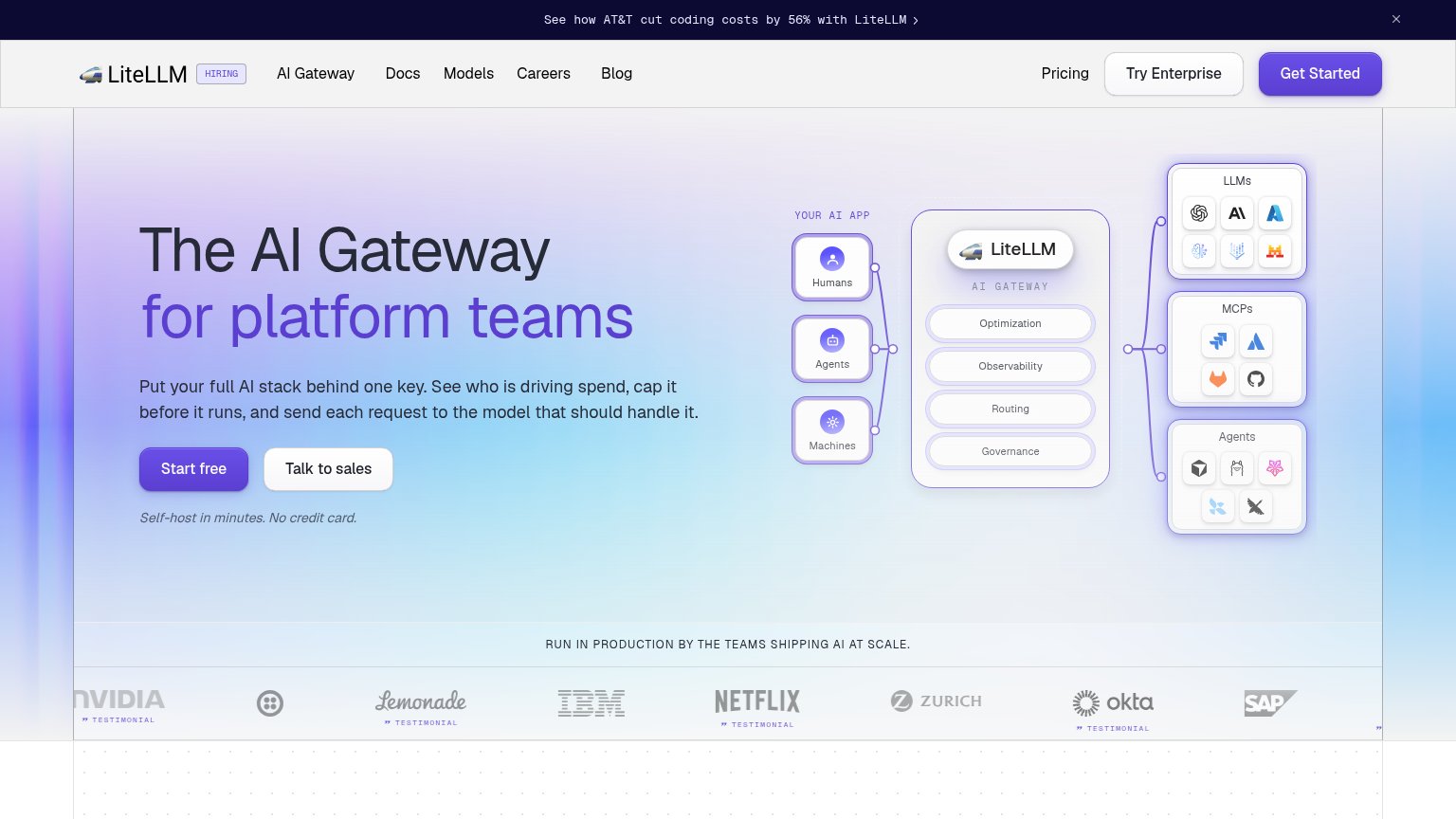
Your landing page’s weakest score is Information hierarchy.
How LiteLLM ranks
81Growth scoreupdated
category scores
category scoresShowHide
Information hierarchy
76FairDoes the design help or inhibit what the page is trying to say?
 1234
- Get Started button — Third equal-weight CTA in the header competes with 'Start free' and splits the primary action across two labels.
- Try Enterprise button — Duplicates the hero's 'Talk to sales' path at nav level, adding a fourth button to a fold that needs one.
- Announcement banner link — AT&T case-study link sits above everything and routes attention off the conversion path before the headline is read.
- Gateway diagram clusters — Three stacked icon panels (LLMs, MCPs, Agents) with ~15 tiny logos add scan load without labeling what the outcome is.
Mobile web
76FairThe phone experience as a first-class citizen.
 123
- Start free button — Desktop-proportioned pill instead of a full-width thumb target; splits attention with Talk to sales beside it.
- Truncated promo banner — Copy clips mid-word at "with Li…" so the AT&T proof point never lands on mobile.
- Double-decker header — Banner plus logo row stack to consume a meaningful slice of the first viewport before the headline.
Trust
82StrongProof that the product is real, competent, and safe to try.
How LiteLLM compares
Trust read
Value props
84StrongTitle, subtitle, hero — do they sell the product's true value?
LiteLLM’s headline
The AI Gateway for platform teams
Put your full AI stack behind one key. See who is driving spend, cap it before it runs, and send each request to the model that should handle it.
Working
Could improve
CTA
88StrongCopy, size, verb, cost-feel — does the primary CTA earn the click?
How LiteLLM compares
Recommended rewrites