
Your landing page’s weakest score is Mobile web.
How Gradescope (Turnitin) ranks
- 1.
Frizzle77
- 2.
Gradescope (Turnitin)76
- 3.
SchoolAI70
- 4.
Snorkl67
- 5.
Bakpax40
76Growth scoreupdated
category scores
category scoresShowHide
Mobile web
70FairThe phone experience as a first-class citizen.
 1234
- Primary CTAs below fold — The illustration and long subhead push 'Sign Up for Free' to the bottom edge of the first viewport, barely tappable without scrolling.
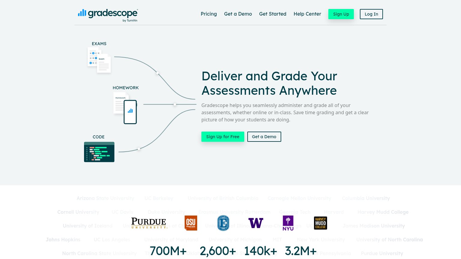
- Oversized hero illustration — The EXAMS/HOMEWORK/CODE graphic consumes roughly a third of the first viewport before any value statement appears.
- Split-width CTA pair — 'Sign Up for Free' and 'Get a Demo' sit side-by-side at half width instead of stacked full-bleed thumb targets.
- Clipped logo watermark — Faint university-name text is cut off at both edges and collides with the stat counters, reading as broken layout.
Information hierarchy
76FairDoes the design help or inhibit what the page is trying to say?
 1234
- Duplicate nav Sign Up — Mint button identical to the hero CTA splits the primary action into two same-weight targets.
- University logo band — Logos and stats overlap the ghosted university names, rendering as a broken, unreadable collision.
- Nav link row — Five links plus Log In leak attention away from the conversion before the headline is read.
- Get a Demo button — Outlined at near-equal weight beside the primary CTA and duplicated in the nav, forcing a choice.
Value props
76FairTitle, subtitle, hero — do they sell the product's true value?
Gradescope (Turnitin)’s headline
Deliver and Grade Your Assessments Anywhere
Gradescope helps you seamlessly administer and grade all of your assessments, whether online or in-class. Save time grading and get a clear picture of how your students are doing.
Working
Could improve
Trust
76FairProof that the product is real, competent, and safe to try.
How Gradescope (Turnitin) compares
Trust read
CTA
80StrongCopy, size, verb, cost-feel — does the primary CTA earn the click?
How Gradescope (Turnitin) compares
Recommended rewrites