
Your landing page’s weakest score is Mobile web.
How Frizzle ranks
Mobile web
68FairThe phone experience as a first-class citizen.
 123
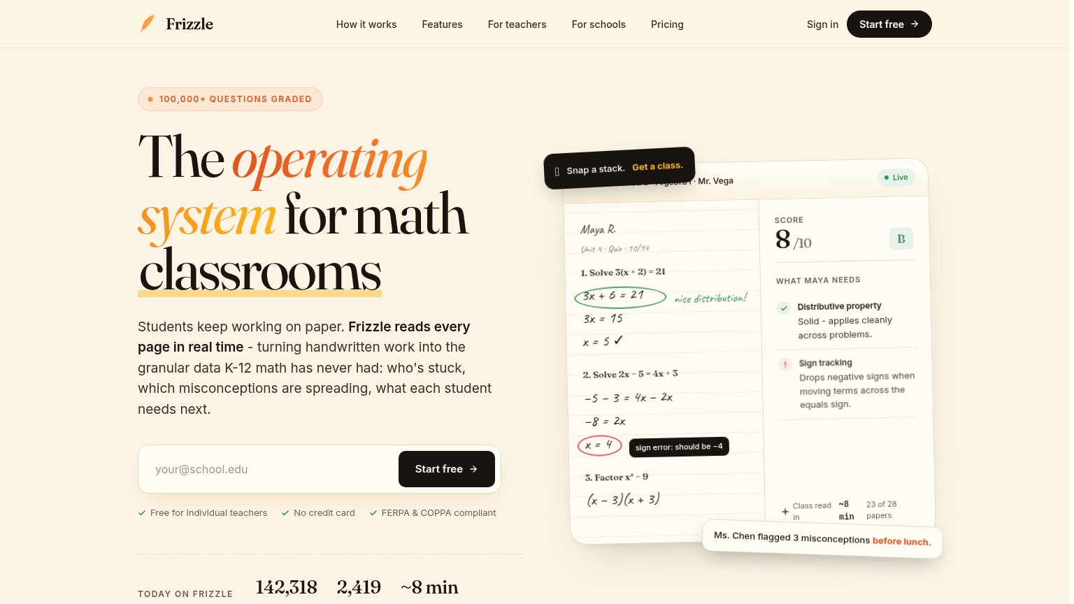
- Primary CTA below fold — The email field and "Start free" button sit well below the first viewport; a visitor must scroll past the full paragraph to reach the action.
- Sign in crowds logo — "Sign in" is jammed flush against the "Frizzle" wordmark with no spacing, reading as "FrizzleSign in" and cluttering the header.
- Long body paragraph — Nine lines of dense copy between headline and CTA push the conversion action off-screen; mobile needs one or two lines here.
Trust
72FairProof that the product is real, competent, and safe to try.
| Trust read | |
|---|---|
| Frizzle | "100,000+ QUESTIONS GRADED" badge above the hero headline |
| AI Feedback demo card showing "Great job splitting up the composite shape into three rectangles!" over a real student wo | |
| Compliance badge row beneath the CTAs: FERPA, COPPA, AICPA SOC 2, 1EdTech Certified, FIPPA | |
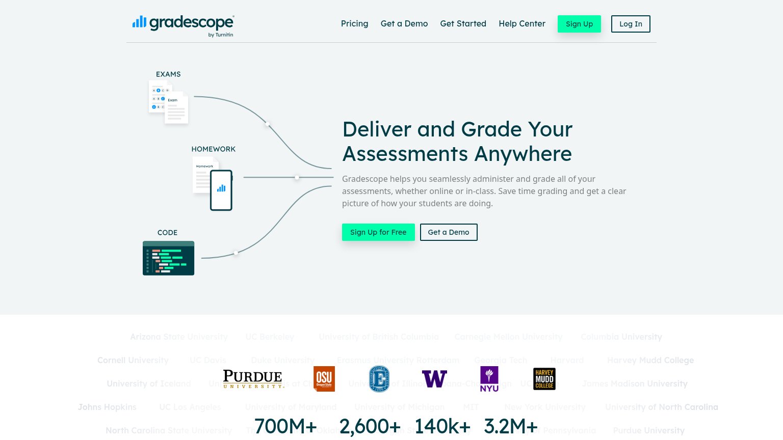
| "700M+ Questions Graded, 2,600+ Universities, 140k+ Instructors, 3.2M+ Students" stat bar | |
| No visible trust signal identified. |
Value props
78FairTitle, subtitle, hero — do they sell the product's true value?
Frizzle’s headline
The operating system for math classrooms
Students keep working on paper. Frizzle reads every page in real time - turning handwritten work into the granular data K-12 math has never had: who's stuck, which misconceptions are spreading, what each student needs next.
Working
Could improve
Information hierarchy
82StrongDoes the design help or inhibit what the page is trying to say?
What works
What to improve
CTA
86StrongCopy, size, verb, cost-feel — does the primary CTA earn the click?
How Frizzle compares
Recommended rewrites