
Your landing page’s weakest score is Trust.
How Slick ranks
Trust
62FairProof that the product is real, competent, and safe to try.
| Trust read | |
|---|---|
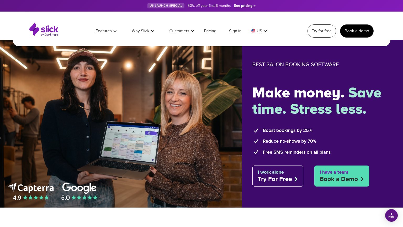
| Slick | Capterra 4.9 and Google 5.0 star-rating badges overlaid on the hero photo |
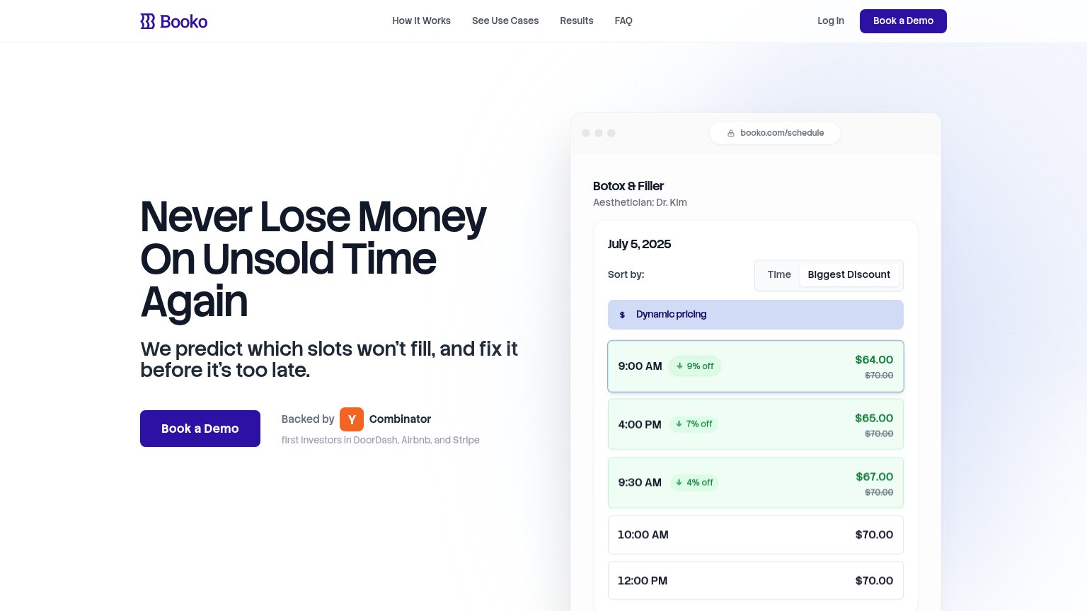
| "Backed by Y Combinator — first investors in DoorDash, Airbnb, and Stripe" badge next to the Book a Demo CTA | |
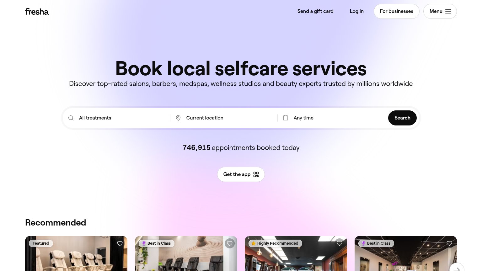
| "746,915 appointments booked today" counter beneath the search bar | |
| Real product UI overlays: "Select Appointment Time" scheduler, "Booked appointments 1107", and "Projected sales $67,085. | |
| Realistic embedded product demo: 'INDIGO — Choose an option: Book for one person / Book for a group' booking UI powered |
Mobile web
62FairThe phone experience as a first-class citizen.
 123
- Help bubble on CTA — The floating Help chat bubble overlaps the 'Book a Demo' button, blocking its tap target.
- Cut-off CTA buttons — Both 'Try For Free' and 'Book a Demo' are clipped at the viewport edge, not fully tappable in the first fold.
- Oversized hero headline — 'Make money. Save time. Stress less.' spans three huge lines, pushing the CTAs below the fold.
Information hierarchy
72FairDoes the design help or inhibit what the page is trying to say?
What works
What to improve
Value props
76FairTitle, subtitle, hero — do they sell the product's true value?
Slick’s headline
Make money. Save time. Stress less.
BEST SALON BOOKING SOFTWARE
Working
Could improve
CTA
78FairCopy, size, verb, cost-feel — does the primary CTA earn the click?
How Slick compares
Recommended rewrites