
Your landing page’s weakest score is Trust.
How Fresha ranks
82Growth scoreupdated
category scores
category scoresShowHide
Trust
72FairProof that the product is real, competent, and safe to try.
| Trust read | |
|---|---|
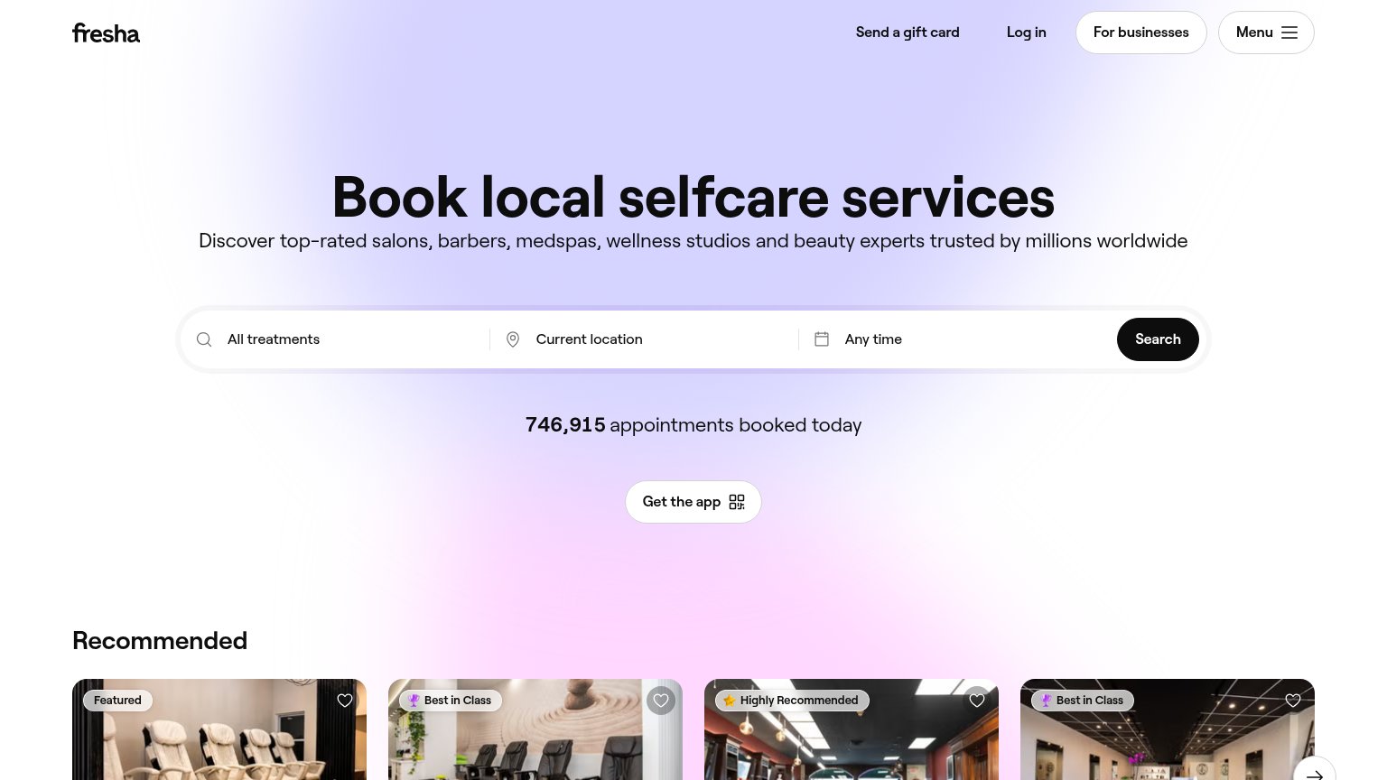
| Fresha | "746,915 appointments booked today" counter beneath the search bar |
| "Backed by Y Combinator — first investors in DoorDash, Airbnb, and Stripe" badge next to the Book a Demo CTA | |
| Capterra 4.9 and Google 5.0 star-rating badges overlaid on the hero photo | |
| Real product UI overlays: "Select Appointment Time" scheduler, "Booked appointments 1107", and "Projected sales $67,085. | |
| Realistic embedded product demo: 'INDIGO — Choose an option: Book for one person / Book for a group' booking UI powered |
Information hierarchy
82StrongDoes the design help or inhibit what the page is trying to say?
 123
- Get the app pill — Second white pill-shaped button below the search bar competes with Search and detours visitors to an app-store exit before they try the core action.
- For businesses button — The only outlined, pill-styled control in the nav gives the B2B exit more visual weight than any consumer path, pulling the wrong audience action into the scan line.
- Recommended card badges — Four saturated badge/heart overlays crest into the fold at equal weight, starting a browsing loop before the search intent is captured.
Value props
82StrongTitle, subtitle, hero — do they sell the product's true value?
Fresha’s headline
Book local selfcare services
Discover top-rated salons, barbers, medspas, wellness studios and beauty experts trusted by millions worldwide
Working
Could improve
CTA
84StrongCopy, size, verb, cost-feel — does the primary CTA earn the click?
How Fresha compares
Recommended rewrites
Mobile web
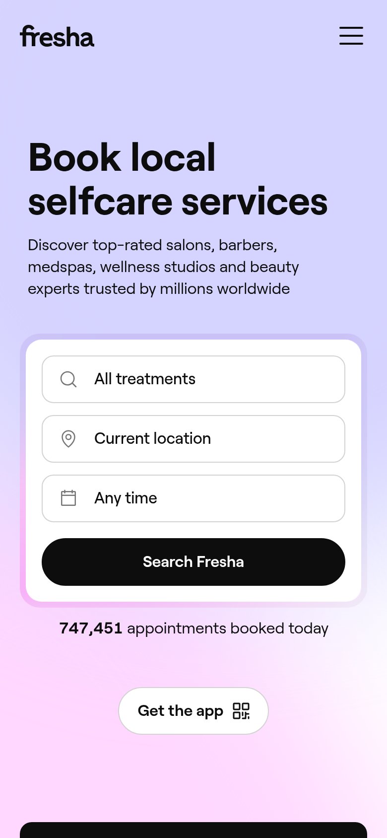
88StrongThe phone experience as a first-class citizen.
What works
What to improve