
Your landing page’s weakest score is Trust.
How Qlo ranks
Trust
48PoorProof that the product is real, competent, and safe to try.

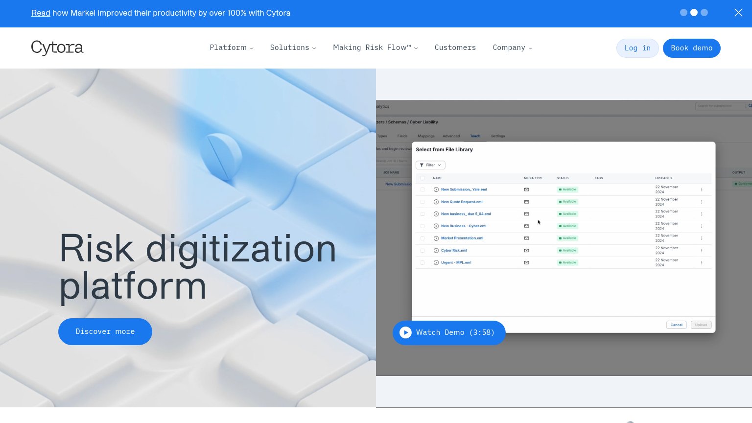
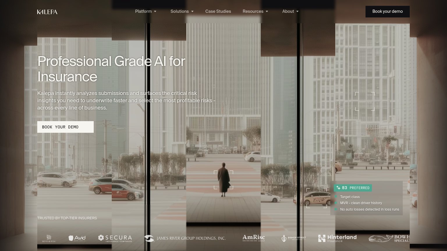

| Trust read | |
|---|---|
| Qlo | Product UI card showing "Worth writing — In appetite" with real submission fields (EPL, Assets $79,636,000, policy dates |
| "TRUSTED BY TOP-TIER INSURERS" logo strip (Secura, James River Group Holdings, AmRisc, Hinterland) | |
| No visible trust signal identified. | |
| Announcement bar: "Live Demo on Oct 6th: AI Underwriter for Life & Health → RSVP" | |
| Banner: "Read how Markel improved their productivity by over 100% with Cytora" | |
| "Duck Creek has acquired Send" announcement with READ PRESS RELEASE link |
CTA
58FairCopy, size, verb, cost-feel — does the primary CTA earn the click?
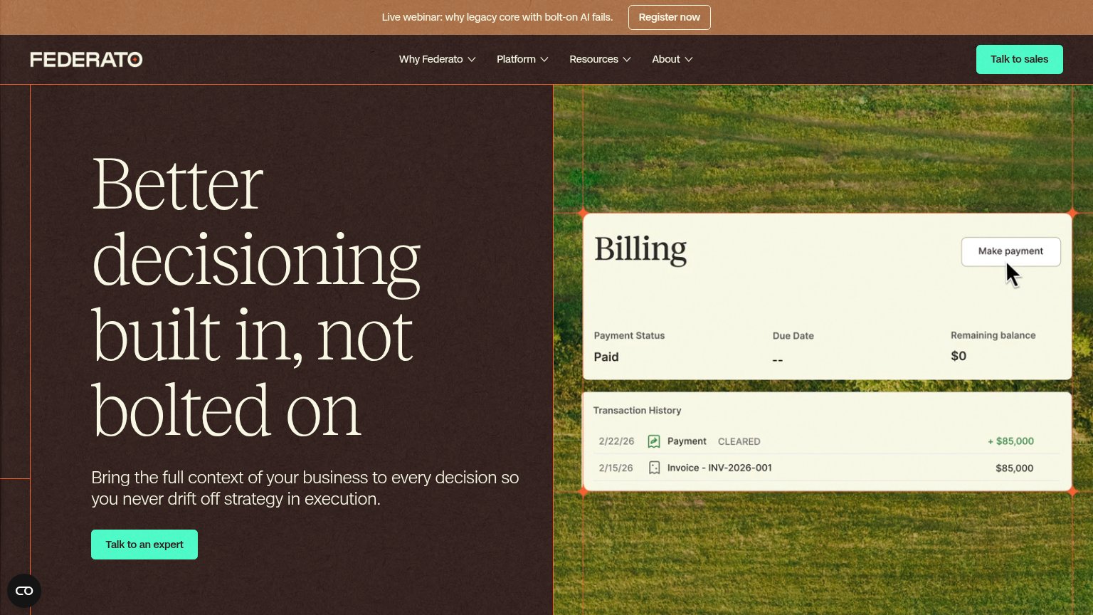
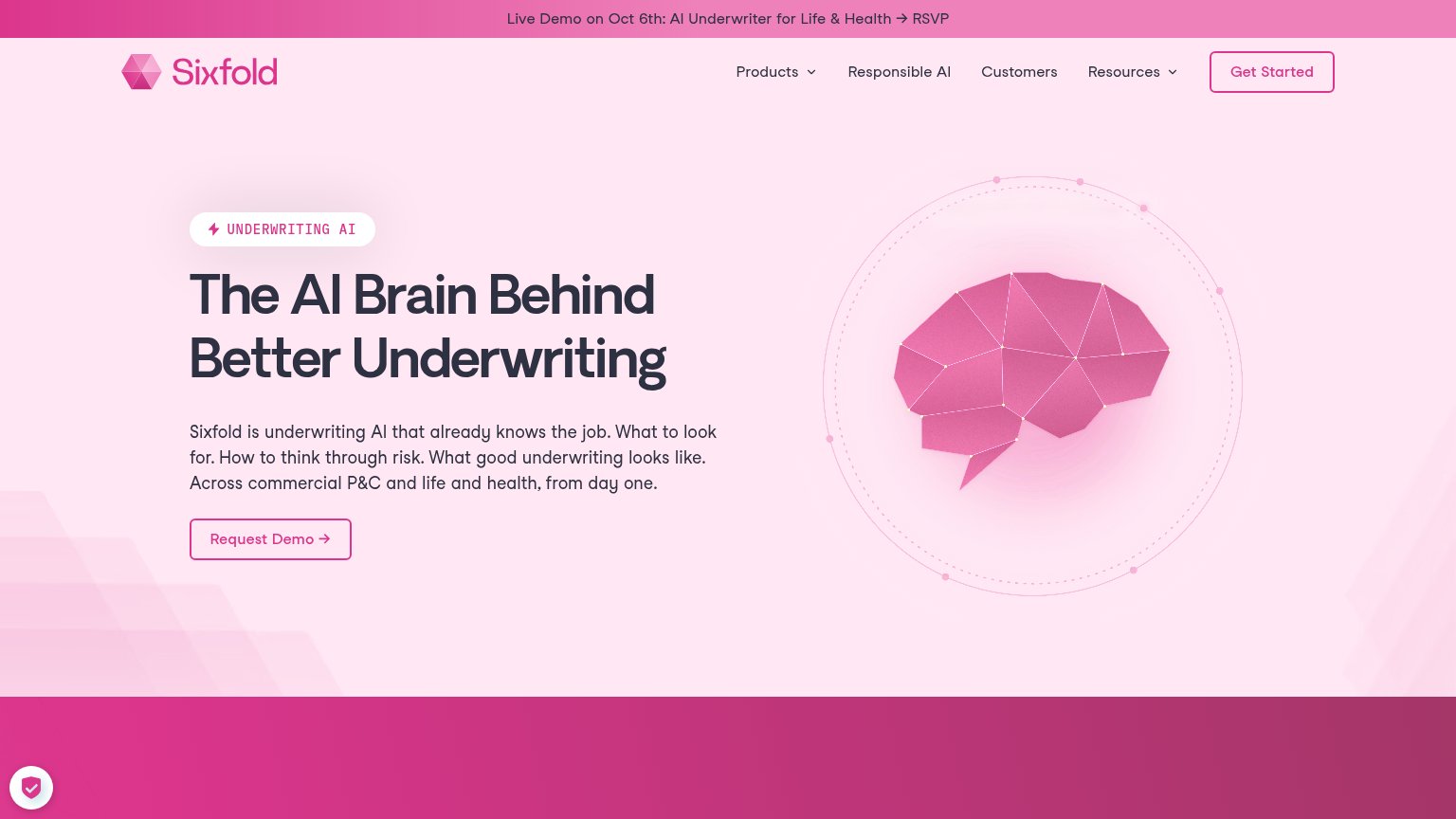
Problems
- 'Join' feels committal, not valuable
- no CTA in the hero itself
- small nav-corner footprint on desktop
- payoff of the click is unclear
Mobile web
62FairThe phone experience as a first-class citizen.
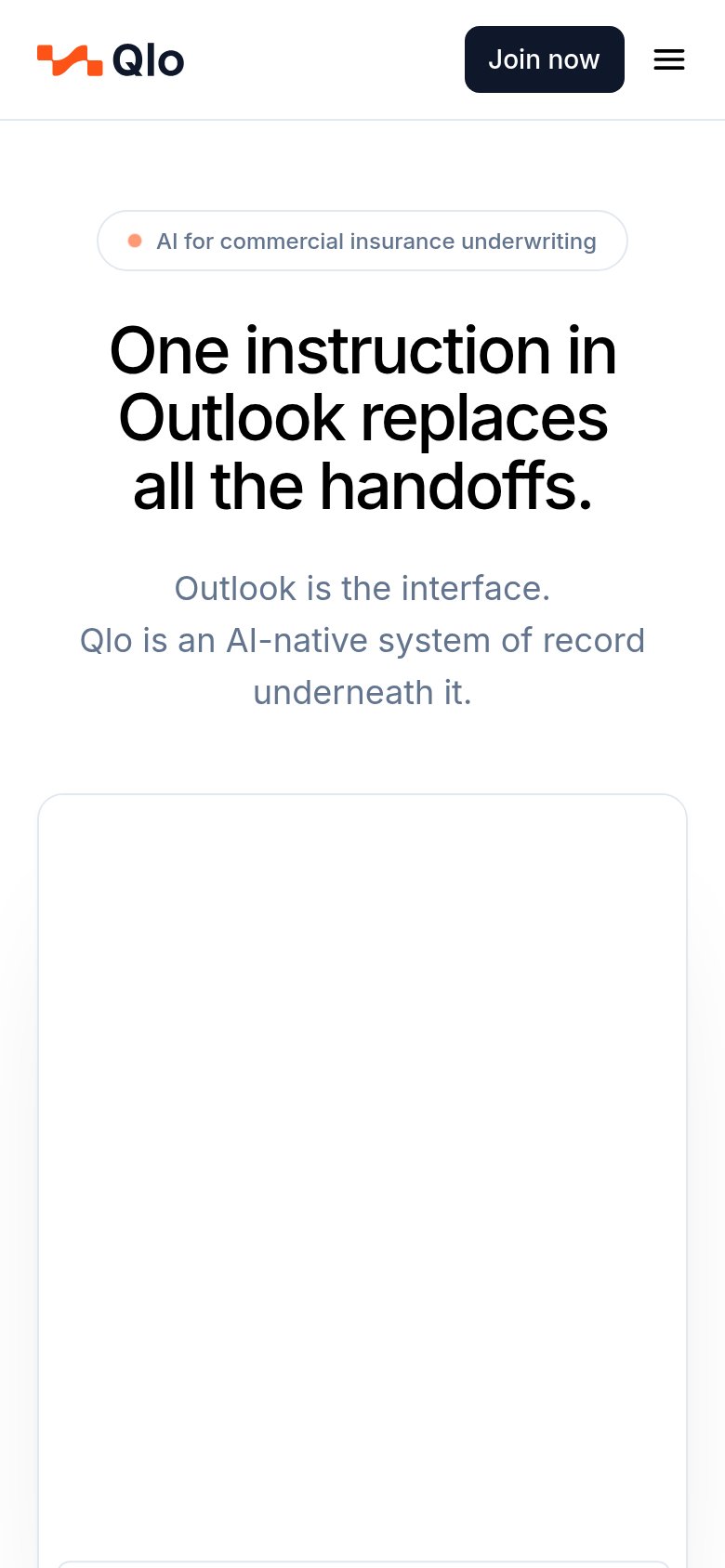
What works
What to improve
Information hierarchy
72FairDoes the design help or inhibit what the page is trying to say?
What works
What to improve
Value props
74FairTitle, subtitle, hero — do they sell the product's true value?
Qlo’s headline
One instruction in Outlook replaces all the handoffs.
Outlook is the interface. Qlo is an AI-native system of record underneath it.
Working
Could improve