
Your landing page’s weakest score is Information hierarchy.
How Croissant ranks
- 1.
Croissant78
- 2.
Phia76
- 3.
Encore71
- 4.
Gem69
- 5.
Retrofit63
- 6.
Faircado62
78Growth scoreupdated
category scores
category scoresShowHide
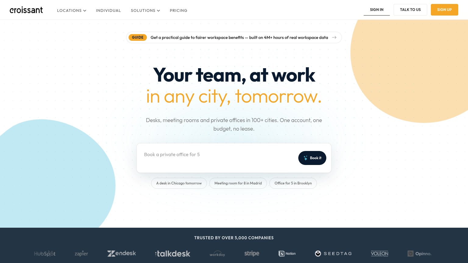
Information hierarchy
74FairDoes the design help or inhibit what the page is trying to say?
 123
- Guide announcement banner — The GUIDE pill sits directly above the headline and pulls the first click toward a content download instead of booking.
- Header CTA cluster — SIGN IN, TALK TO US, and SIGN UP compete at similar weight, splitting attention from the on-page Book it action.
- Example query chips — Three same-weight chips under the search bar dilute the single Book it action into four equal choices.
Trust
74FairProof that the product is real, competent, and safe to try.
| Trust read | |
|---|---|
| Croissant | "TRUSTED BY OVER 5,000 COMPANIES" logo band with HubSpot, Zapier, Zendesk, Stripe, Notion logos |
| No visible trust signal identified. | |
| Functional search bar with image-search icon and category filter chips (Vintage, Brand, Women's, Men's) | |
| Search Studio panel with 'Exact Grail / Under $250' toggles and composed query 'Find me some vintage Prada nylon shoulde | |
| Functional search bar "What are you shopping for?" with trending query chips (Y2K, Baggy Jeans, Boho Belts, Adidas Samba | |
| Press logo strip: The New York Times, TIME Best Inventions, Fortune, ELLE, Business Insider |
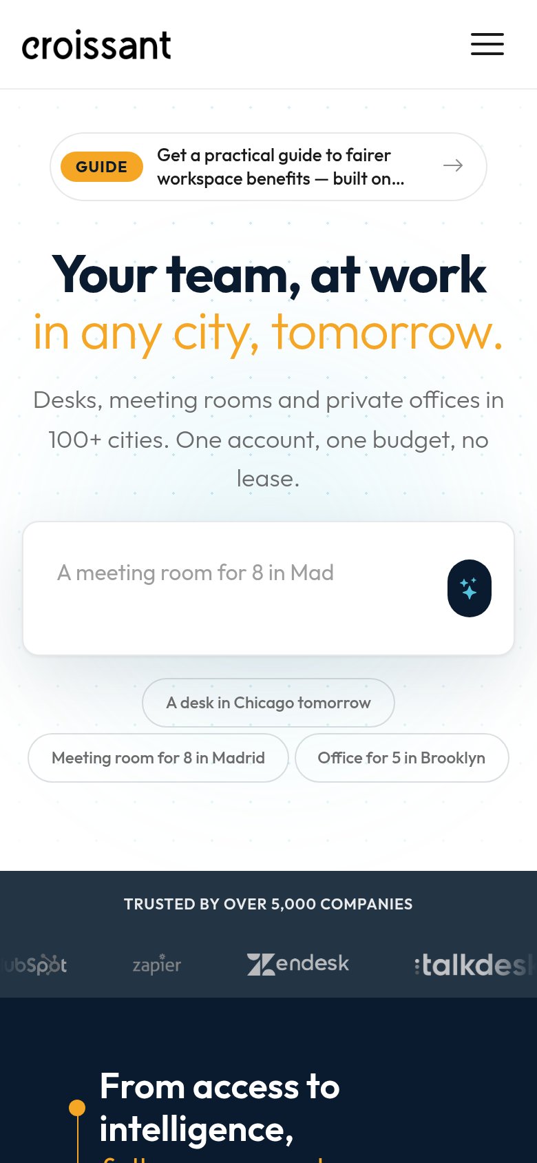
Mobile web
76FairThe phone experience as a first-class citizen.
What works
What to improve
CTA
78FairCopy, size, verb, cost-feel — does the primary CTA earn the click?
How Croissant compares
Recommended rewrites
Value props
88StrongTitle, subtitle, hero — do they sell the product's true value?
Croissant’s headline
Your team, at work in any city, tomorrow.
Desks, meeting rooms and private offices in 100+ cities. One account, one budget, no lease.
Working
Could improve