
Your landing page’s weakest score is Trust.
How Creatr ranks
Trust
62FairProof that the product is real, competent, and safe to try.
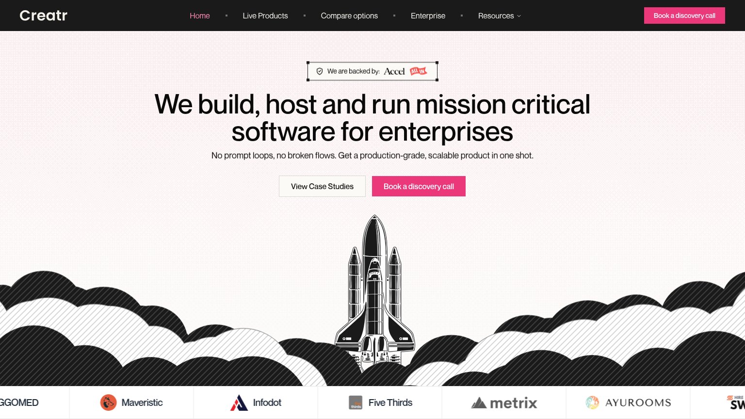
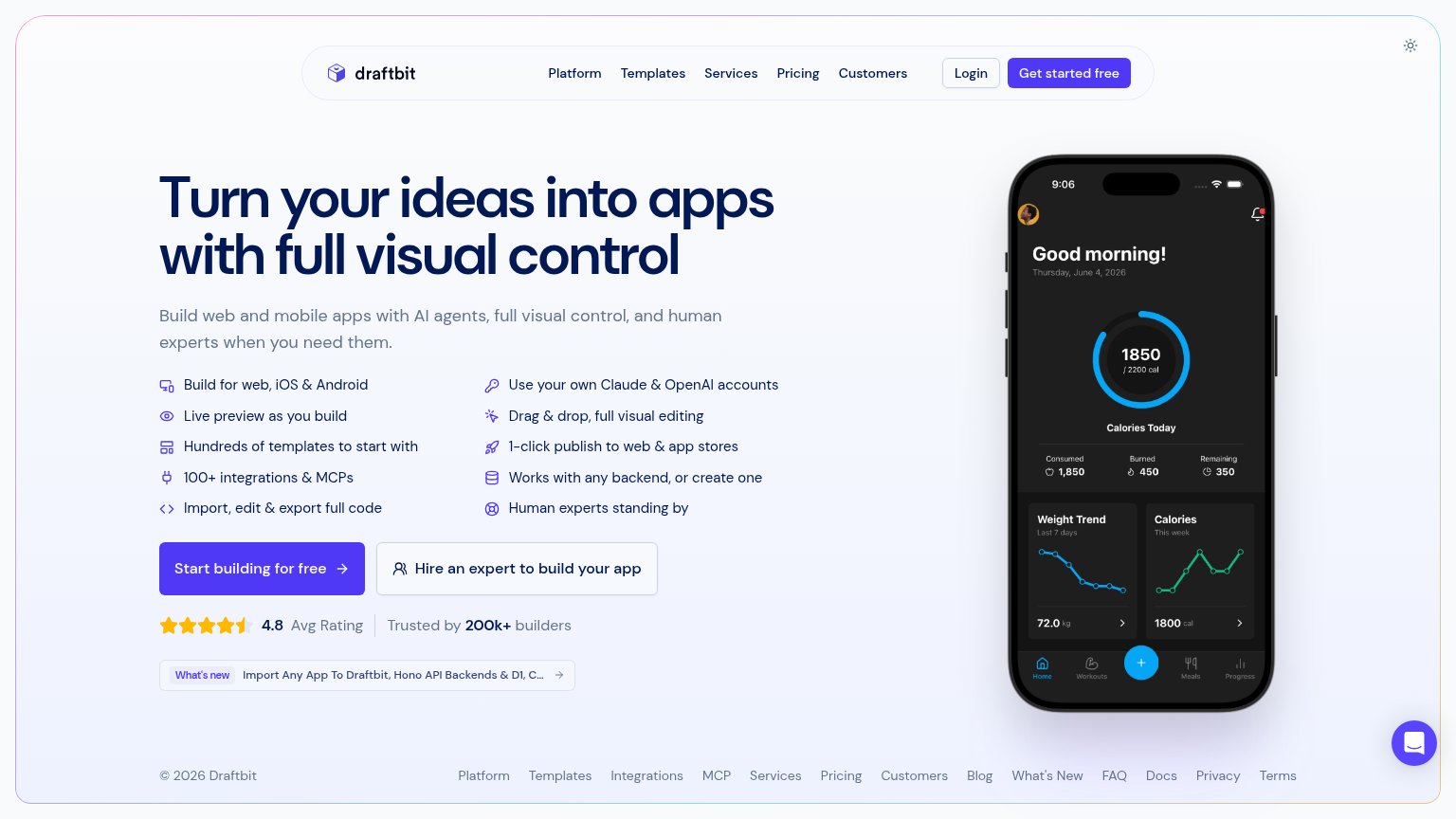
| Trust read | |
|---|---|
| Creatr | "We are backed by: Accel" investor badge above the headline |
| "Backed by Y Combinator" badge above the headline | |
| The interactive builder UI — "An app that..." prompt with Build/Model controls and iPhone/Android/Web platform toggles | |
| "Backed by Y Combinator" badge below the prompt box | |
| "4.8 Avg Rating · Trusted by 200k+ builders" beneath the primary CTA | |
| Functional AI prompt box with Figma and GitHub import options showing real product entry points |
Mobile web
62FairThe phone experience as a first-class citizen.
 123
- Paired bottom CTAs — Both CTAs sit two screens below the fold and split the row into half-width taps instead of one full-bleed button.
- Rocket illustration — Oversized artwork consumes most of the fold and pushes every actionable element off-screen.
- Cropped logo strip — Partner logo "GOMED" is cut off mid-word, signaling an unchecked mobile carousel.
CTA
64FairCopy, size, verb, cost-feel — does the primary CTA earn the click?
How Creatr compares
Recommended rewrites
Value props
72FairTitle, subtitle, hero — do they sell the product's true value?
Creatr’s headline
We build, host and run mission critical software for enterprises
No prompt loops, no broken flows. Get a production-grade, scalable product in one shot.
Working
Could improve
Information hierarchy
78FairDoes the design help or inhibit what the page is trying to say?
What works
What to improve