
Your landing page’s weakest score is Mobile web.
How Draftbit ranks
70Growth scoreupdated
category scores
category scoresShowHide
Mobile web
58FairThe phone experience as a first-class citizen.
 123
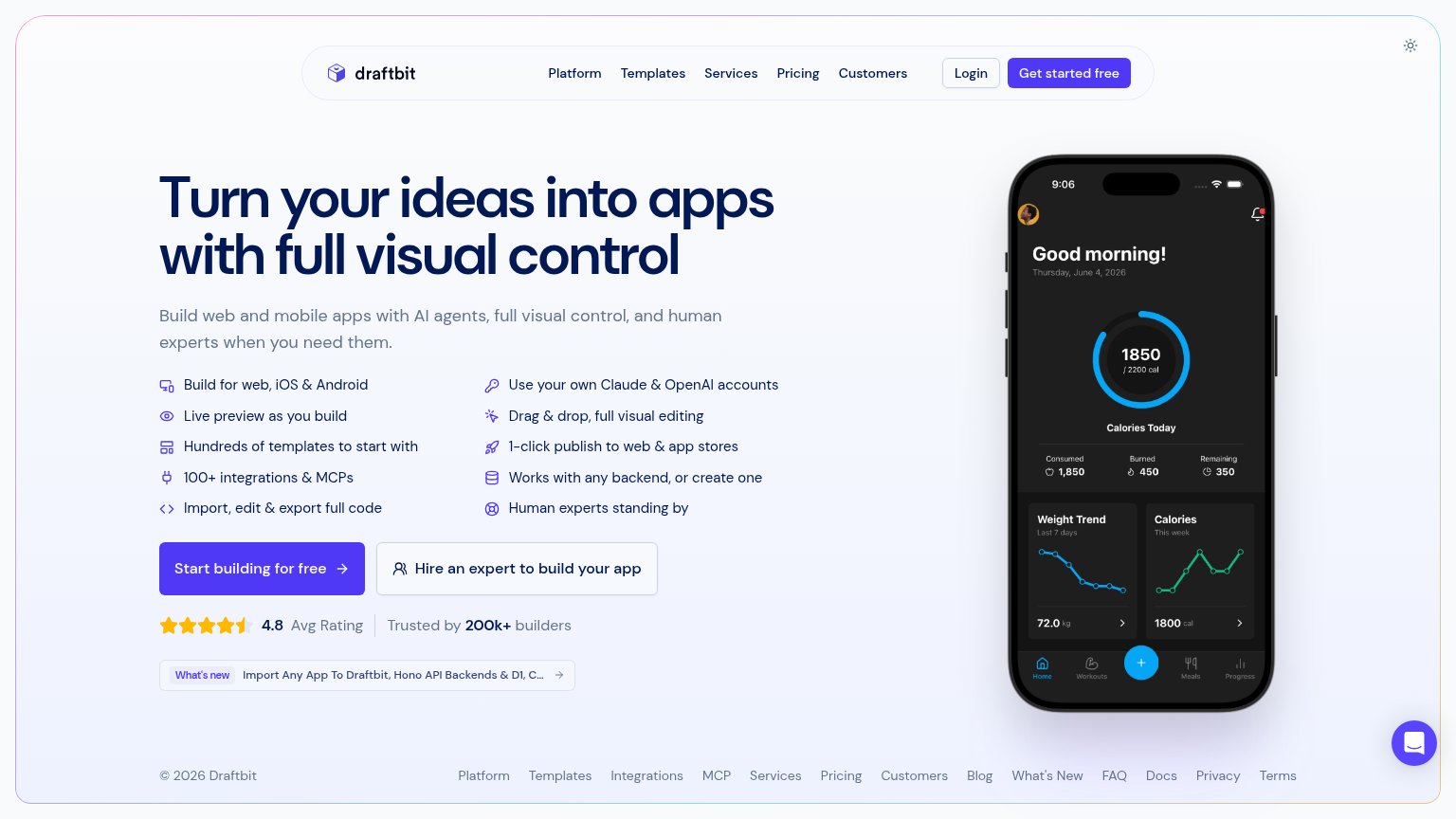
- Ten-item feature checklist — Desktop-length list stacked full-height on mobile pushes the primary CTA two screens down.
- Start building CTA — The full-width primary button sits far below the first viewport, invisible on landing.
- Chat bubble overlap — The Intercom bubble covers the right edge of the 'Hire an expert' secondary CTA.
Information hierarchy
64FairDoes the design help or inhibit what the page is trying to say?
 1234
- Footer link row — Twelve footer links creep into the fold, adding a dense exit strip directly under the CTAs.
- Ten-item feature list — Ten same-weight bullets between subhead and CTA force a scan-and-parse step before the action.
- Hire an expert button — Secondary CTA sits at nearly equal size beside the primary, splitting the click decision.
- Nav with dual CTAs — Five nav links plus Login and Get started free duplicate the hero CTA and add exits.
Trust
68FairProof that the product is real, competent, and safe to try.
How Draftbit compares
Trust read
Value props
78FairTitle, subtitle, hero — do they sell the product's true value?
Draftbit’s headline
Turn your ideas into apps with full visual control
Build web and mobile apps with AI agents, full visual control, and human experts when you need them.
Working
Could improve
CTA
82StrongCopy, size, verb, cost-feel — does the primary CTA earn the click?
How Draftbit compares
Recommended rewrites