
Your landing page’s weakest score is Trust.
How Fastshot ranks
Trust
58FairProof that the product is real, competent, and safe to try.
| Trust read | |
|---|---|
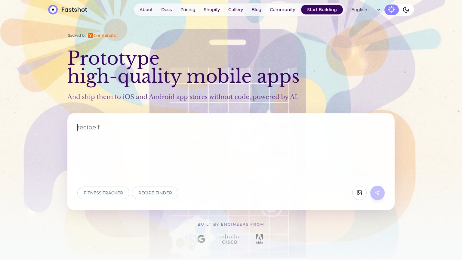
| Fastshot | "Backed by Y Combinator" badge above the headline |
| The interactive builder UI — "An app that..." prompt with Build/Model controls and iPhone/Android/Web platform toggles | |
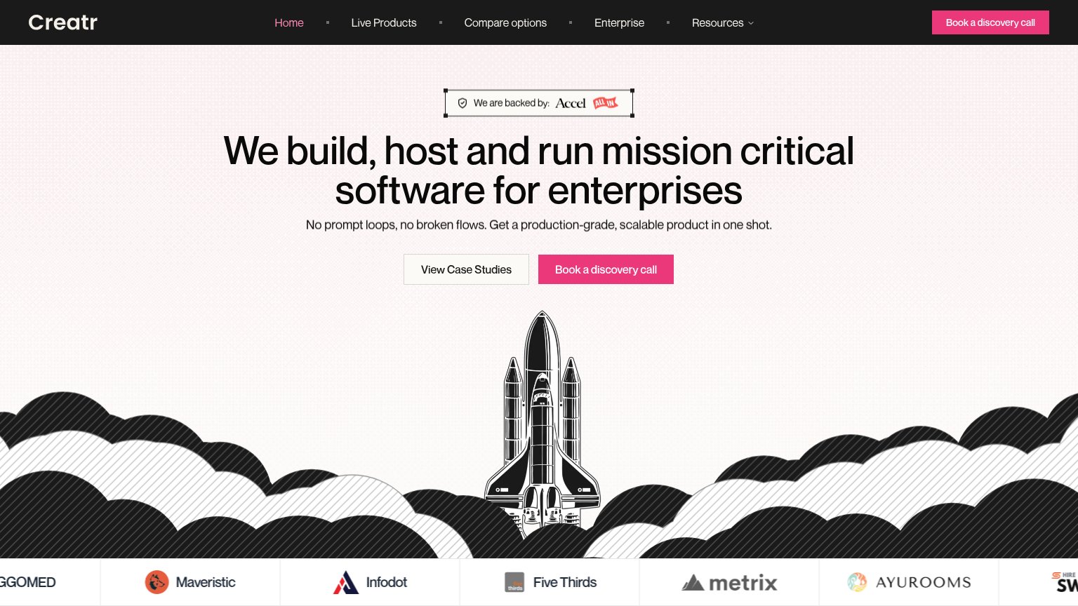
| "We are backed by: Accel" investor badge above the headline | |
| "Backed by Y Combinator" badge below the prompt box | |
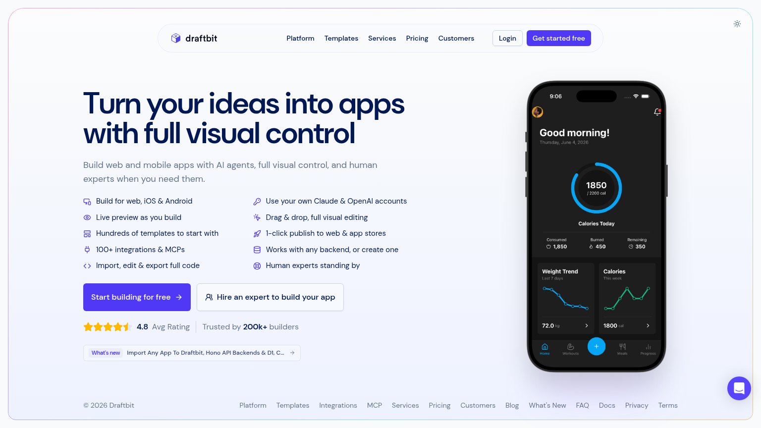
| "4.8 Avg Rating · Trusted by 200k+ builders" beneath the primary CTA | |
| Functional AI prompt box with Figma and GitHub import options showing real product entry points |
Mobile web
62FairThe phone experience as a first-class citizen.
 123
- Truncated headline text — The headline reads only "high-quality mobile apps" — the word "Prototype" from the desktop headline is cut off, leaving a sentence fragment as the value statement.
- Serif headline oversized — The serif headline scales down poorly, wrapping into two very large lines that push the prompt box toward the bottom of the viewport.
- Small circular submit button — The primary action is a small desktop-proportioned icon circle instead of a full-width labeled button, and its faint lilac fill reads as disabled.
Information hierarchy
64FairDoes the design help or inhibit what the page is trying to say?
What works
What to improve
Value props
72FairTitle, subtitle, hero — do they sell the product's true value?
Fastshot’s headline
Prototype high-quality mobile apps
And ship them to iOS and Android app stores without code, powered by AI.
Working
Could improve
CTA
76FairCopy, size, verb, cost-feel — does the primary CTA earn the click?
How Fastshot compares
Recommended rewrites