
Your landing page’s weakest score is Information hierarchy.
How F2 ranks
73Growth scoreupdated
category scores
category scoresShowHide
Information hierarchy
68FairDoes the design help or inhibit what the page is trying to say?
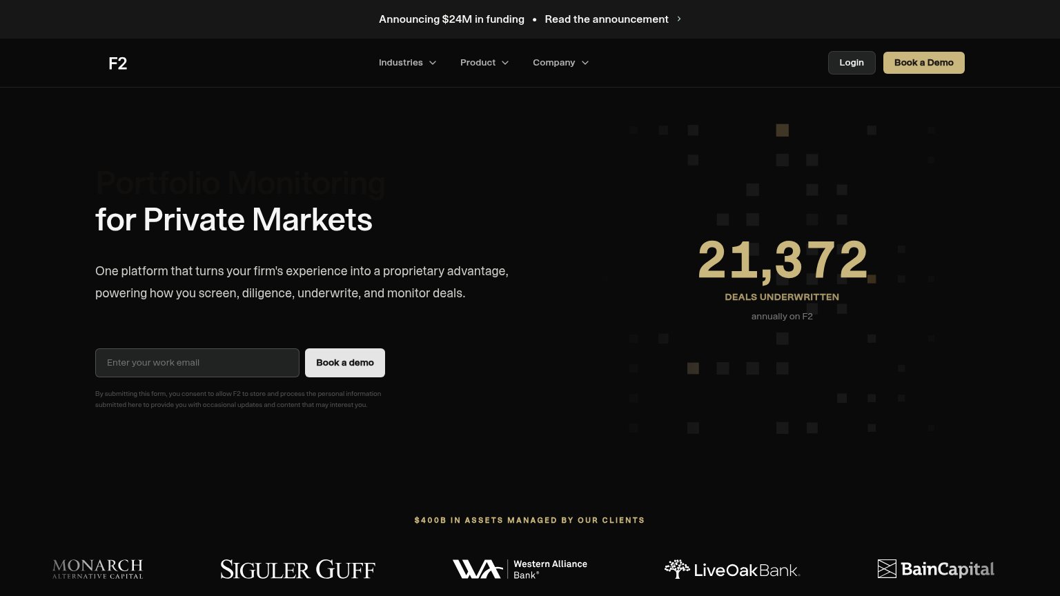 1234
- Faded headline first line — "Portfolio Monitoring" is rendered so low-contrast it reads as missing, breaking the headline mid-thought.
- Book a demo button — Off-white on black at form-field size is quieter than the gold nav CTA, splitting weight between two demo buttons.
- Funding announcement banner — Top-of-page exit link competes for the first glance before the value prop or CTA.
- 21,372 deals stat — The gold stat is the brightest element on the fold, outranking the headline and CTA in the scan path.
CTA
68FairCopy, size, verb, cost-feel — does the primary CTA earn the click?
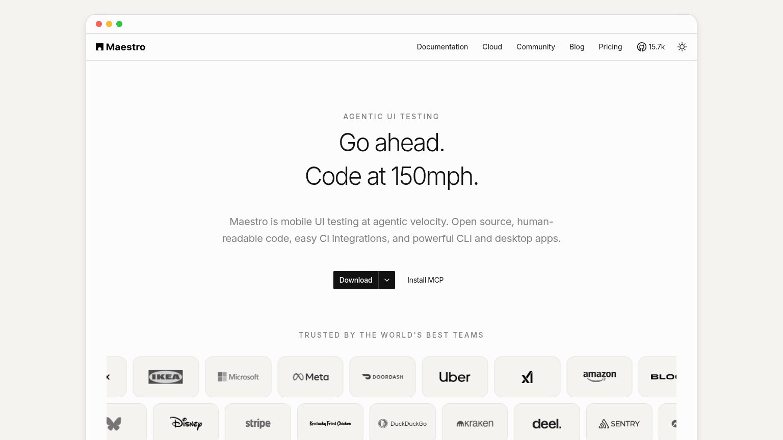
Problems
- demo booking feels costly
- small, low-contrast on desktop
- consent legalese under button
- casing varies: 'Demo' vs 'demo'
Value props
72FairTitle, subtitle, hero — do they sell the product's true value?
F2’s headline
Portfolio Monitoring for Private Markets
One platform that turns your firm's experience into a proprietary advantage, powering how you screen, diligence, underwrite, and monitor deals.
Working
Could improve
Trust
78FairProof that the product is real, competent, and safe to try.
How F2 compares
Trust read
Mobile web
78FairThe phone experience as a first-class citizen.
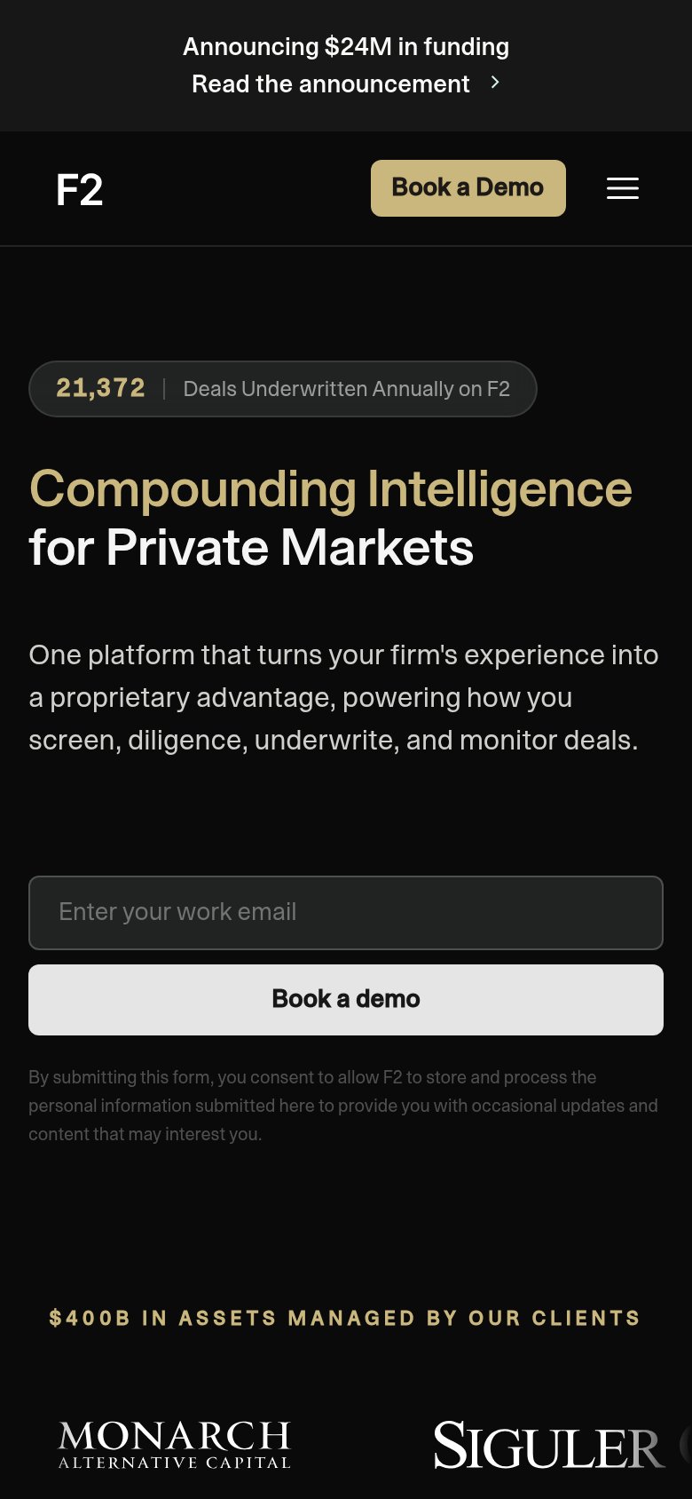
What works
What to improve