
Your landing page’s weakest score is Information hierarchy.
How Ex Libris (Alma) ranks
46Growth scoreupdated
category scores
category scoresShowHide
Information hierarchy
38PoorDoes the design help or inhibit what the page is trying to say?
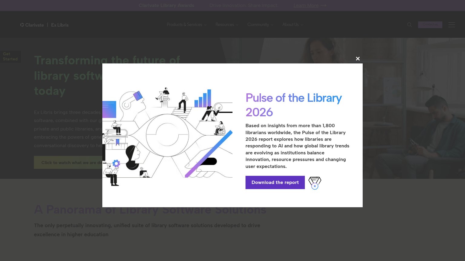 1234
- Report interstitial modal — Covers the headline, paragraph, and hero CTA on load, replacing the page's message with a PDF offer.
- Obscured hero CTA — "Click to watch what we are doing" is half-hidden behind the modal and reads as a low-contrast text link, not a button.
- Awards banner Learn More — Underlined exit link at the very top pulls attention away before the value prop is even readable.
- Truncated hero headline — "Transforming the future of library softw…" is cut off by the overlay, so the value prop never lands.
Value props
42PoorTitle, subtitle, hero — do they sell the product's true value?
Ex Libris (Alma)’s headline vague
Transforming the future of library software today
Ex Libris brings three decades of ... software, combined with our g... private and public libraries, and ... embracing the powers of gene... conversational discovery to he...
Working
- Names the category: library software
- Subhead cites three decades of experience
- Mentions AI and conversational discovery
Could improve
- H1 is an abstraction with no outcome
- Popup buries the hero on both viewports
- No numbers or proof for Alma itself
Trust
44PoorProof that the product is real, competent, and safe to try.
How Ex Libris (Alma) compares
Trust read
Mobile web
48PoorThe phone experience as a first-class citizen.

What works
What to improve
CTA
58FairCopy, size, verb, cost-feel — does the primary CTA earn the click?
How Ex Libris (Alma) compares
Recommended rewrites