
Your landing page’s weakest score is Trust.
How Clarius ranks
Trust
54FairProof that the product is real, competent, and safe to try.
| Trust read | |
|---|---|
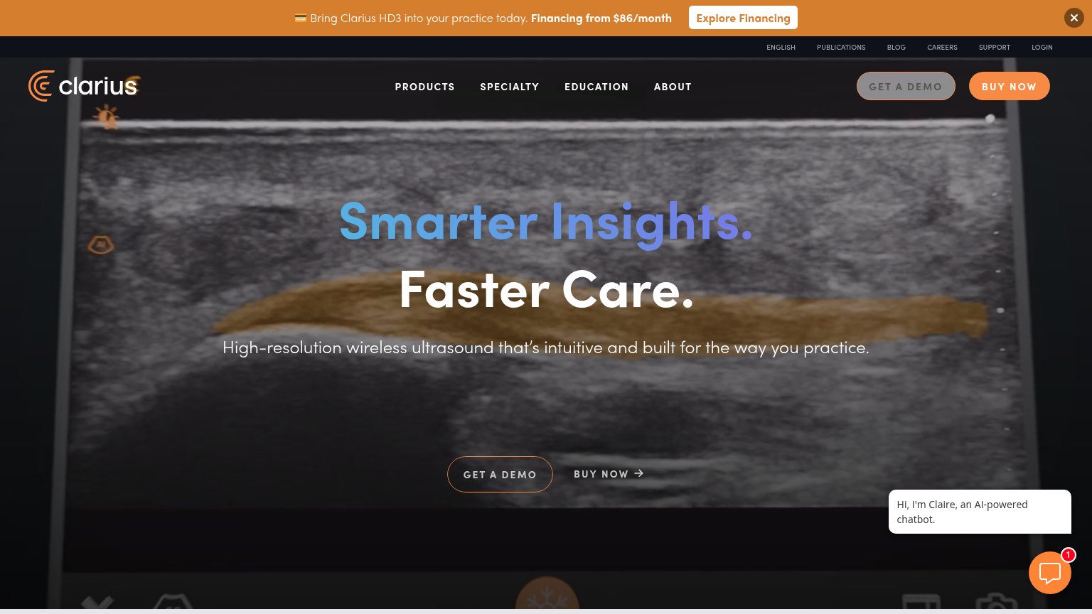
| Clarius | Hero background showing a real ultrasound scan with live imaging UI (freeze control, timeline scrubber, measurement over |
| No visible trust signal identified. | |
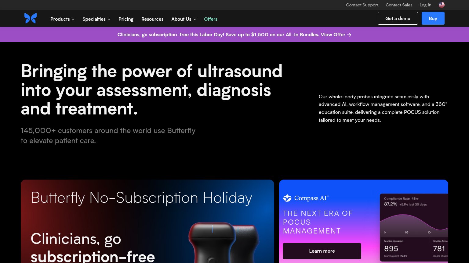
| "145,000+ customers around the world use Butterfly to elevate patient care." | |
| No visible trust signal identified. | |
| No visible trust signal identified. | |
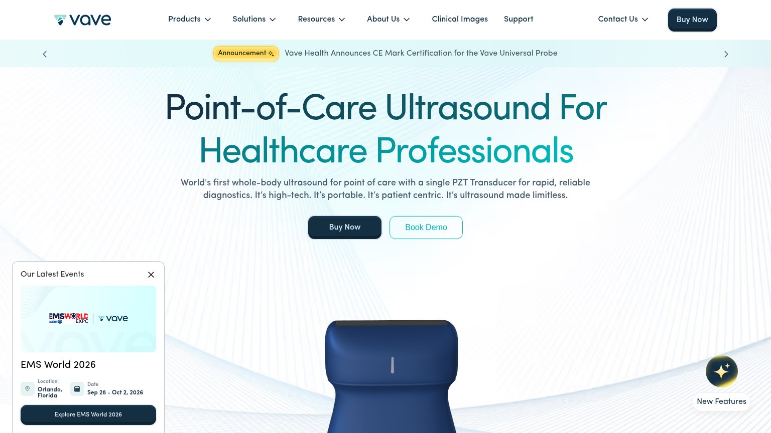
| "Vave Health Announces CE Mark Certification for the Vave Universal Probe" announcement banner |
Mobile web
58FairThe phone experience as a first-class citizen.
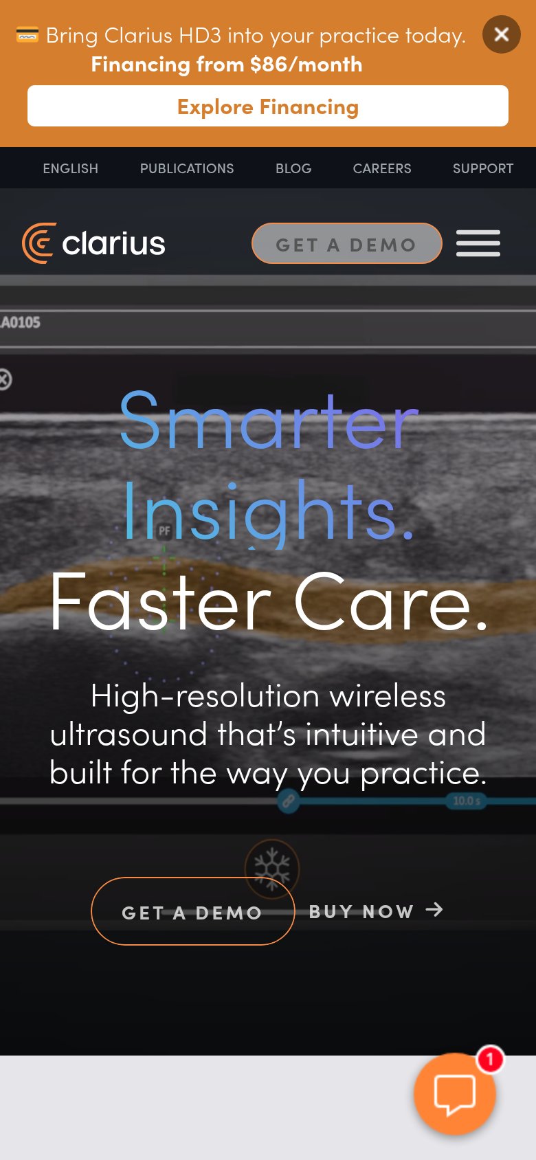
1234- Promo banner stack — Three-row orange banner with its own Explore Financing CTA eats the top of the fold and competes with the demo CTA.
- Utility link row — Full desktop link row (ENGLISH/PUBLICATIONS/BLOG/CAREERS/SUPPORT) survives on mobile instead of collapsing into the hamburger.
- Hero CTA pair — GET A DEMO is a small desktop-proportioned outline button crowded against a low-contrast BUY NOW text link, not a full-bleed tap target.
- Oversized hero headline — Headline barely scales down, wrapping into three huge lines that push the subhead and CTAs deep into the viewport.
Information hierarchy
68FairDoes the design help or inhibit what the page is trying to say?
What works
What to improve
CTA
68FairCopy, size, verb, cost-feel — does the primary CTA earn the click?
How Clarius compares
Recommended rewrites
Value props
72FairTitle, subtitle, hero — do they sell the product's true value?
Clarius’s headline
Smarter Insights. Faster Care.
High-resolution wireless ultrasound that's intuitive and built for the way you practice.
Working
Could improve