
Your landing page’s weakest score is CTA.
How Butterfly Network ranks
- 1.
Butterfly Network64
- 2.
Exo64
- 3.
Clarius64
- 4.
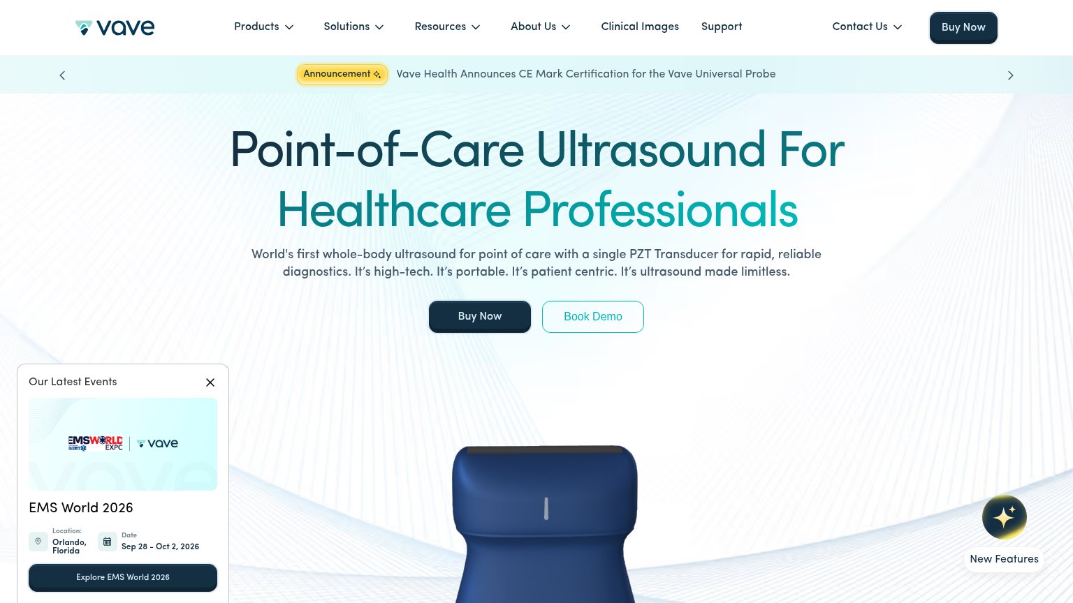
Vave Health63
- 5.
EchoNous62
- 6.
Lumius57
64Growth scoreupdated
category scores
category scoresShowHide
CTA
58FairCopy, size, verb, cost-feel — does the primary CTA earn the click?
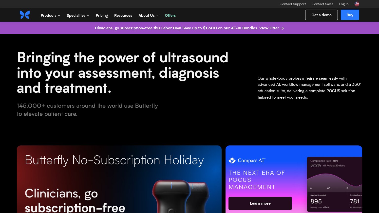
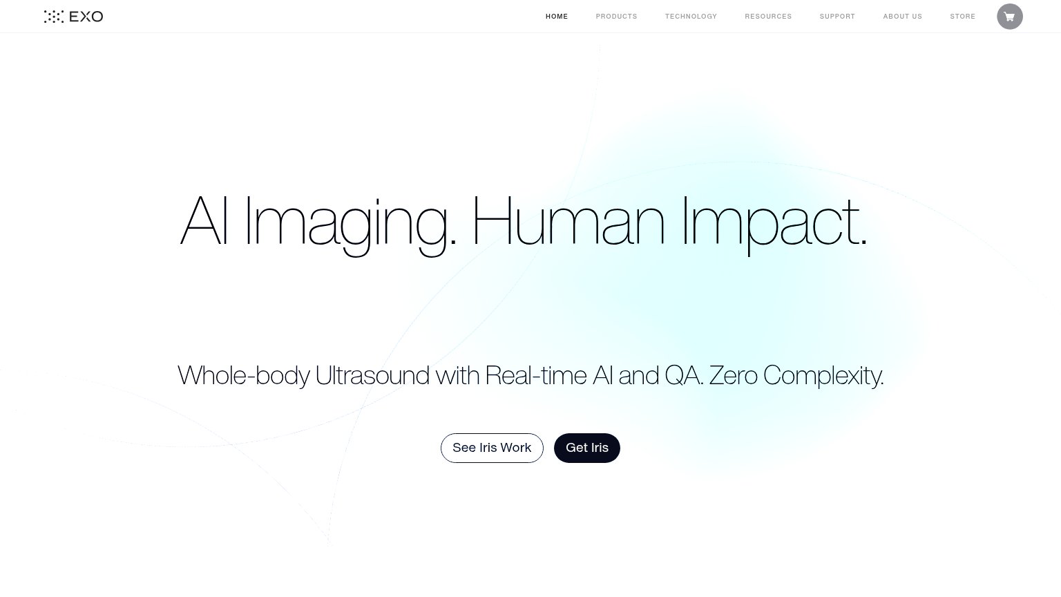
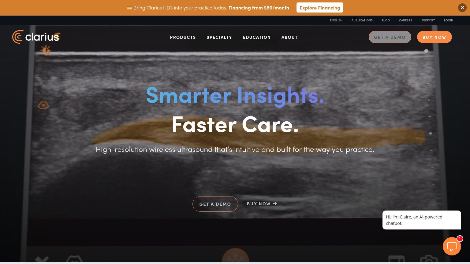
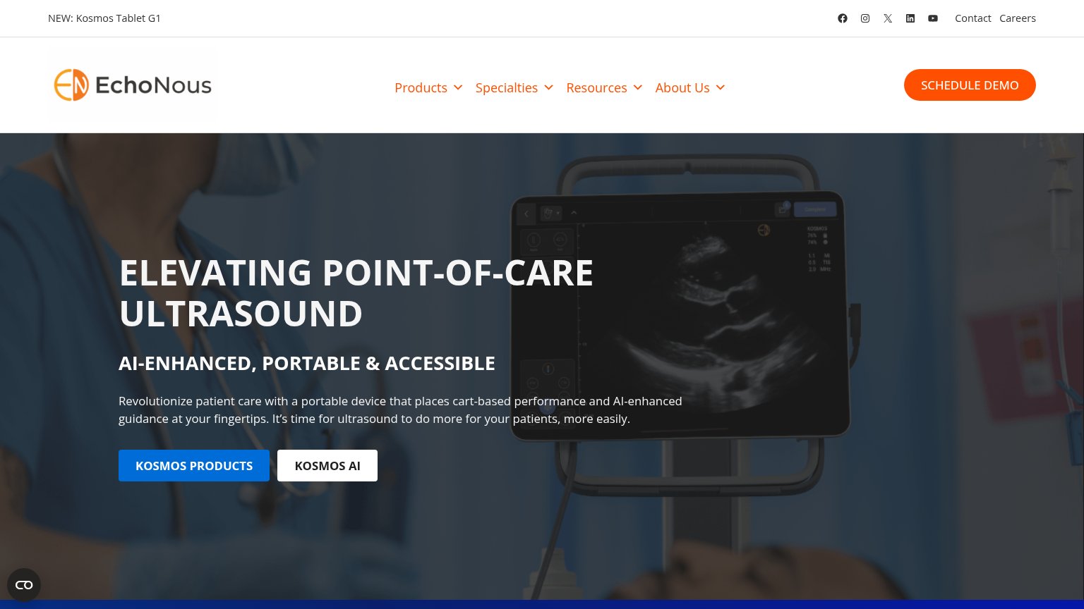
Problems
- 'Buy' makes click feel costly
- no CTA in the hero itself
- four competing labels on fold
- small nav-sized footprint
Information hierarchy
62FairDoes the design help or inhibit what the page is trying to say?
1234- Hero headline block — No CTA anywhere in the hero scan path; the visitor reads the promise with nothing to click.
- Buy and demo buttons — Primary action is tucked into the nav corner at near-equal weight with 'Get a demo', splitting the click.
- Purple offer banner — Repeats the same Labor Day message as the promo card below, adding a third competing exit above the fold.
- Compass AI card — A second same-weight promo panel with its own 'Learn more' pulls attention away from the hero argument.
Trust
62FairProof that the product is real, competent, and safe to try.
How Butterfly Network compares
Trust read
Mobile web
68FairThe phone experience as a first-class citizen.

What works
What to improve
Value props
72FairTitle, subtitle, hero — do they sell the product's true value?
Butterfly Network’s headline
Bringing the power of ultrasound into your assessment, diagnosis and treatment.
145,000+ customers around the world use Butterfly to elevate patient care.
Working
Could improve