
Your landing page’s weakest score is Trust.
How Clarify ranks
78Growth scoreupdated
category scores
category scoresShowHide
Trust
62FairProof that the product is real, competent, and safe to try.
| Trust read | |
|---|---|
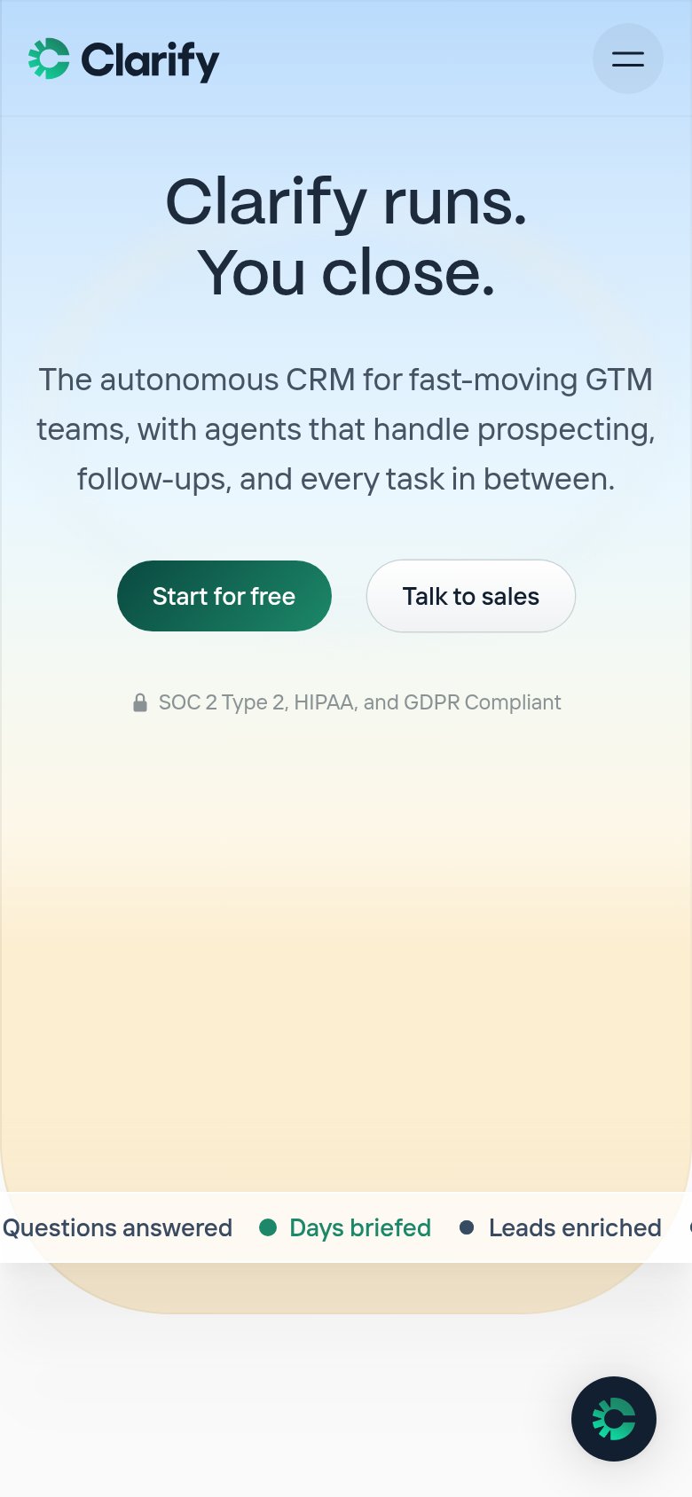
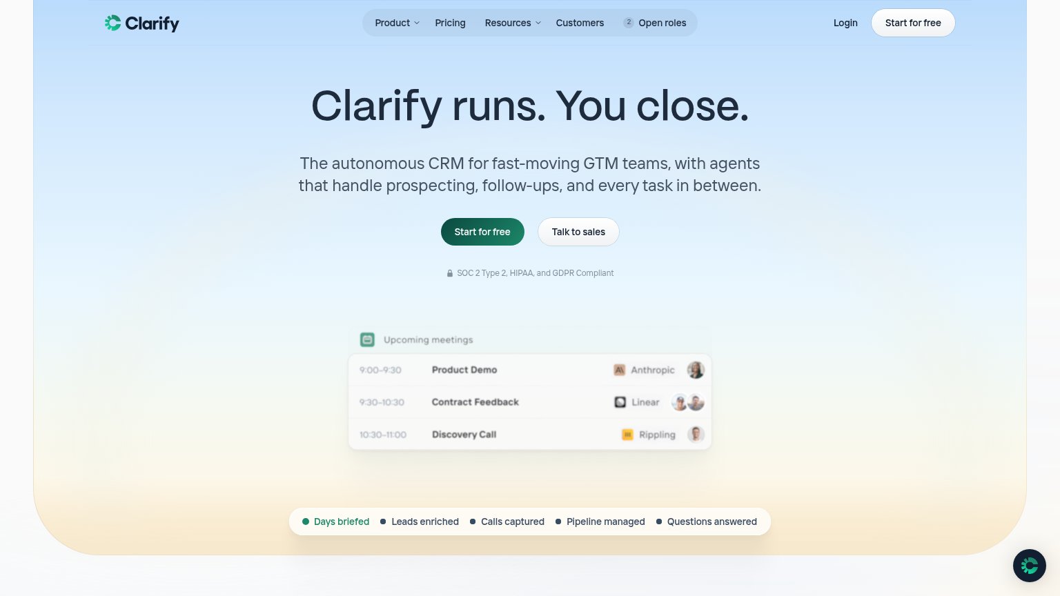
| Clarify | "SOC 2 Type 2, HIPAA, and GDPR Compliant" line with lock icon under the CTAs |
| No visible trust signal identified. | |
| Sales pipeline product UI with named contacts, deal stages, and dollar values ($30K, $45K) | |
| Integration diagram naming Slack, Gong, Gmail, API, and Snowflake feeding the Day AI /company-brain | |
| Real CRM product UI showing a People table (1,272 contacts) with deal tags and feature tabs | |
| GitHub star count "57.3K" in the desktop navigation |
Value props
78FairTitle, subtitle, hero — do they sell the product's true value?
Clarify’s headline sells
Clarify runs. You close.
The autonomous CRM for fast-moving GTM teams, with agents that handle prospecting, follow-ups, and every task in between.
Working
- Headline names the real trade: agents work, reps close
- Subhead lists concrete tasks: prospecting, follow-ups
- Hero shows agents working; logos add credibility
Could improve
- No numbers quantify the time or pipeline gain
- 'Every task in between' is a vague catch-all
- Mobile fold loses the product demo entirely
Mobile web
78FairThe phone experience as a first-class citizen.
What works
What to improve
Information hierarchy
84StrongDoes the design help or inhibit what the page is trying to say?
What works
What to improve
CTA
86StrongCopy, size, verb, cost-feel — does the primary CTA earn the click?
How Clarify compares
Recommended rewrites