
Your landing page’s weakest score is Mobile web.
How BillShark ranks
Mobile web
42PoorThe phone experience as a first-class citizen.
 12
- Deny button off-screen — The consent stack ('Allow all', 'Allow selection', 'Deny') runs to the viewport edge, forcing a scroll just to dismiss the wall.
- Oversized hero headline — 'HUNDRED$' plus two headline lines consume the whole visible hero, pushing the savings-estimate form and any CTA far below the fold.
Trust
52FairProof that the product is real, competent, and safe to try.
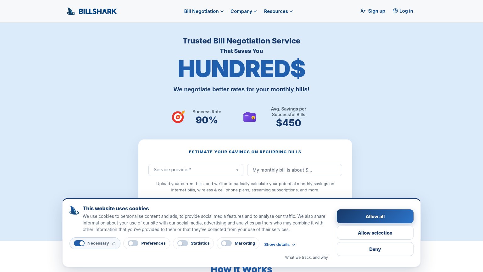
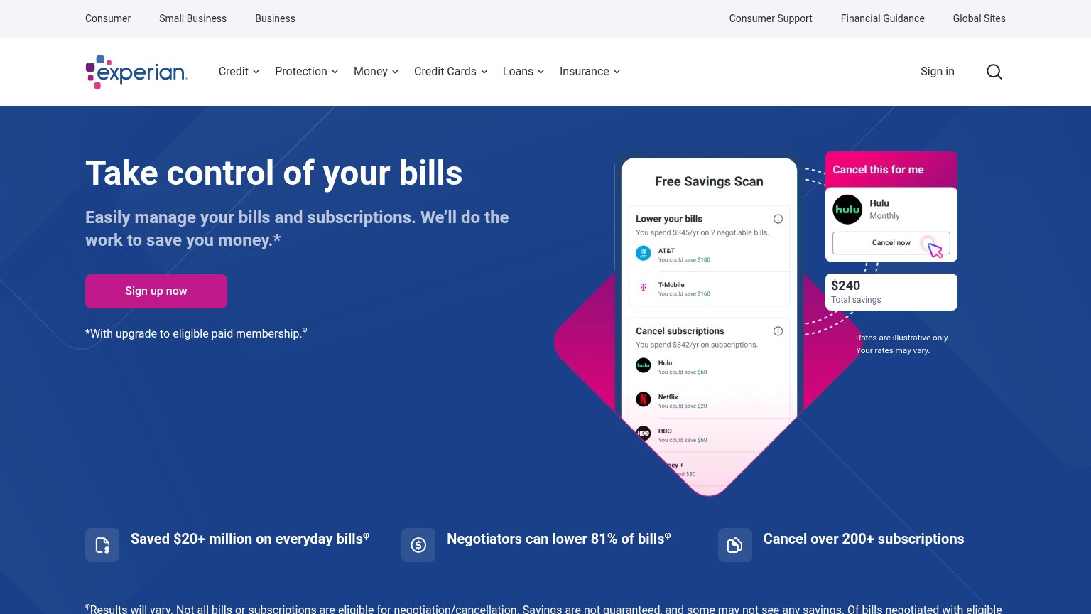
| Trust read | |
|---|---|
| BillShark | "Success Rate 90%" and "Avg. Savings per Successful Bills $450" stat callouts |
| No visible trust signal identified. | |
| Detailed in-app screenshot showing 'Current spend this month $3,298' and 'Payday in 8 days' | |
| "Saved $20+ million on everyday bills" stat strip | |
| implicit context Experian BillFixer may benefit from pre-existing familiarity among its target audience. |
Information hierarchy
58FairDoes the design help or inhibit what the page is trying to say?
What works
What to improve
CTA
62FairCopy, size, verb, cost-feel — does the primary CTA earn the click?
How BillShark compares
Recommended rewrites
Value props
78FairTitle, subtitle, hero — do they sell the product's true value?
BillShark’s headline
Trusted Bill Negotiation Service That Saves You HUNDRED$
We negotiate better rates for your monthly bills!
Working
Could improve