
Your landing page’s weakest score is Information hierarchy.
How Billy (formerly BillFixers) ranks
70Growth scoreupdated
category scores
category scoresShowHide
Information hierarchy
64FairDoes the design help or inhibit what the page is trying to say?
 1234
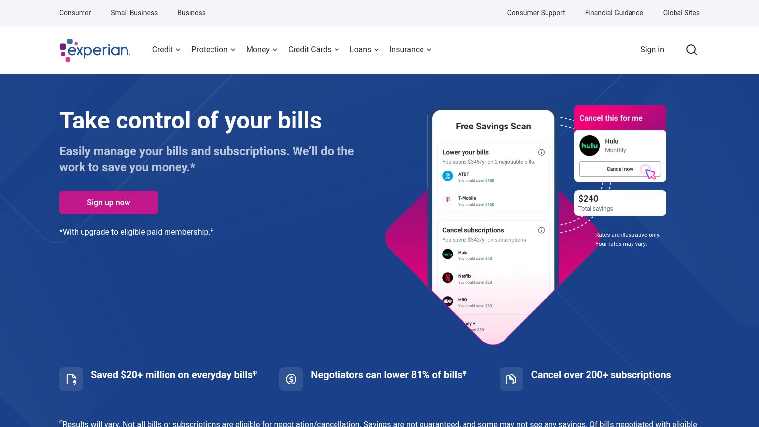
- Dual navigation rows — Two stacked nav bars with 12+ links plus search and sign-in siphon attention before the pink CTA can register.
- Sign up now button — Small footprint relative to the hero and outweighed by the larger, brighter product mockup to its right.
- Disclaimer under CTA — "*With upgrade to eligible paid membership" sits directly below the CTA, undercutting the action at the decision moment.
- Mockup micro-text — Savings-scan card packs tiny line items (AT&T, T-Mobile, Hulu, Netflix, HBO) that are illegible at hero scale and add density without communicating.
CTA
66FairCopy, size, verb, cost-feel — does the primary CTA earn the click?
Problems
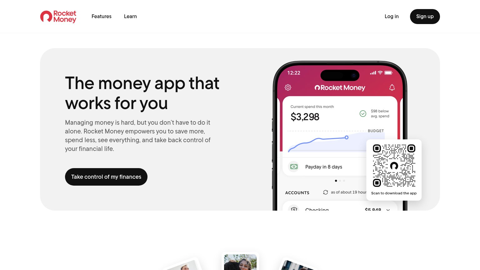
- no 'free' despite Free Savings Scan
- 'Sign up' sells work, not payoff
- paid-upgrade asterisk adds cost-feel
Trust
68FairProof that the product is real, competent, and safe to try.
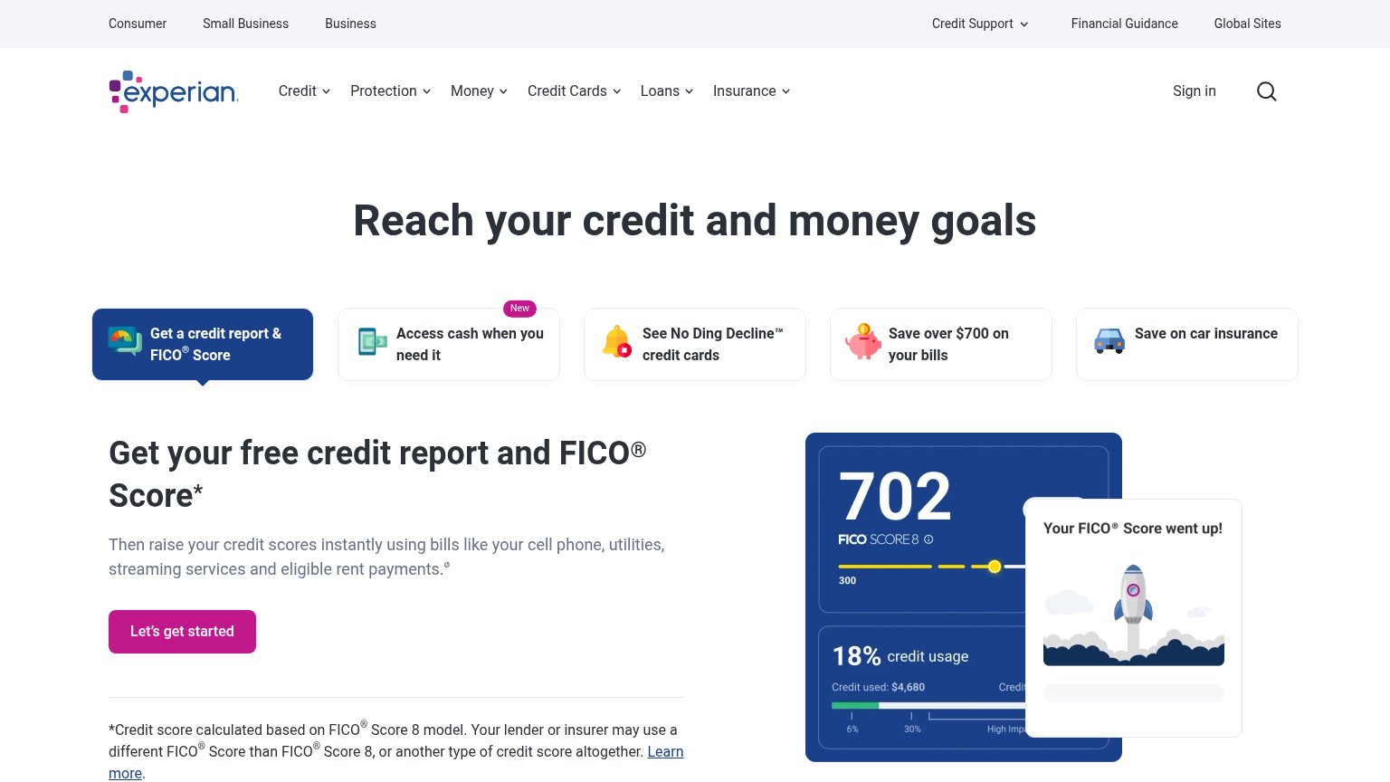
How Billy (formerly BillFixers) compares
Trust read
Mobile web
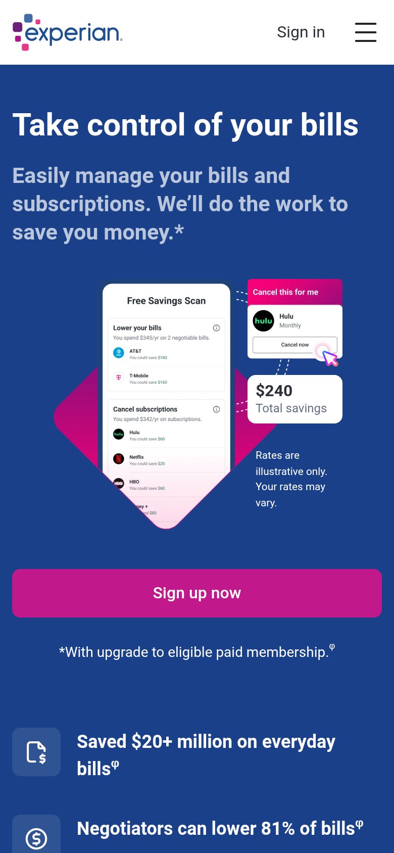
72FairThe phone experience as a first-class citizen.
What works
What to improve
Value props
78FairTitle, subtitle, hero — do they sell the product's true value?
Billy (formerly BillFixers)’s headline
Take control of your bills
Easily manage your bills and subscriptions. We’ll do the work to save you money.*
Working
Could improve