
Your landing page’s weakest score is CTA.
How Arrive Logistics ranks
64Growth scoreupdated
category scores
category scoresShowHide
CTA
55FairCopy, size, verb, cost-feel — does the primary CTA earn the click?

Problems
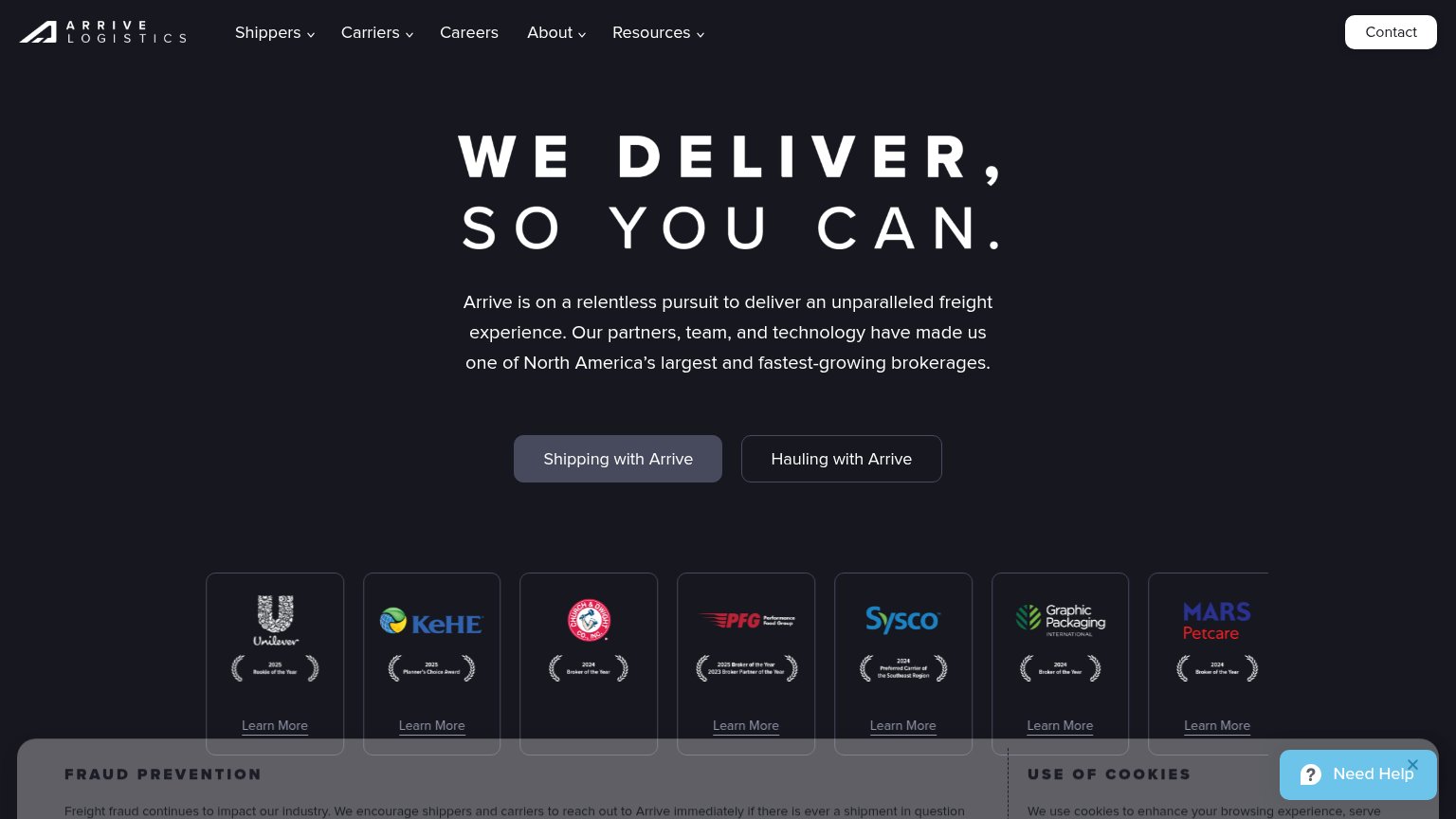
- no action verb — reads as a label
- no payoff named, just brand name
- no echo of headline promise
Information hierarchy
58FairDoes the design help or inhibit what the page is trying to say?
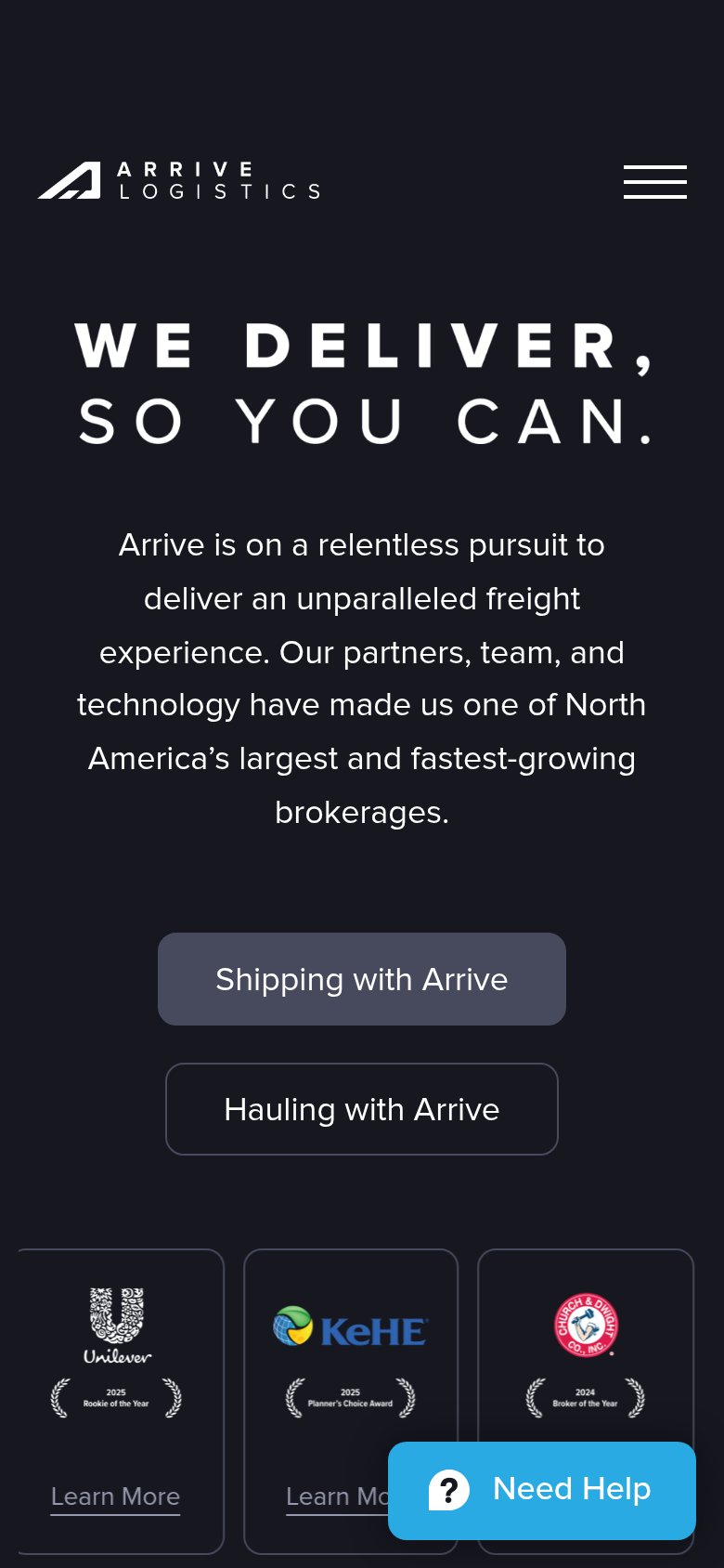
1234- Cookie and fraud banners — Two stacked legal notices creep into the fold and bury the awards row under text walls.
- Dual segment buttons — "Shipping with Arrive" and "Hauling with Arrive" sit at near-equal weight in muted greys, so neither reads as the primary action within a second.
- Awards logo carousel — Seven equal-weight cards each with a "Learn More" exit link scatter attention right below the CTAs.
- Contact button styling — The white "Contact" pill in the nav is the highest-contrast button on the page, outranking both hero CTAs.
Value props
62FairTitle, subtitle, hero — do they sell the product's true value?
Arrive Logistics’s headline
WE DELIVER, SO YOU CAN.
Arrive is on a relentless pursuit to deliver an unparalleled freight experience. Our partners, team, and technology have made us one of North America’s largest and fastest-growing brokerages.
Working
Could improve
Mobile web
72FairThe phone experience as a first-class citizen.
What works
What to improve
Trust
74FairProof that the product is real, competent, and safe to try.
How Arrive Logistics compares
Trust read