
Your landing page’s weakest score is Value props.
How Akur8 ranks
74Growth scoreupdated
category scores
category scoresShowHide
Value props
66FairTitle, subtitle, hero — do they sell the product's true value?
Akur8’s headline undersells
The Global Actuarial AI Platform
Unlock your full potential with AI-first, end-to-end actuarial solutions, built for trust and transparency
Working
- Headline names audience and category clearly
- 350+ insurers proof point with real logos
- "Trust and transparency" hits actuarial anxiety
Could improve
- Subhead is an abstraction stack, no outcome
- Hero images decorate, don't show the product
- No metric on speed, accuracy, or savings
Information hierarchy
72FairDoes the design help or inhibit what the page is trying to say?
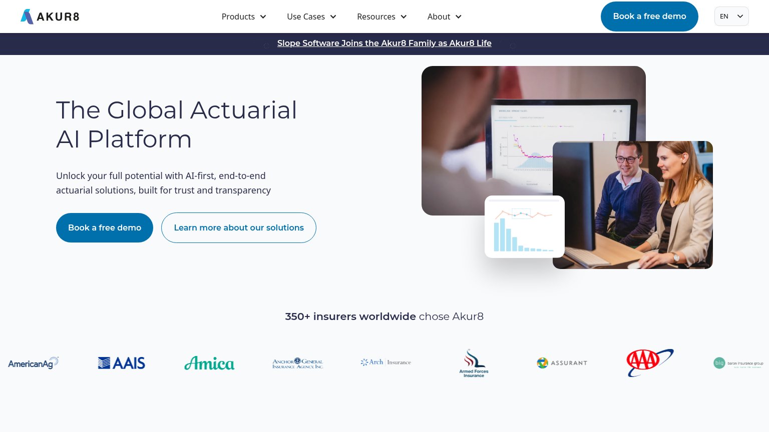 1234
- Duplicate demo CTAs — "Book a free demo" appears identically styled in the nav and hero, splitting the primary action's visual weight.
- Announcement banner link — The full-width "Slope Software Joins the Akur8 Family" banner sits directly under the nav and pulls attention away before the headline.
- Overlapping hero collage — Three stacked images (laptop close-up, chart card, team photo) compete with each other and show generic office scenes rather than the product outcome.
- Equal-weight secondary CTA — "Learn more about our solutions" is nearly the same size and shape as the primary button, diluting the demo action.
Trust
72FairProof that the product is real, competent, and safe to try.
How Akur8 compares
Trust read
CTA
78FairCopy, size, verb, cost-feel — does the primary CTA earn the click?
How Akur8 compares
Recommended rewrites
Mobile web
82StrongThe phone experience as a first-class citizen.
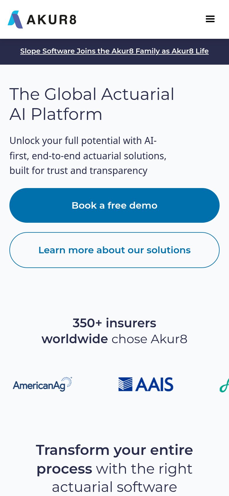
What works
What to improve