
Your landing page’s weakest score is Trust.
How Verdex ranks
66Growth scoreupdated
category scores
category scoresShowHide
Score over time
Trust
48PoorProof that the product is real, competent, and safe to try.

| Trust read | |
|---|---|
| Verdex | "Backed by Y Combinator" badge above the headline |
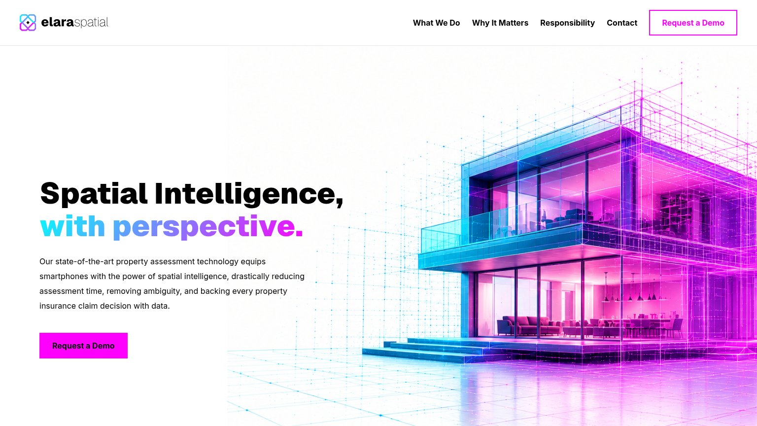
| LexisNexis® Risk Solutions branding and the "LexisNexis® Total Property Understanding™" product headline | |
| No visible trust signal identified. | |
| Annotated product overlay on hero imagery showing "STRUCTURAL VULNERABILITY 6/10" with "ROOF MATERIAL: COMPOSITE SHINGLE | |
| Moody's wordmark in the header | |
| implicit context Betterview (part of Nearmap) may benefit from pre-existing familiarity among its target audience. |
Value props
58FairTitle, subtitle, hero — do they sell the product's true value?
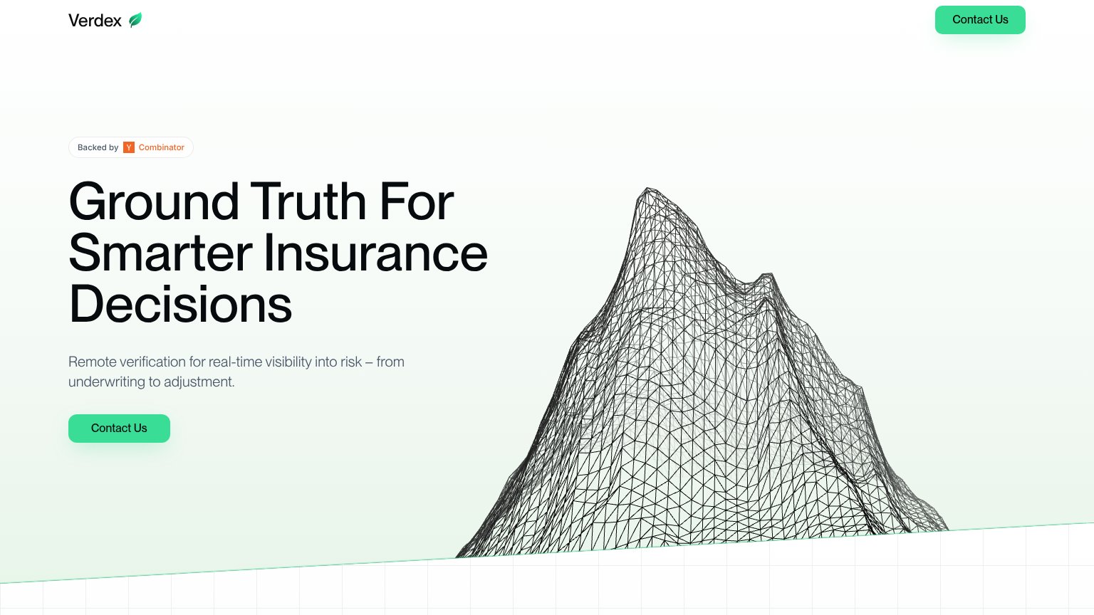
Verdex’s headline vague
Ground Truth For Smarter Insurance Decisions
Remote verification for real-time visibility into risk – from underwriting to adjustment.
Working
- Names the target vertical: insurance
- Subhead names mechanism: remote verification
- Spans workflow: underwriting to adjustment
Could improve
- "Smarter decisions" is an abstraction
- Zero numbers or proof points
- Hero graphic decorates, not demonstrates
CTA
62FairCopy, size, verb, cost-feel — does the primary CTA earn the click?

Problems
- click feels costly — sales contact
- no value promised for the click
- no lower-commitment alternative
Mobile web
78FairThe phone experience as a first-class citizen.
 12
- Hero Contact Us button — Desktop-proportioned button at ~40% column width; should stretch near-full-bleed for thumb reach.
- Header Contact Us pill — Duplicates the hero CTA inches below, splitting attention between two identical targets.
Information hierarchy
86StrongDoes the design help or inhibit what the page is trying to say?
12- Hero Contact Us button — Small footprint next to a massive headline and duplicated at equal weight in the nav, so no single CTA dominates.
- Nav Contact Us button — Same size, color, and label as the hero CTA, splitting the one action into two equal targets.