
Your landing page’s weakest score is Trust.
How Valence ranks
- 1.
Valence70
- 2.
Kalshi60
- 3.
PredictIt60
- 4.
Polymarket58
70Growth scoreupdated
category scores
category scoresShowHide
Score over time
Trust
58FairProof that the product is real, competent, and safe to try.
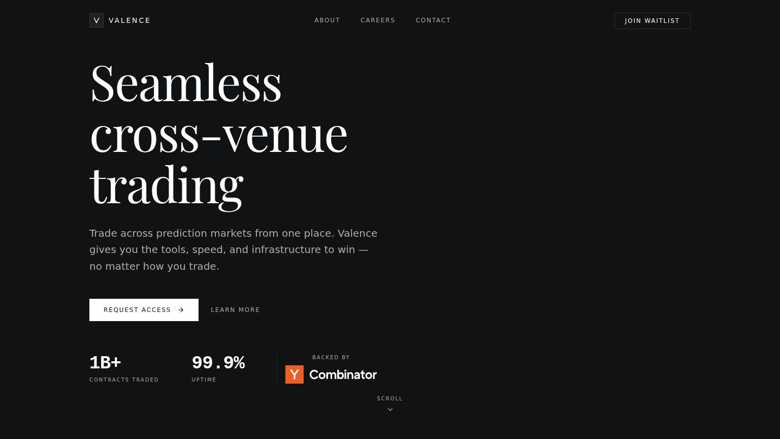

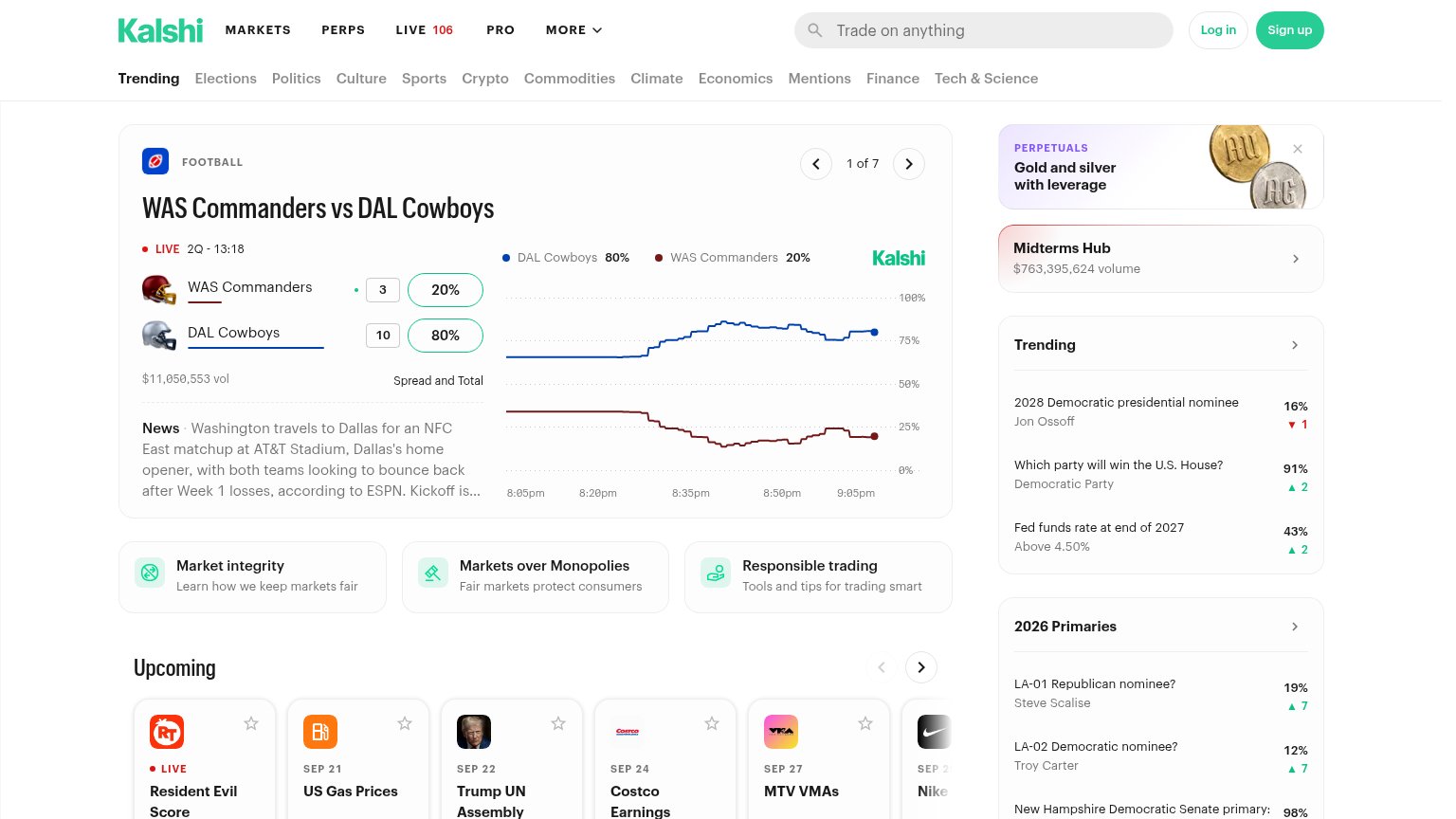
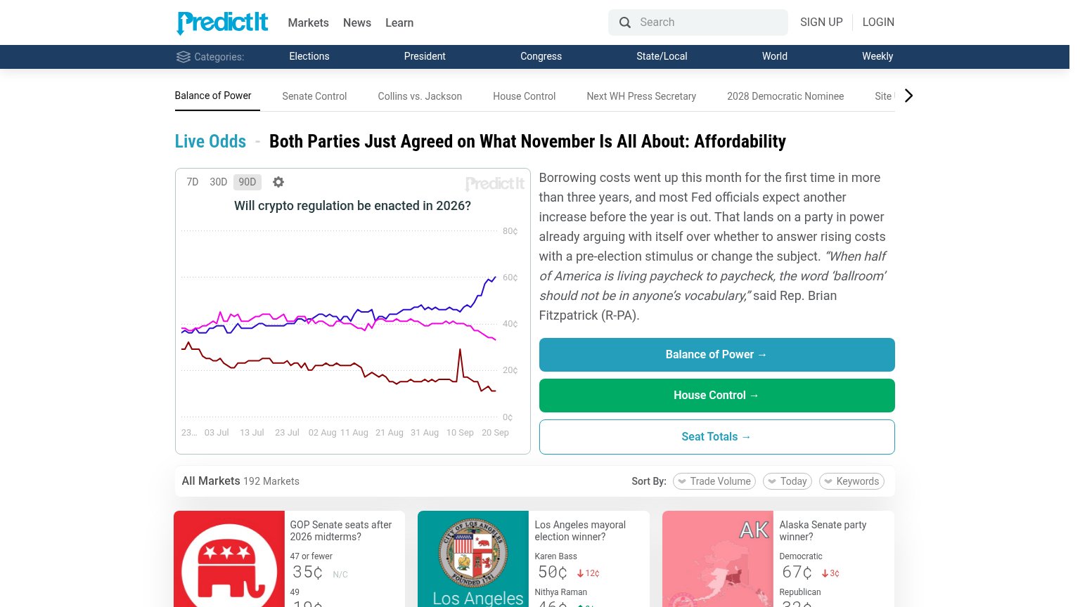
| Trust read | |
|---|---|
| Valence | "BACKED BY" Y Combinator badge alongside "1B+ CONTRACTS TRADED" and "99.9% UPTIME" stats |
| Live market volume figures — "$7M Vol." on the NATO x Russia market and Hot Topics showing "$614K today" traded | |
| Live market card showing "$11,050,553 vol" with a real-time price chart for WAS Commanders vs DAL Cowboys | |
| Live market chart "Will crypto regulation be enacted in 2026?" with real-time price history and 192-market listing |
CTA
68FairCopy, size, verb, cost-feel — does the primary CTA earn the click?
Problems
- 'Request' feels gated, not value
- conflicts with nav 'JOIN WAITLIST'
- no payoff implied by the click
Value props
74FairTitle, subtitle, hero — do they sell the product's true value?
Valence’s headline sells
Seamless cross-venue trading
Trade across prediction markets from one place. Valence gives you the tools, speed, and infrastructure to win — no matter how you trade.
Working
- Names the category: cross-venue trading
- 'One place' states the core benefit
- 1B+ contracts and 99.9% uptime add proof
Could improve
- 'Tools, speed, infrastructure' is vague
- No hero image demonstrating the product
- No specific venues or outcomes named
Information hierarchy
76FairDoes the design help or inhibit what the page is trying to say?
12- Join Waitlist button — Second white-outlined CTA competes at near-equal weight with 'Request Access' and asks for a different action.
- Serif headline block — 'Seamless cross-venue trading' takes three viewport-tall lines, pushing the CTA to the very bottom of the scan path.
Mobile web
76FairThe phone experience as a first-class citizen.
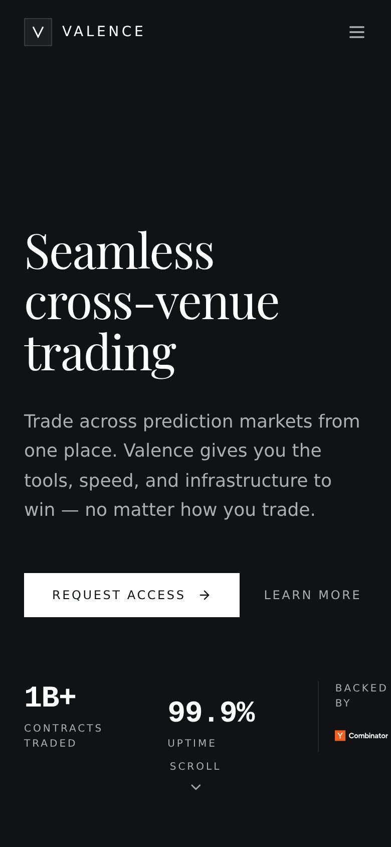 123
- Backed by block — "BACKED BY" wraps to two lines and the Y Combinator logo clips at the right edge.
- REQUEST ACCESS button — Stops at ~60% width to fit LEARN MORE beside it instead of going thumb-friendly full-bleed.
- Stat row baselines — "1B+" and "99.9%" sit at different vertical positions, making the row look broken.