SilaYC W26 landing page report.
← Back to YC W26

Your landing page’s weakest score is Trust.

Fix Trust

Score over time

90807060504030Slack 79 on Apr 7 (Wayback)Slack 78 on Apr 21 (Wayback)Slack 82 on May 19 (Wayback)Slack 78 on Jun 16 (Wayback)Slack 82 on Jun 30 (Wayback)Slack 79 on Jul 10 (Wayback)Slack 80 on Sep 22 (Live)Microsoft Teams 59 on Jul 22 (Live)Google Chat 70 on Mar 9 (Wayback)Google Chat 73 on Mar 23 (Wayback)Google Chat 73 on Apr 6 (Wayback)Google Chat 73 on Apr 20 (Wayback)Google Chat 69 on May 4 (Wayback)Google Chat 66 on May 12 (Wayback)Google Chat 69 on Jul 29 (Live)Zulip 60 on Jun 15 (Wayback)Zulip 62 on Jun 24 (Wayback)Zulip 62 on Jul 13 (Wayback)Zulip 68 on Aug 2 (Wayback)Zulip 65 on Aug 26 (Wayback)Zulip 66 on Sep 10 (Wayback)Zulip 66 on Sep 22 (Live)Sila 38 on Jul 18 (Wayback)Sila 66 on Sep 17 (Wayback)Sila 64 on Sep 22 (Live)Jul 18Sep 17Sep 22
Past reportsShow past reportsHide past reports
  1. Sep 22, 202664LiveOverall −2 · Mobile web −4 · Value props −2Viewing
  2. Sep 17, 202666Overall +28 · Mobile web +50 · Information hierarchy +30View →
  3. Jul 18, 202638First tracked report — strongest CTA 52, weakest Mobile web 28View →

Trust

52Fair

Proof that the product is real, competent, and safe to try.

Sila
Slack
Zulip
Microsoft Teams
Trust read
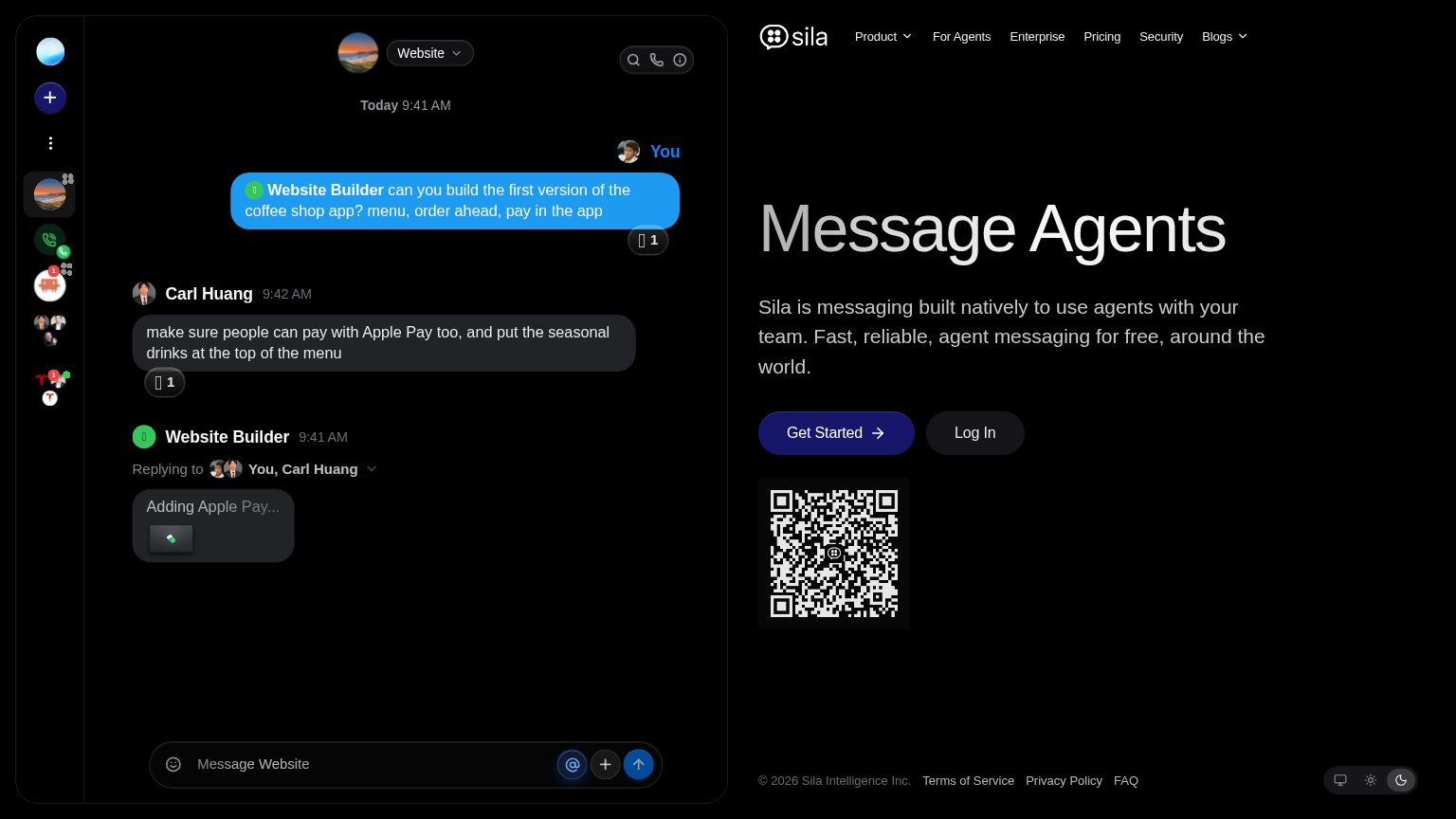
SilaEmbedded product demo: chat UI showing the "Website Builder" agent replying "Adding Apple Pay..." to a real conversation
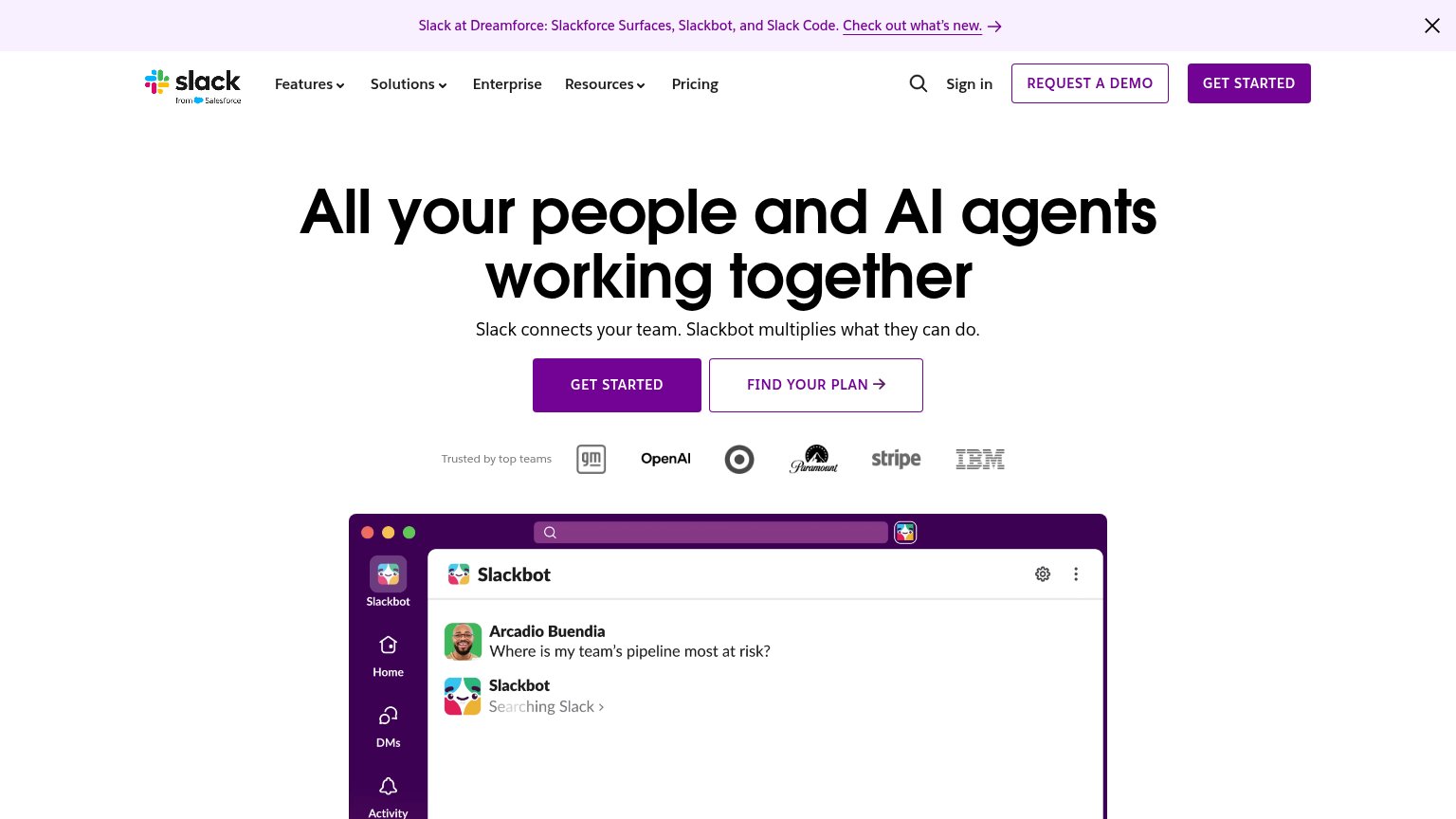
Slack"Trusted by top teams" logo row with GM, OpenAI, Target, Paramount, Stripe, and IBM
Microsoft TeamsReal product photo of Surface device and headphones
Google Chatimplicit context Google Chat may benefit from pre-existing familiarity among its target audience.
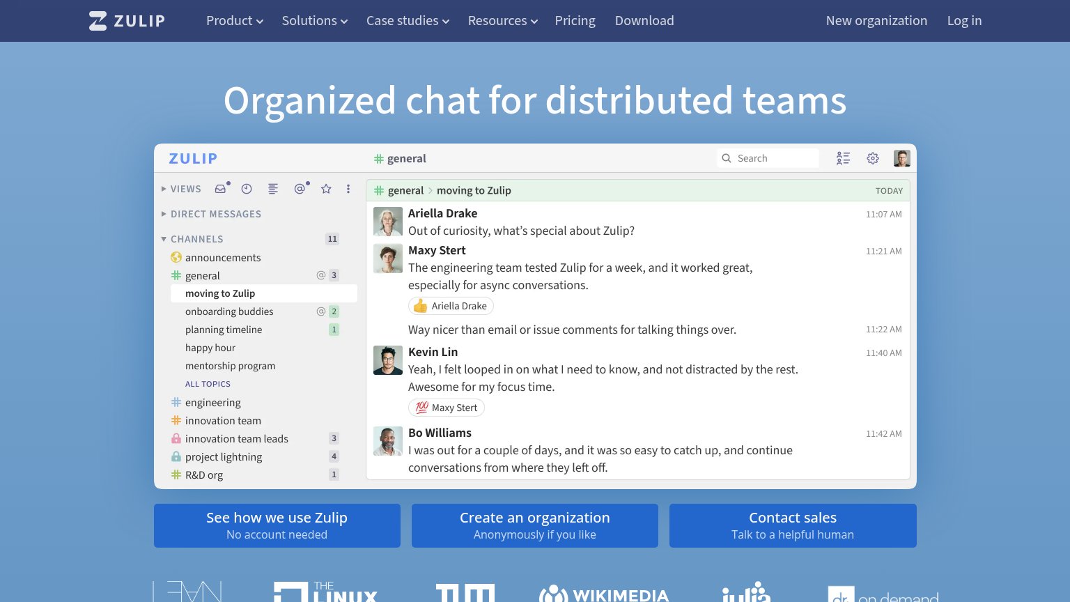
ZulipCustomer logo strip below the CTAs including The Linux Foundation, Wikimedia, and Julia

Value props

56Fair

Title, subtitle, hero — do they sell the product's true value?

Sila’s headline vagueMessage AgentsSila is messaging built natively to use agents with your team. Fast, reliable, agent messaging for free, around the world.

Working

  • Chat demo shows agent doing real work
  • "free" is a concrete claim
  • Subhead names the category: agent messaging

Could improve

  • "Message Agents" is ambiguous to cold visitors
  • No numbers or named outcome anywhere
  • "Fast, reliable" could caption any app

Information hierarchy

68Fair

Does the design help or inhibit what the page is trying to say?

Information hierarchy annotations on the desktop capture1234
  1. Undirected QR code — Large QR block sits below the CTAs with no caption explaining what scanning it does.
  2. Equal-weight nav links — Six nav items (Product, For Agents, Enterprise, Pricing, Security, Blogs) siphon attention before Get Started.
  3. Busy chat mockup — The dense left-half app screenshot competes with the headline at equal visual weight and pulls the first scan away from the message.
  4. Footer in fold — Terms, Privacy, FAQ and theme toggles creep above the fold, adding four more exits.

CTA

72Fair

Copy, size, verb, cost-feel — does the primary CTA earn the click?

Sila
Slack
Microsoft Teamsin-product action

Problems

  • no 'free' despite free claim
  • generic label, no product echo
  • no payoff hint on click

Mobile web

74Fair

The phone experience as a first-class citizen.

Mobile web annotations on the mobile capture123
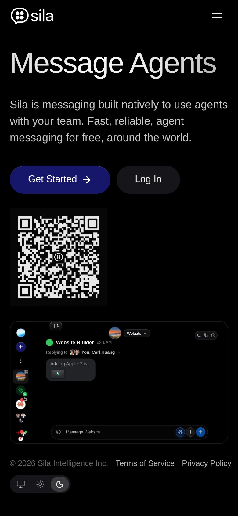
  1. QR code block — A scan-with-Sila's-phone device shown on a phone; it is untappable dead weight in prime scroll position.
  2. Get Started button — Desktop-proportioned pill at roughly half column width; should be near-full-bleed and thumb-sized.
  3. Chat product screenshot — Desktop UI shrunk to phone width; message text and controls are illegibly small.

Competitors

inferred from product, audience, and value prop