
Your landing page’s weakest score is Information hierarchy.
How Slack ranks
80Growth scoreupdated
category scores
category scoresShowHide
Information hierarchy
76FairDoes the design help or inhibit what the page is trying to say?
 1234
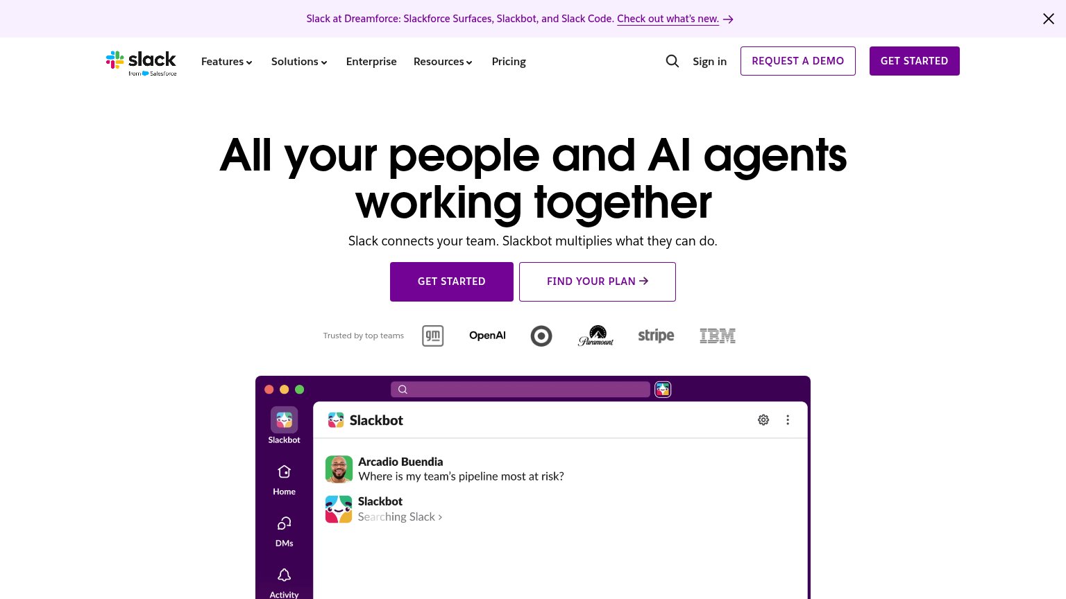
- Duplicate demo/CTA buttons — "REQUEST A DEMO" sits at near-equal weight beside "GET STARTED" in the nav, splitting the primary action before the hero is even read.
- Dreamforce announcement banner — A full-width purple banner with an underlined "Check out what's new" link is the first thing in the scan path and exits visitors before the value prop.
- Hero secondary CTA — "FIND Slack's PLAN" is styled at the same size and adjacency as "GET STARTED", forcing a choice where one button should dominate.
- Nav dropdown cluster — Six nav items including three dropdowns (Features, Solutions, Resources) plus search and Sign in create eight-plus exits above the hero.
CTA
76FairCopy, size, verb, cost-feel — does the primary CTA earn the click?
Problems
- generic — no product value named
- no header echo with AI-agents promise
- competes with 'Request a demo' in nav
Value props
78FairTitle, subtitle, hero — do they sell the product's true value?
Slack’s headline
All your people and AI agents working together
Slack connects your team. Slackbot multiplies what they can do.
Working
Could improve
Trust
82StrongProof that the product is real, competent, and safe to try.
How Slack compares
Trust read
Mobile web
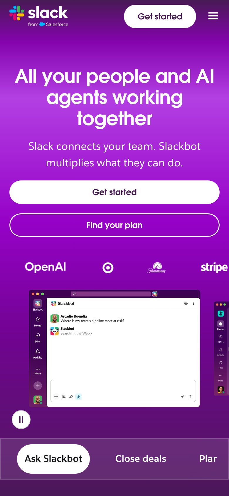
86StrongThe phone experience as a first-class citizen.
What works
What to improve