
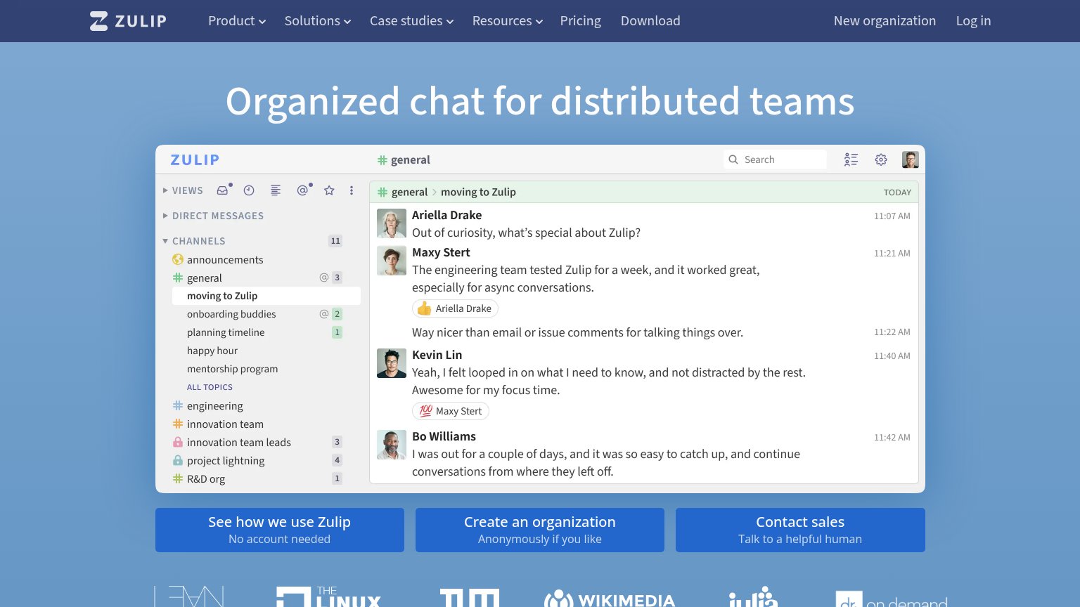
Your landing page’s weakest score is Mobile web.
How Zulip ranks
Mobile web
58FairThe phone experience as a first-class citizen.
 1
- Fake message input — The mockup's "Message" field looks like a real tappable input, inviting dead taps instead of conversion.
CTA
62FairCopy, size, verb, cost-feel — does the primary CTA earn the click?
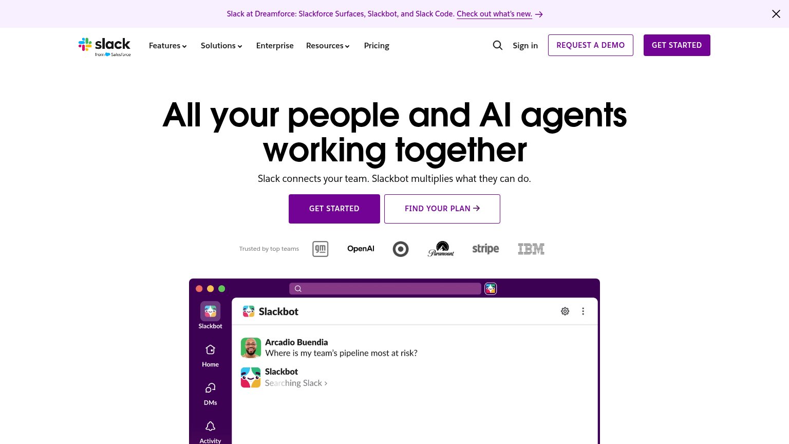

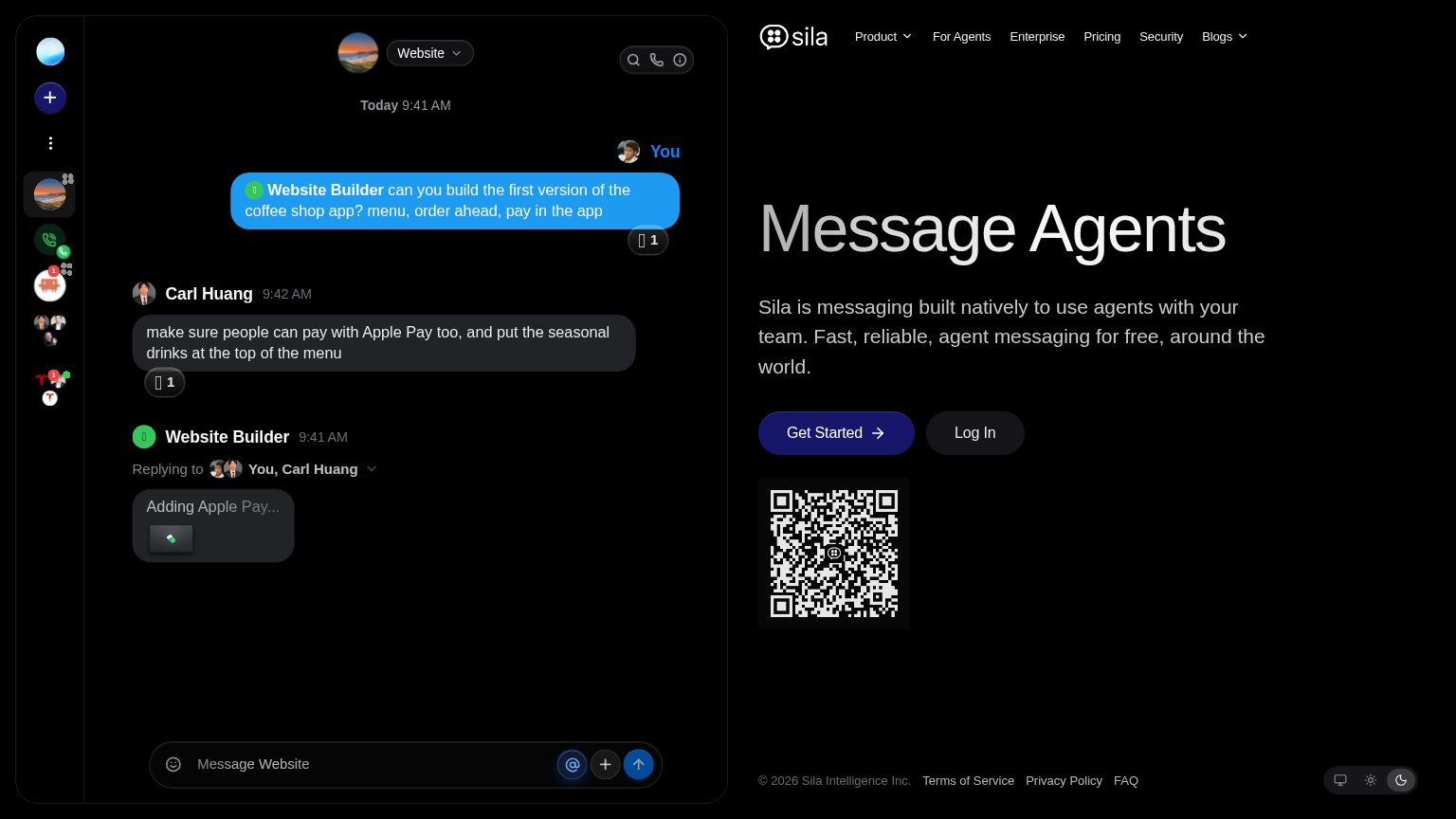
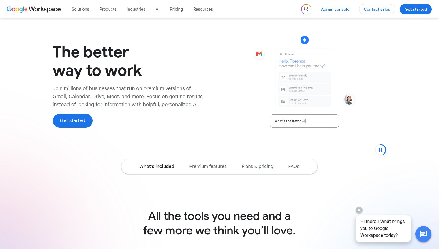
Problems
- three equal buttons, no hierarchy
- no 'free' despite free offer
- 'organization' feels heavy/committal
- CTAs below fold on mobile
Information hierarchy
68FairDoes the design help or inhibit what the page is trying to say?
What works
What to improve
Trust
68FairProof that the product is real, competent, and safe to try.
How Zulip compares
Trust read
Value props
72FairTitle, subtitle, hero — do they sell the product's true value?
Zulip’s headline
Organized chat for distributed teams
Working
Could improve