
Your landing page’s weakest score is Trust.
How Sentrial ranks
67Growth scoreupdated
category scores
category scoresShowHide
Score over time
Trust
42PoorProof that the product is real, competent, and safe to try.


| Trust read | |
|---|---|
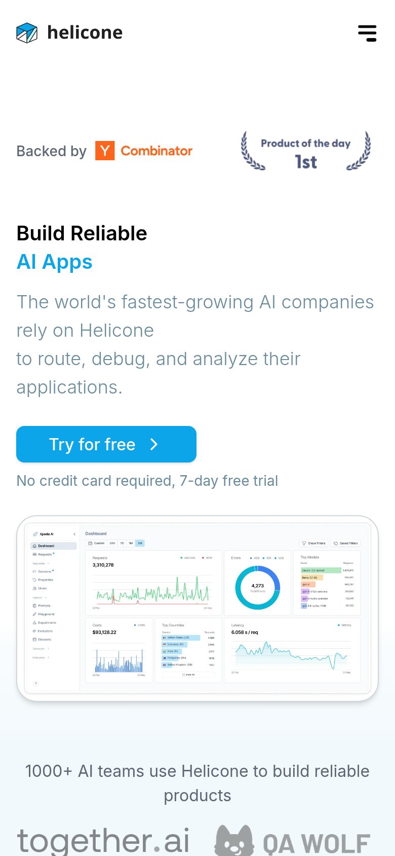
| Sentrial | "Backed by Y Combinator" badge above the headline |
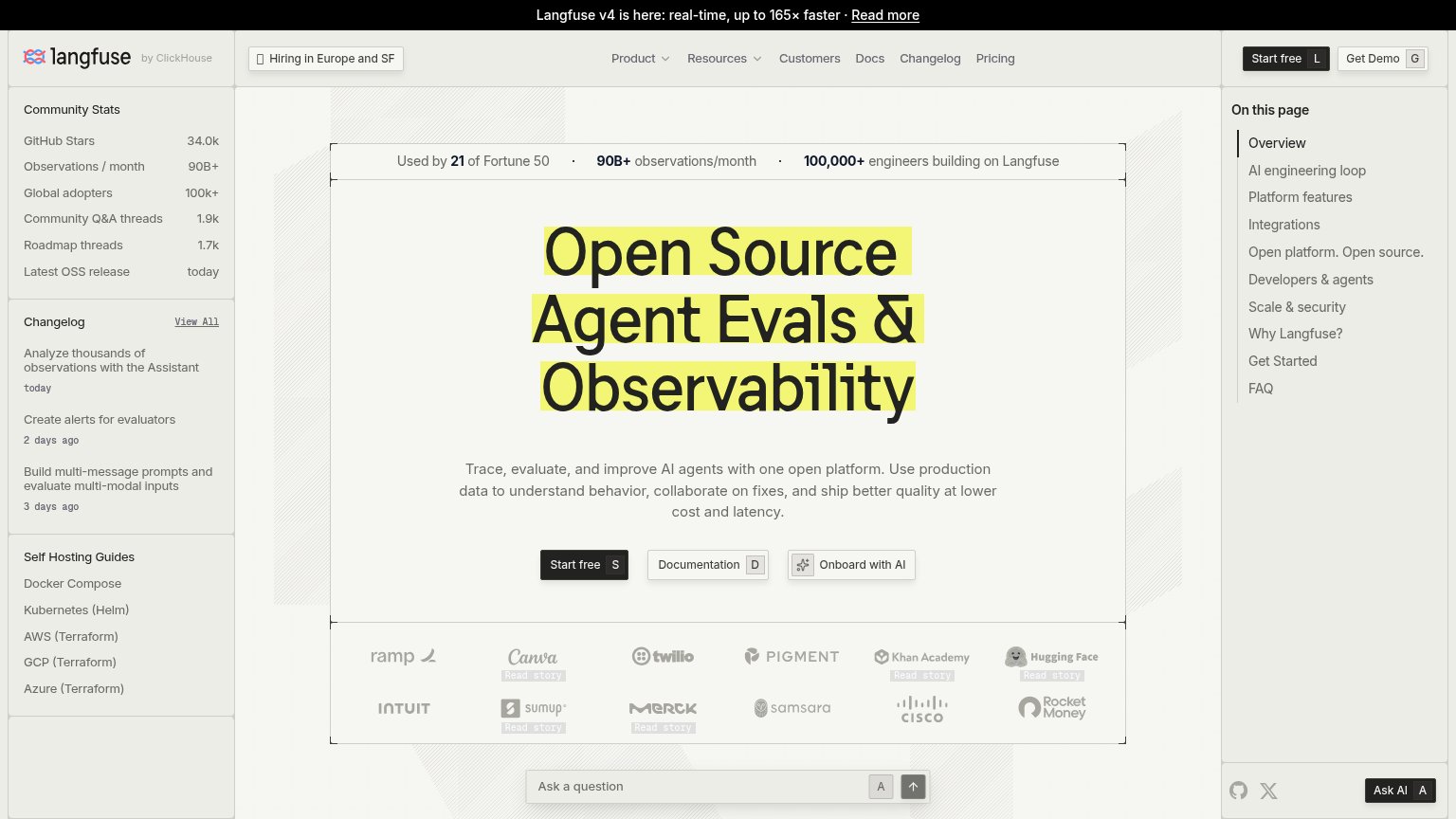
| Used by 21 of Fortune 50 · 90B+ observations/month · 100,000+ engineers building on Langfuse | |
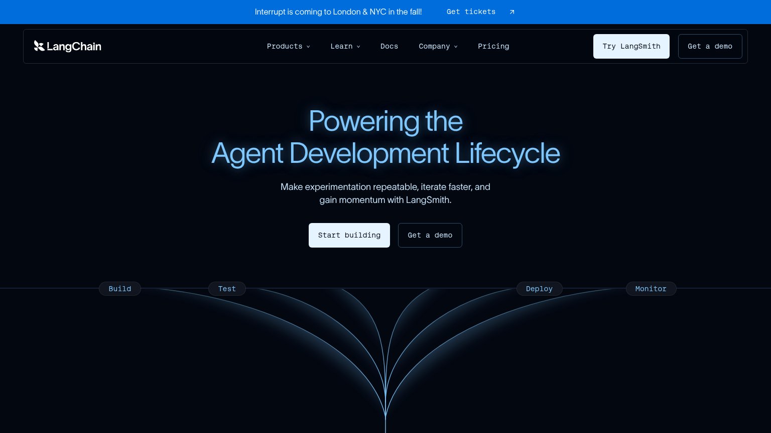
| 'Interrupt is coming to London & NYC in the fall!' conference banner | |
| Customer logo wall under "Powering the world's leading AI teams" (Uber, Spotify, Instacart, DoorDash, Booking.com) | |
| "1000+ AI teams use Helicone to build reliable products" with customer logos (together.ai, QA Wolf) | |
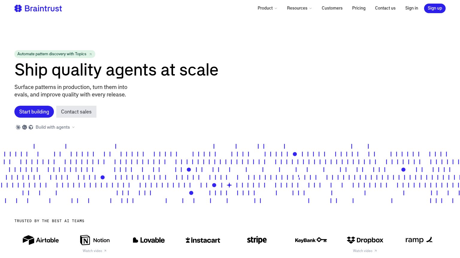
| "TRUSTED BY THE BEST AI TEAMS" logo wall (Airtable, Notion, Stripe, Instacart, Dropbox, Ramp) |
Value props
68FairTitle, subtitle, hero — do they sell the product's true value?
Sentrial’s headline sells
Production Monitoring for AI Agents
Catch agent drift before your users do. Detect silent regressions across every session, tool call, and LLM interaction.
Working
- Names audience and category instantly
- Subhead hits real fear: users see bugs first
- Concrete scope: sessions, tool calls, LLM
Could improve
- Zero numbers anywhere in the fold
- Hero image decorates, shows no product
- 'Saves hours' claim is unquantified
CTA
70FairCopy, size, verb, cost-feel — does the primary CTA earn the click?

Problems
- generic label, no product promise
- weak contrast vs secondary CTA
- competes with nav 'Book a Call'
Mobile web
76FairThe phone experience as a first-class citizen.
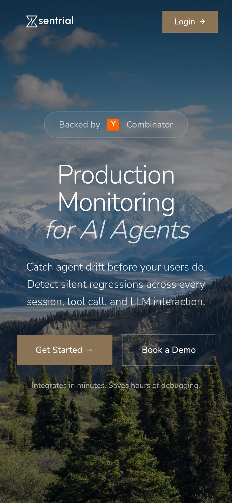 123
- Get Started button — Primary CTA sits low in the fold and splits taps with the equal-weight 'Book a Demo' button beside it.
- Headline over photo — Light-weight white text on a busy mountain photo drops contrast in the sky region, straining legibility at arm's length.
- Header Login button — The only header action is 'Login' in the same tan as the primary CTA, drawing new visitors toward an existing-user path.
Information hierarchy
80StrongDoes the design help or inhibit what the page is trying to say?
123- Get Started button — Tan fill blends into the earth-toned landscape, so the primary CTA fails the one-second find test.
- Book a Demo button — Same size and placement as Get Started, splitting the click at the decision moment.
- Login button — Uses the same tan fill as the primary CTA, pulling scan-path attention to the nav corner.