
Your landing page’s weakest score is Value props.
How Arize ranks
74Growth scoreupdated
category scores
category scoresShowHide
Value props
68FairTitle, subtitle, hero — do they sell the product's true value?
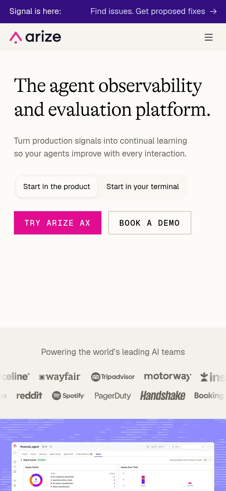
Arize’s headline sells
The agent observability and evaluation platform.
Turn production signals into continual learning so your agents improve with every interaction.
Working
- Names category precisely: agent observability + evals
- Subhead states an outcome, not a feature list
- Strong logo bar backs the claim with real customers
Could improve
- Desktop hero art decorates, shows no product
- Zero numbers or specifics anywhere in fold
- "Continual learning" is jargon, not a felt benefit
Information hierarchy
72FairDoes the design help or inhibit what the page is trying to say?
 1234
- Duplicate CTA pair — "TRY ARIZE AX" and "BOOK A DEMO" repeat in nav and hero, splitting the primary action four ways above the fold.
- Announcement banner — The full-width purple "Signal is here" bar outranks the nav in contrast and pulls the first click away from the conversion path.
- Start-in tab toggle — "Start in the product / Start in Arize's terminal" sits directly above the CTAs at similar weight, adding a decision before the action.
- Crowded nav row — Seven nav items plus GitHub icon and Sign In give ten-plus exits before the visitor reaches the hero CTA.
CTA
72FairCopy, size, verb, cost-feel — does the primary CTA earn the click?
How Arize compares
Recommended rewrites
Trust
76FairProof that the product is real, competent, and safe to try.
How Arize compares
Trust read
Mobile web
82StrongThe phone experience as a first-class citizen.
What works
What to improve