
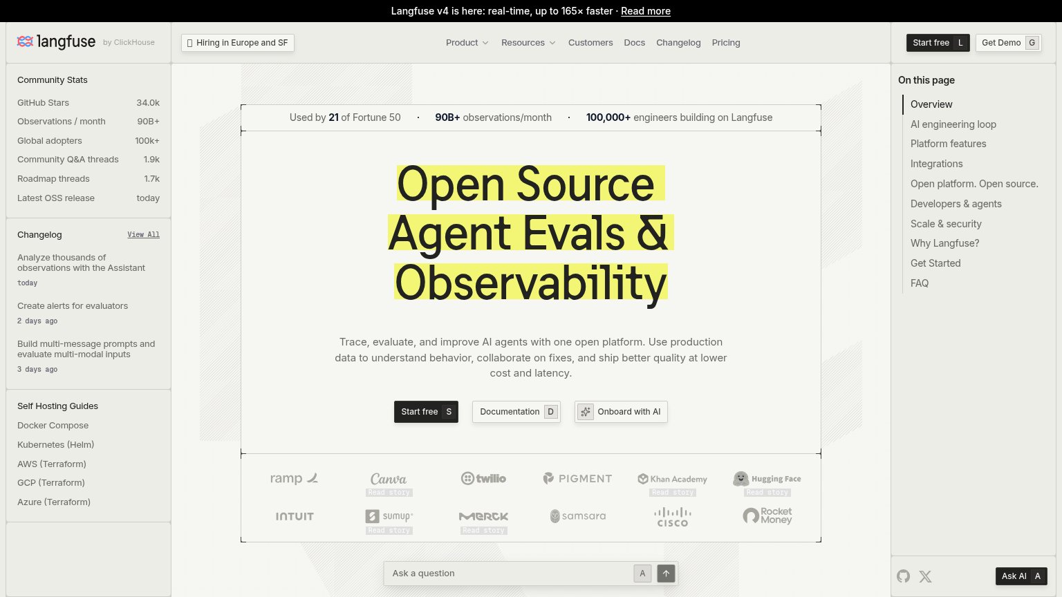
Your landing page’s weakest score is Information hierarchy.
How Langfuse ranks
77Growth scoreupdated
category scores
category scoresShowHide
Information hierarchy
64FairDoes the design help or inhibit what the page is trying to say?
 1234
- Left sidebar rail — Community Stats, Changelog, and Self Hosting Guides stack three competing info blocks beside the hero, adding a dozen exit links before the headline is read.
- On this page rail — Ten anchor links at the same visual weight as the hero copy pull the eye rightward and split the scan path away from Start free.
- Three hero buttons — "Documentation" and "Onboard with AI" sit at near-equal size beside "Start free", diluting the single-action decision.
- Logo wall Read story — Faint "Read story" links under Canva, Khan Academy, and Hugging Face add low-value exits inside the social-proof band.
Mobile web
72FairThe phone experience as a first-class citizen.
 1234
- Start free button — Desktop-proportioned button floats small beside Documentation instead of a full-width thumb target.
- Truncated stats bar — Social-proof strip clips mid-word ('engineers b…') at the right edge, breaking the credibility line.
- Onboard with AI button — Third CTA orphaned on its own row adds a competing choice below the primary pair.
- Clipped logo row — Customer logos cut off at the right edge, suggesting an unadapted desktop carousel.
Value props
82StrongTitle, subtitle, hero — do they sell the product's true value?
Langfuse’s headline
Open Source Agent Evals & Observability
Trace, evaluate, and improve AI agents with one open platform. Use production data to understand behavior, collaborate on fixes, and ship better quality at lower cost and latency.
Working
Could improve
Trust
82StrongProof that the product is real, competent, and safe to try.
How Langfuse compares
Trust read
CTA
86StrongCopy, size, verb, cost-feel — does the primary CTA earn the click?
How Langfuse compares
Recommended rewrites