
Your landing page’s weakest score is Trust.
How MochaCare ranks
70Growth scoreupdated
category scores
category scoresShowHide
Score over time
Trust
58FairProof that the product is real, competent, and safe to try.
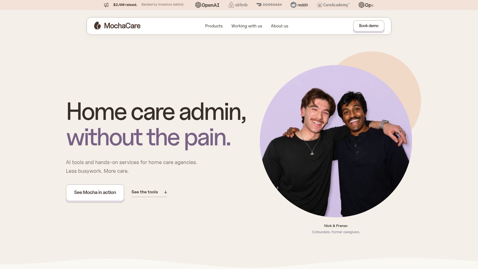

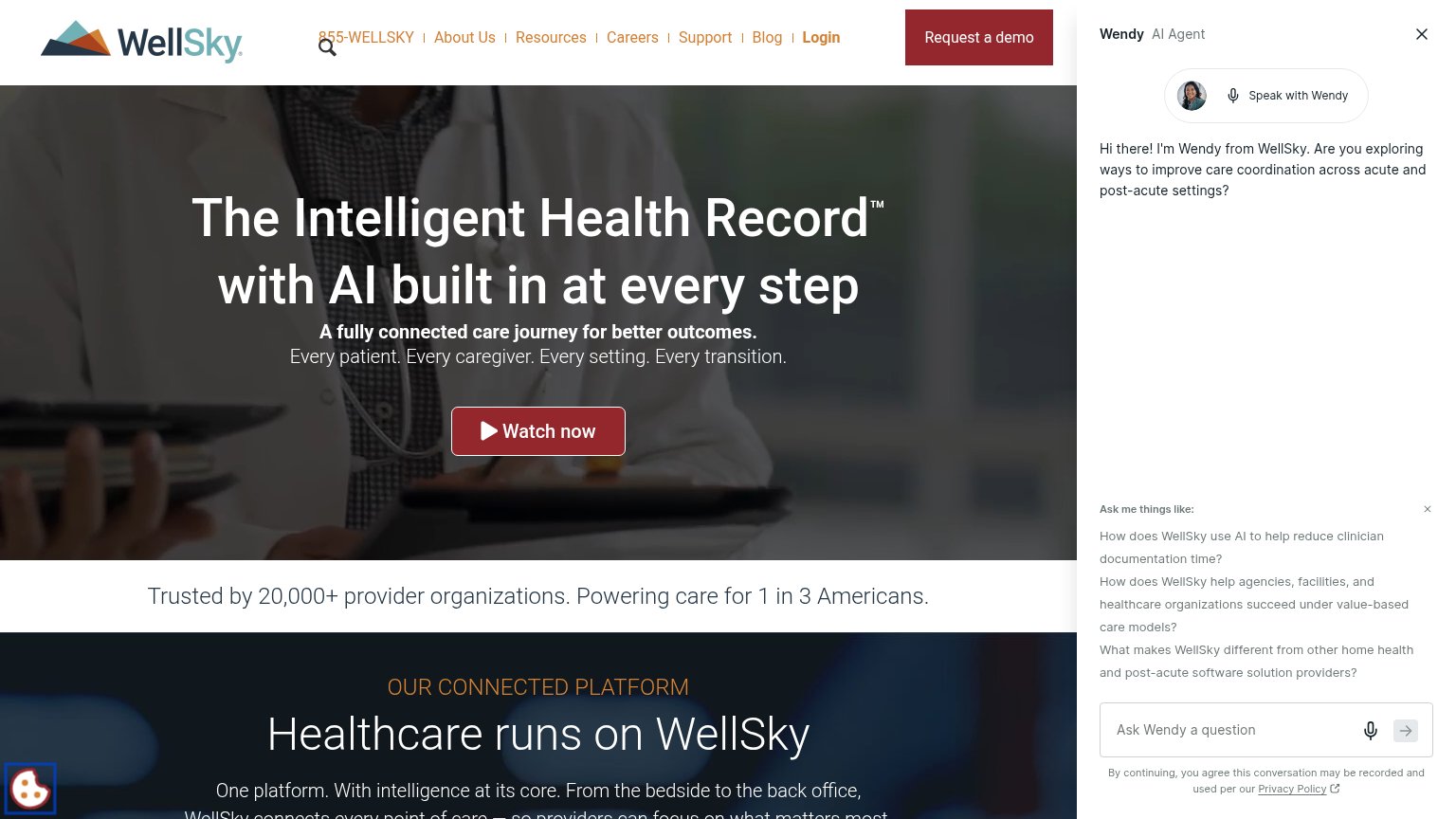
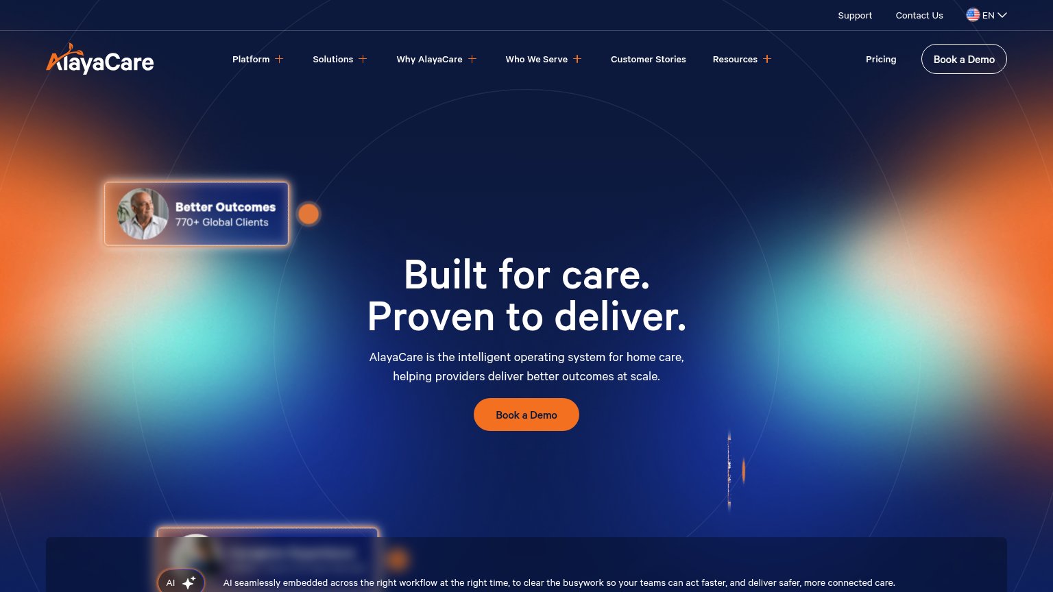
| Trust read | |
|---|---|
| MochaCare | "$2.4M raised. Backed by investors behind" bar with OpenAI, Airbnb, DoorDash, Reddit, CareAcademy logos |
| Review-site badge strip with star ratings from G2, Capterra, GetApp, and TrustRadius on the mobile fold | |
| Trusted by 20,000+ provider organizations. Powering care for 1 in 3 Americans. | |
| "770+ Global Clients" stat card in the desktop hero | |
| Product demo panel showing "Cover Saturday caregiver call-out" with outputs "Visits covered 2 of 3" and "OT added +1.5 h | |
| G2 "Users Love Us" badge next to real dashboard product screenshots in the hero |
CTA
68FairCopy, size, verb, cost-feel — does the primary CTA earn the click?
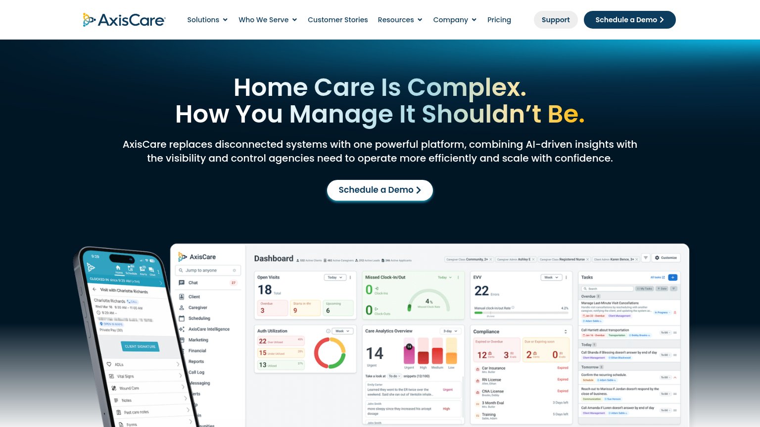
Problems
- conflicts with nav 'Book demo'
- 4 words, over 3-word limit
- verb 'See' repeats in secondary CTA
Value props
72FairTitle, subtitle, hero — do they sell the product's true value?
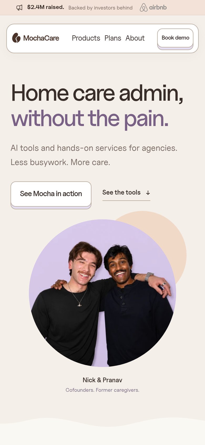
MochaCare’s headline undersells
Home care admin, without the pain.
AI tools and hands-on services for home care agencies. Less busywork. More care.
Working
- Names the exact audience and pain
- Emotional hook: pain, busywork, care
- Founder-caregiver caption builds trust
Could improve
- No specific tasks or numbers
- Hero photo decorates, not demonstrates
- "AI tools and services" stays generic
Mobile web
72FairThe phone experience as a first-class citizen.
 123
- Uncollapsed nav link row — Full desktop links "Products Plans About" crammed beside the logo and Book demo — tiny tap targets, no hamburger.
- Primary CTA button — "See Mocha in action" stays desktop-sized and shares its row with "See the tools" instead of going full-width for the thumb.
- Investor banner strip — Sticky-looking "$2.4M raised" bar with a truncated logo row eats the top of the viewport before any value statement.
Information hierarchy
78FairDoes the design help or inhibit what the page is trying to say?
123- See Mocha in action — White outline button on cream barely contrasts and duplicates the nav's Book demo at equal weight — no clear primary.
- Investor logo banner — Top strip of five gray logos is the first thing scanned and the OpenAI mark is clipped mid-repeat at the right edge.
- See the tools link — Underlined secondary link sits at the same baseline as the primary CTA, splitting the single action into three demo-ish choices.