
Your landing page’s weakest score is Trust.
How Careswitch ranks
Trust
52FairProof that the product is real, competent, and safe to try.
| Trust read | |
|---|---|
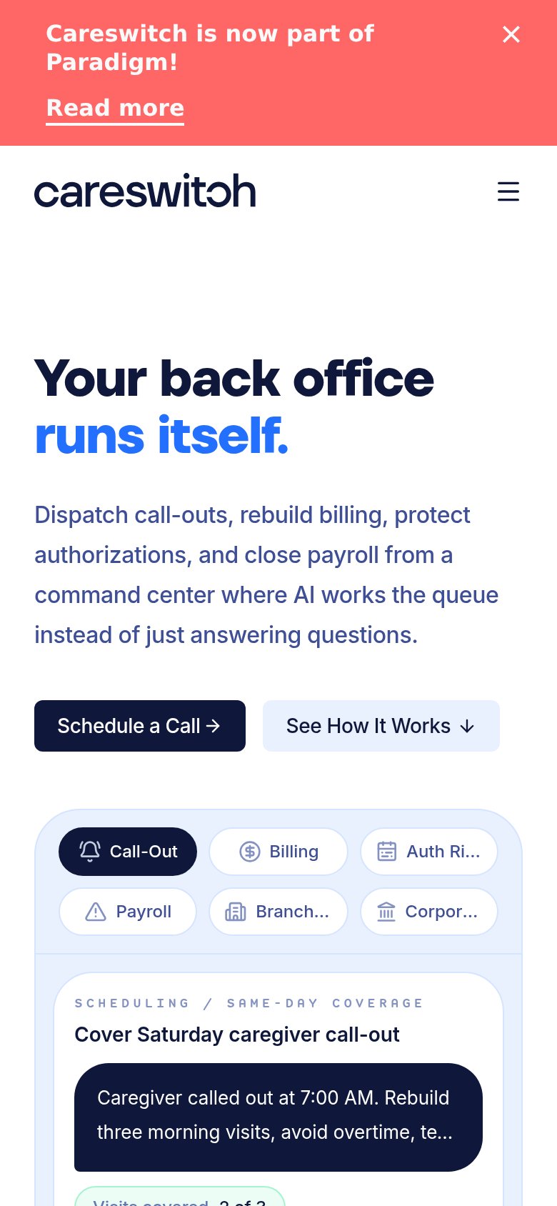
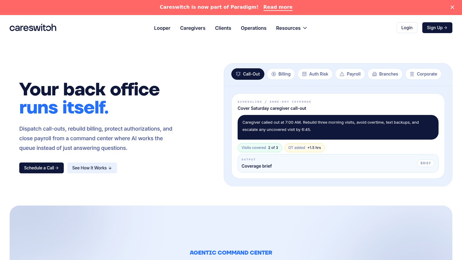
| Careswitch | Product demo panel showing "Cover Saturday caregiver call-out" with outputs "Visits covered 2 of 3" and "OT added +1.5 h |
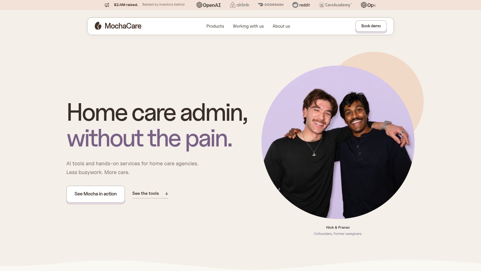
| "$2.4M raised. Backed by investors behind" bar with OpenAI, Airbnb, DoorDash, Reddit, CareAcademy logos | |
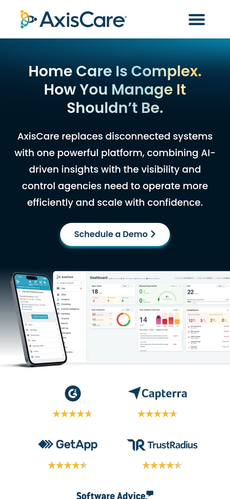
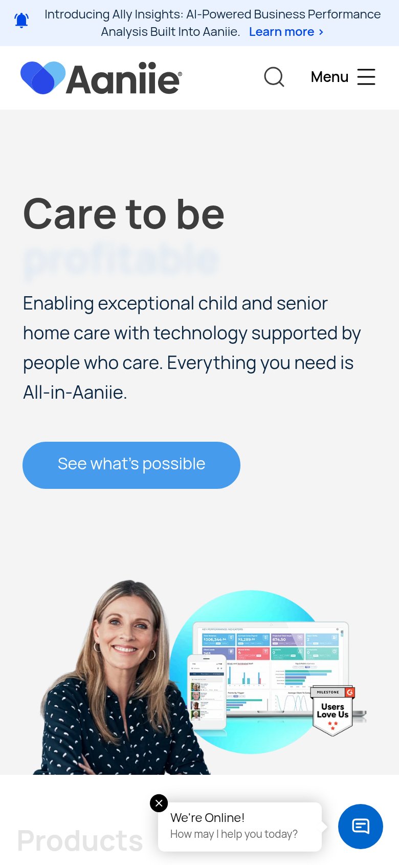
| Review-site badge strip with star ratings from G2, Capterra, GetApp, and TrustRadius on the mobile fold | |
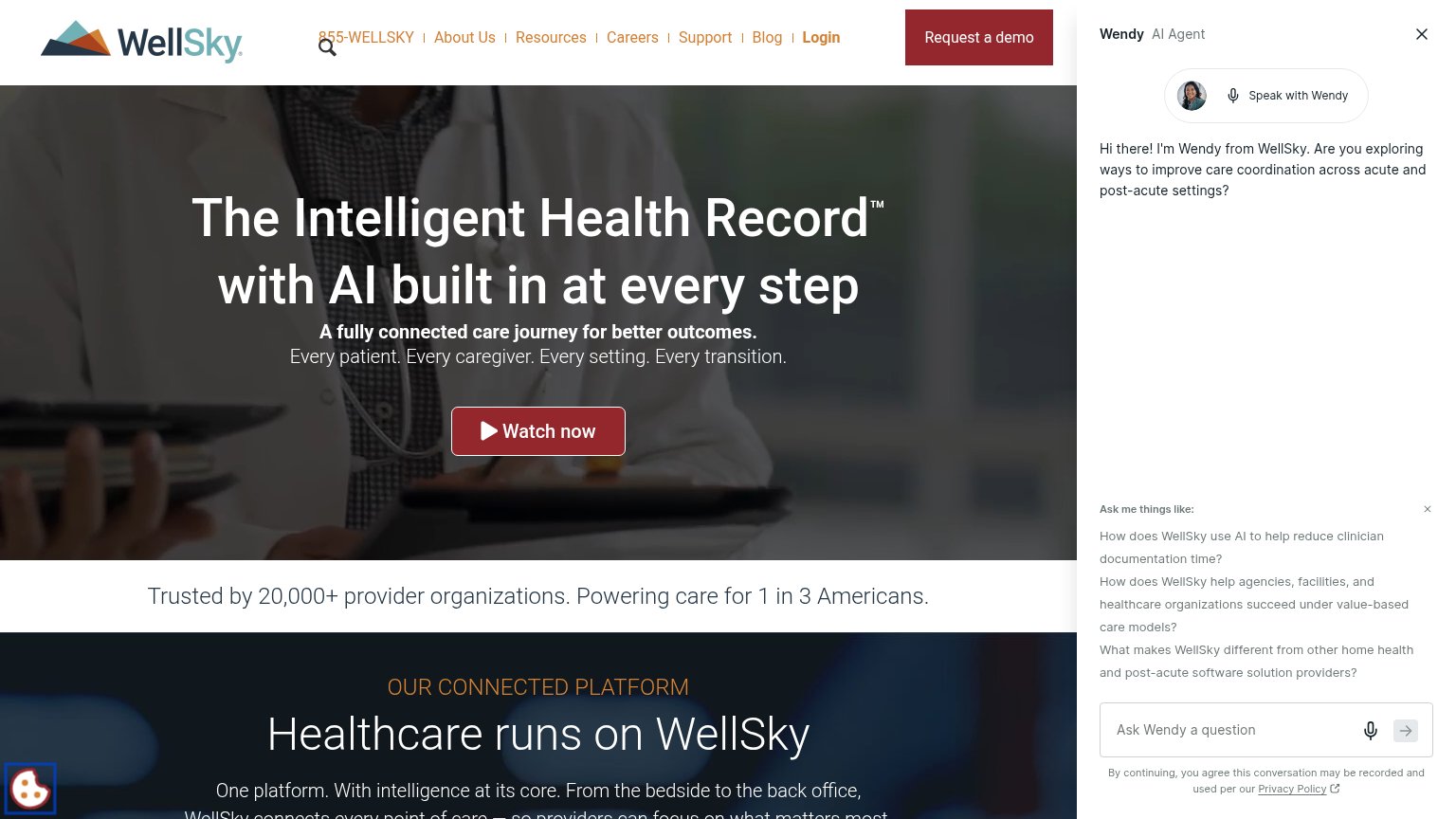
| Trusted by 20,000+ provider organizations. Powering care for 1 in 3 Americans. | |
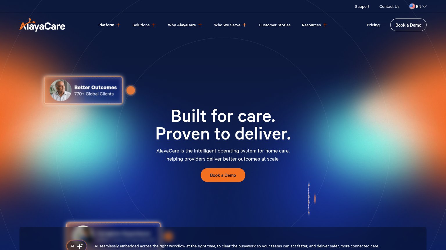
| "770+ Global Clients" stat card in the desktop hero | |
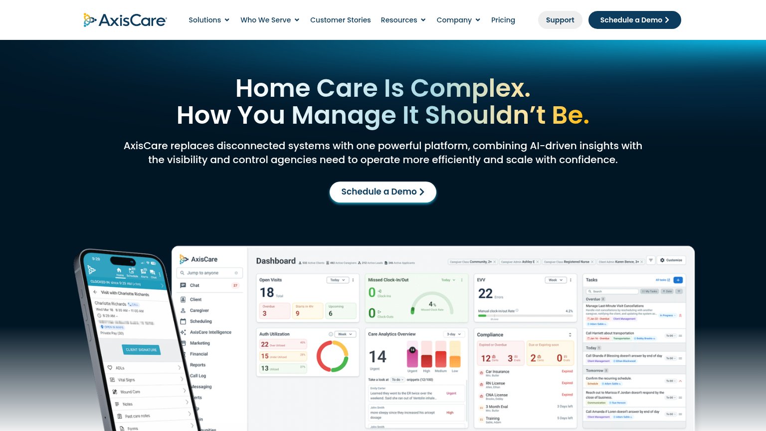
| G2 "Users Love Us" badge next to real dashboard product screenshots in the hero |
CTA
64FairCopy, size, verb, cost-feel — does the primary CTA earn the click?
Problems
- high-cost sales-call ask
- no product value on first click
- demo widget not the primary action
Information hierarchy
66FairDoes the design help or inhibit what the page is trying to say?
What works
What to improve
Mobile web
68FairThe phone experience as a first-class citizen.
What works
What to improve
Value props
78FairTitle, subtitle, hero — do they sell the product's true value?
Careswitch’s headline
Your back office runs itself.
Dispatch call-outs, rebuild billing, protect authorizations, and close payroll from a command center where AI works the queue instead of just answering questions.
Working
Could improve