
Your landing page’s weakest score is Mobile web.
How WellSky ranks
62Growth scoreupdated
category scores
category scoresShowHide
Mobile web
52FairThe phone experience as a first-class citizen.
 1234
- Wendy chat bubble — Auto-expanded chat message covers the 'Trusted by 20,000+' proof line and crowds the thumb zone.
- Ask Wendy pill — Second floating chat control stacked over content, doubling the interruption from the same widget.
- Empty carousel arrows — A blank strip with left/right arrows eats a band of the first viewport before the hero starts.
- Cookie icon overlay — Boxed cookie icon floats over page content in the corner, adding a third layer of clutter.
Information hierarchy
54FairDoes the design help or inhibit what the page is trying to say?
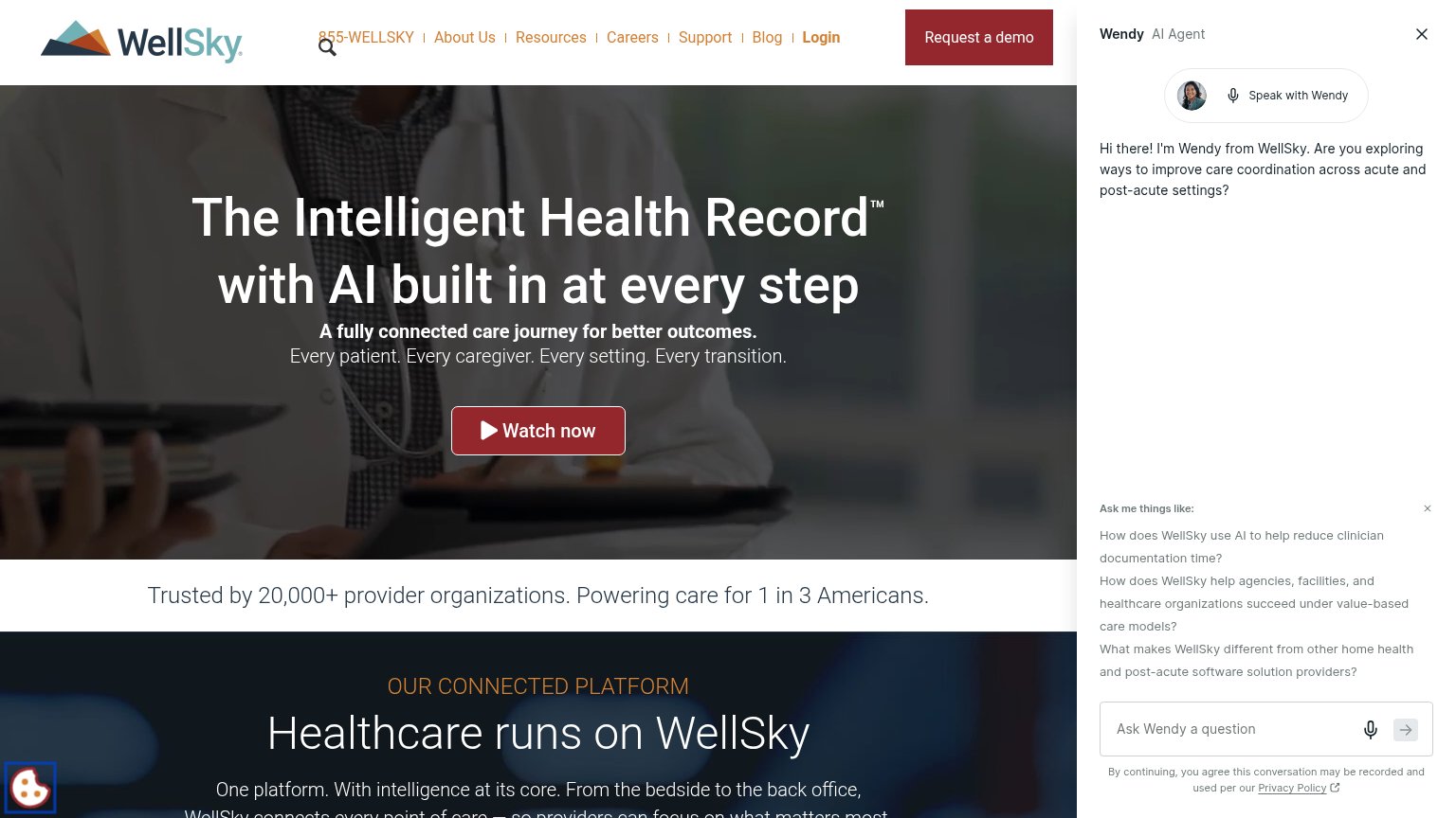 1234
- Wendy AI chat panel — Occupies a quarter of the fold with its own headline and prompts, outcompeting the hero and demo CTA.
- Watch now button — Center-stage red button rivals "Request a demo", splitting the primary action into two equal-weight choices.
- Header nav row — Seven links plus phone number and Login sit above the demo CTA, each an exit before the pitch lands.
- Request a demo button — The true conversion action is shoved to the corner and cropped by the chat panel edge.
Trust
64FairProof that the product is real, competent, and safe to try.
How WellSky compares
Trust read
CTA
68FairCopy, size, verb, cost-feel — does the primary CTA earn the click?
How WellSky compares
Recommended rewrites
Value props
72FairTitle, subtitle, hero — do they sell the product's true value?
WellSky’s headline
The Intelligent Health Record™ with AI built in at every step
A fully connected care journey for better outcomes. Every patient. Every caregiver. Every setting. Every transition.
Working
Could improve