DoomersionYC W26 landing page report.
← Back to YC W26

Your landing page’s weakest score is Trust.

How Doomersion ranks

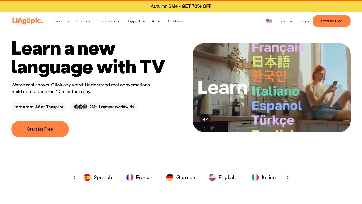
  1. 1.Lingopie82
  2. 2.Doomersion68
  3. 3.FluentU67
  4. 4.Language Reactor60
Fix Trust

Score over time

908070605040Lingopie 70 on May 8 (Wayback)Lingopie 68 on May 17 (Wayback)Lingopie 70 on Jun 5 (Wayback)Lingopie 80 on Jul 10 (Wayback)Lingopie 78 on Jul 31 (Wayback)Lingopie 81 on Aug 15 (Wayback)Lingopie 82 on Sep 22 (Live)FluentU 69 on Jun 4 (Wayback)FluentU 67 on Jun 18 (Wayback)FluentU 68 on Jun 30 (Wayback)FluentU 68 on Aug 5 (Wayback)FluentU 67 on Aug 21 (Wayback)FluentU 68 on Sep 16 (Wayback)FluentU 67 on Sep 22 (Live)Language Reactor 60 on May 29 (Wayback)Language Reactor 57 on Jun 16 (Wayback)Language Reactor 58 on Jun 28 (Wayback)Language Reactor 56 on Jul 19 (Wayback)Language Reactor 53 on Aug 29 (Wayback)Language Reactor 58 on Sep 7 (Wayback)Language Reactor 60 on Sep 22 (Live)Doomersion 60 on Apr 16 (Wayback)Doomersion 62 on Jun 12 (Wayback)Doomersion 68 on Sep 22 (Live)Apr 16Jun 12Sep 22
Past reportsShow past reportsHide past reports
  1. Sep 22, 202668LiveOverall +6 · Information hierarchy +14 · Trust +10Viewing
  2. Jun 12, 202662Overall +2 · Information hierarchy +6 · CTA +4View →
  3. Apr 16, 202660First tracked report — strongest Value props 78, weakest Trust 42View →

Trust

52Fair

Proof that the product is real, competent, and safe to try.

Lingopie
Language Reactor
Trust read
DoomersionNo visible trust signal identified.
Lingopie"★★★★★ 4.8 on Trustpilot" badge next to "2M+ Learners worldwide" with learner avatars
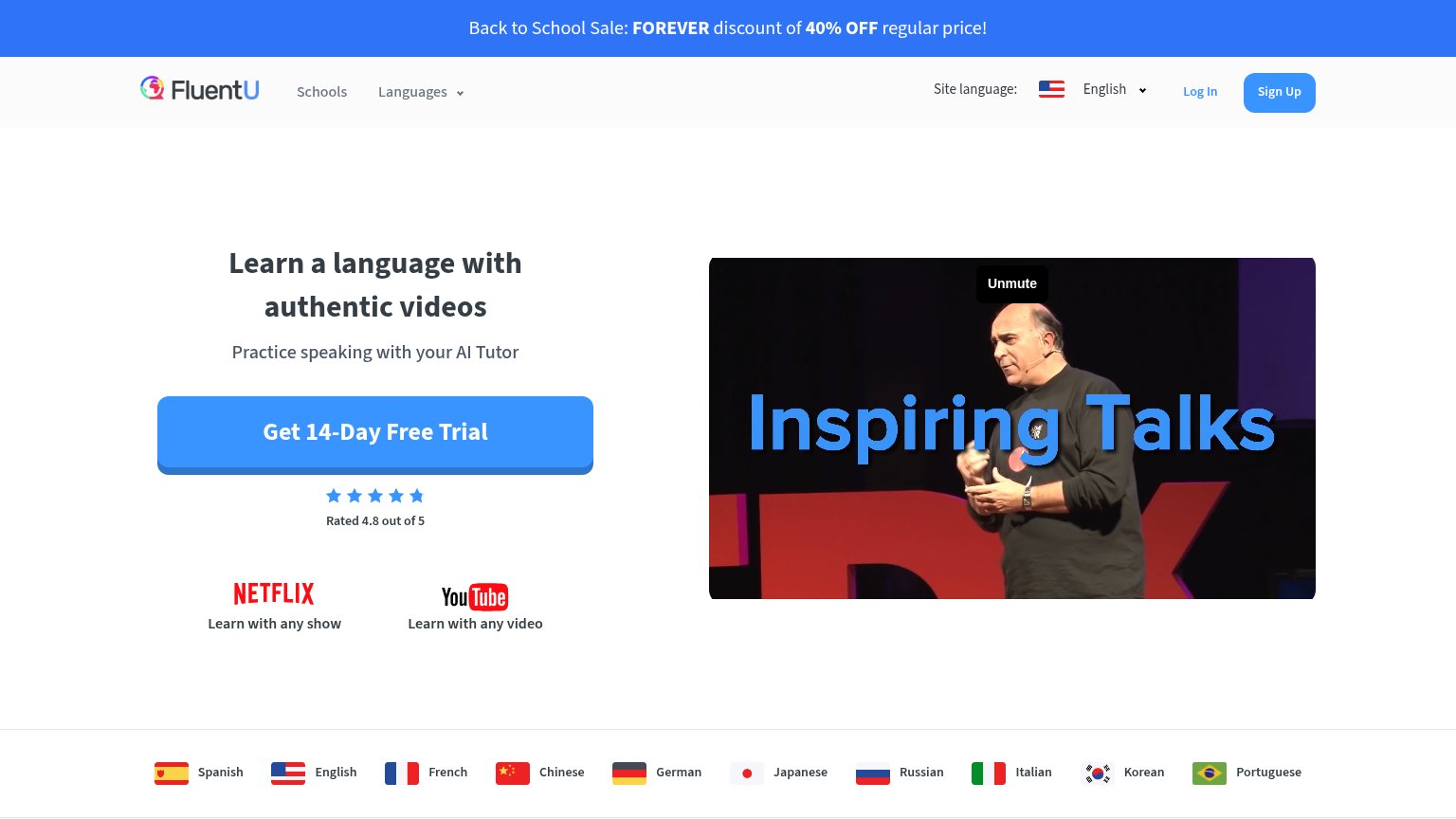
FluentU"Rated 4.8 out of 5" star rating beneath the free-trial CTA
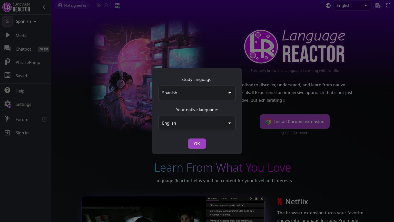
Language Reactor"2,000,000+ users" beneath the Install Chrome extension button

Mobile web

64Fair

The phone experience as a first-class citizen.

Mobile web annotations on the mobile capture123
  1. App store buttons — Both primary CTAs sit below the phone mockup, pushed out of the first viewport by the tall video frame.
  2. Phone video mockup — The full-height mockup consumes most of the fold, displacing the Google Play and App Store buttons below the scroll line.
  3. Mascot overlaps mockup — The doodle mascot collides with the phone's status bar, reading as a rendering glitch rather than intentional decoration.

CTA

68Fair

Copy, size, verb, cost-feel — does the primary CTA earn the click?

Doomersion
Lingopie
FluentU

Problems

  • generic store badge copy
  • partly cut off at desktop fold
  • two equal CTAs split attention
  • no echo of headline promise

Information hierarchy

78Fair

Does the design help or inhibit what the page is trying to say?

Information hierarchy annotations on the desktop capture123
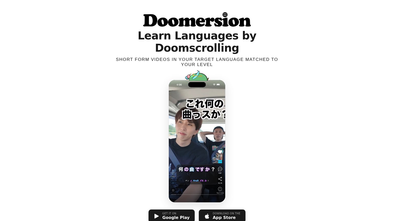
  1. Cropped store badges — Both download buttons sit half below the 864px fold, so the fold shows no complete CTA.
  2. Dual equal-weight CTAs — Google Play and App Store badges share identical size and style, splitting the primary action with no dominant choice.
  3. Oversized phone mockup — The ~470px-tall mockup pushes the only CTAs off the fold; the proof visual outranks the action.

Value props

78Fair

Title, subtitle, hero — do they sell the product's true value?

Doomersion’s headline sellsLearn Languages by DoomscrollingSHORT FORM VIDEOS IN YOUR TARGET LANGUAGE MATCHED TO YOUR LEVEL

Working

  • Reframes doomscrolling guilt into learning
  • Subhead names mechanic and level-matching
  • Hero shows real app with subtitled video

Could improve

  • No concrete numbers or proof points
  • Languages supported not named
  • No outcome (fluency, comprehension) stated