
Your landing page’s weakest score is Trust.
How Booko ranks
78Growth scoreupdated
category scores
category scoresShowHide
Score over time
Trust
64FairProof that the product is real, competent, and safe to try.
| Trust read | |
|---|---|
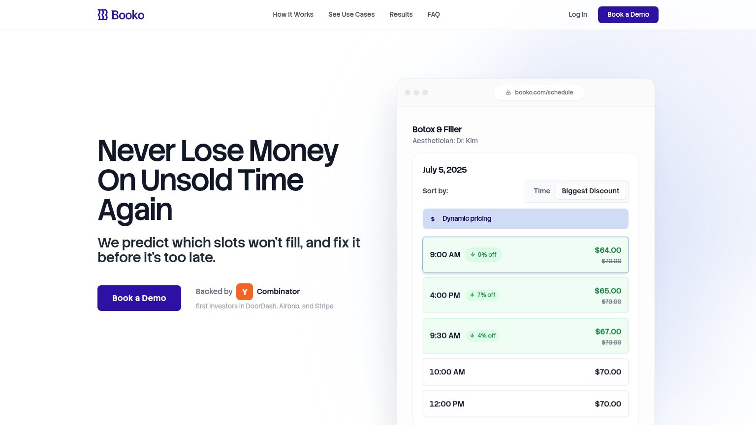
| Booko | "Backed by Y Combinator — first investors in DoorDash, Airbnb, and Stripe" badge next to the Book a Demo CTA |
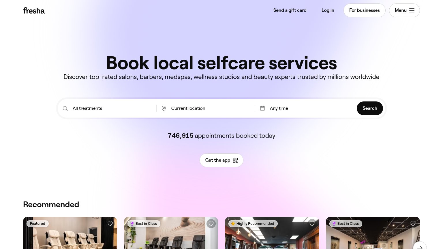
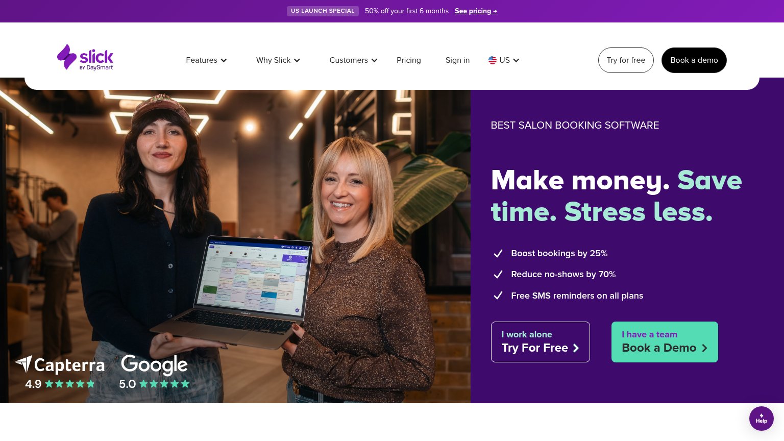
| Capterra 4.9 and Google 5.0 star-rating badges overlaid on the hero photo | |
| "746,915 appointments booked today" counter beneath the search bar | |
| Real product UI overlays: "Select Appointment Time" scheduler, "Booked appointments 1107", and "Projected sales $67,085. | |
| Realistic embedded product demo: 'INDIGO — Choose an option: Book for one person / Book for a group' booking UI powered |
CTA
76FairCopy, size, verb, cost-feel — does the primary CTA earn the click?
Problems
- demo click feels costly/committal
- no self-serve or value-first path
- label ignores hero's money promise
Information hierarchy
82StrongDoes the design help or inhibit what the page is trying to say?
1234- Nav link row — Five links plus Log In offer six exits before the visitor reaches the demo CTA.
- Nav Book a Demo — Same weight and label as the hero CTA, splitting attention between two identical buttons.
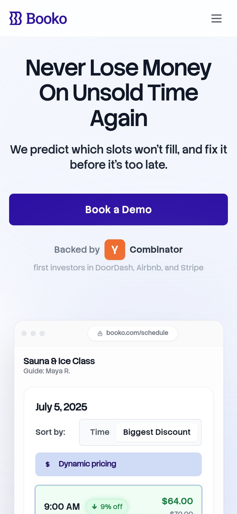
- Botox & Filler header — Desktop mockup shows a med-spa while mobile shows a sauna class, blurring the target vertical.
- YC investor caption — Low-contrast gray line 'first investors in DoorDash...' is nearly illegible at this size.
Value props
82StrongTitle, subtitle, hero — do they sell the product's true value?
Booko’s headline sells
Never Lose Money On Unsold Time Again
We predict which slots won't fill, and fix it before it's too late.
Working
- Names the pain: money lost on empty slots
- Subhead states mechanism: predict + fix
- Hero image shows dynamic pricing in action
Could improve
- No numbers anywhere in the copy
- "fix it" is vague — say how (discounts)
- Target user never named in the fold
Mobile web
88StrongThe phone experience as a first-class citizen.
 12
- Investor proof caption — Light-gray "first investors in DoorDash, Airbnb, and Stripe" is too low-contrast to read on a phone.
- Collapsed header row — Header drops the desktop "Book a Demo" button, leaving no persistent CTA once the user scrolls.