
Your landing page’s weakest score is Value props.
How Vetnio ranks
68Growth scoreupdated
category scores
category scoresShowHide
Score over time
Value props
64FairTitle, subtitle, hero — do they sell the product's true value?
Vetnio’s headline undersells
The leading copilot for veterinarians
Automates notes, supports diagnostics, and handles calls and messages – all in one.
Working
- Names the audience: veterinarians
- Subhead lists three concrete jobs
- Strong customer logo wall below hero
Could improve
- "Leading copilot" is a category claim
- No numbers or time-saved outcome
- Hero photo decorates, not demonstrates
Information hierarchy
68FairDoes the design help or inhibit what the page is trying to say?
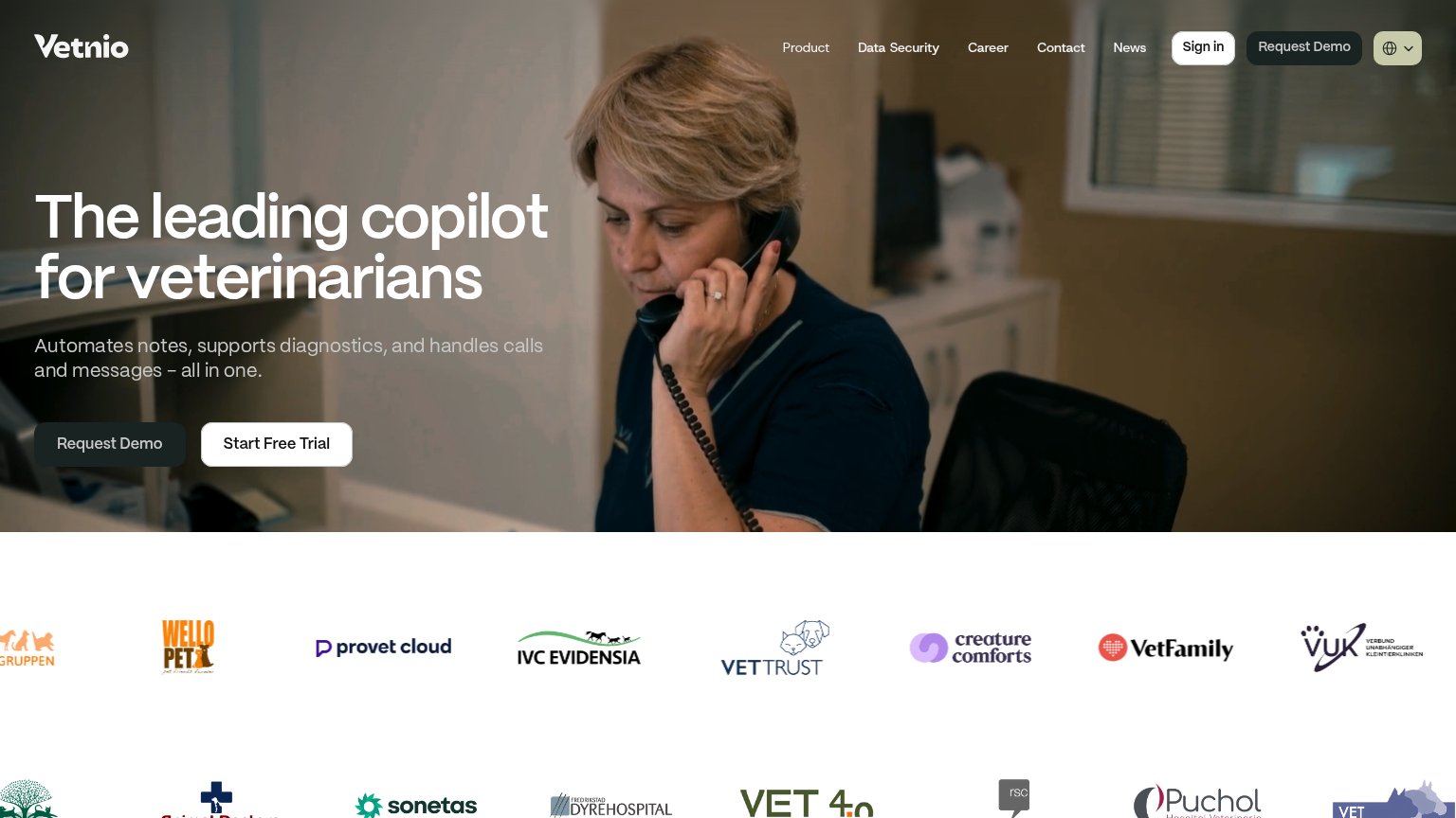 123
- Duplicate Request Demo buttons — The nav's "Request Demo" duplicates the hero button, splitting the primary action into two equal-weight targets.
- Hero Request Demo button — Dark gray on a dark photo background nearly disappears; the secondary "Start Free Trial" in white outshines the primary.
- Six-link nav row — Product, Data Security, Career, Contact, News plus Sign in offer six exits before the visitor reaches the CTA.
Trust
68FairProof that the product is real, competent, and safe to try.
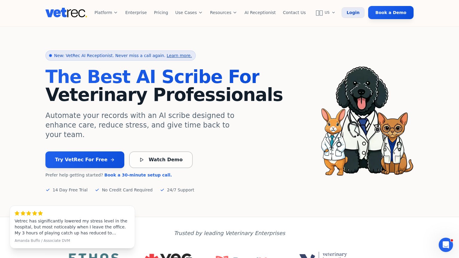
| Trust read | |
|---|---|
| Vetnio | Customer logo wall including IVC Evidensia, Provet Cloud, VetFamily, VetTrust and Creature Comforts |
| SOC 2 Type II — Tested & Attested badge | |
| 96% satisfaction across 2 million+ appointments | |
| Stylized SOAP-note UI (Subjective/Objective/Assessment/Plan) with recording mic in the hero | |
| Five-star testimonial: "Vetrec has significantly lowered my stress level in the hospital..." — Amanda Buffo / Associate | |
| Detailed real product UI: calendar/Flowboard screenshot with appointment-booking flow and mobile app screen |
Mobile web
68FairThe phone experience as a first-class citizen.
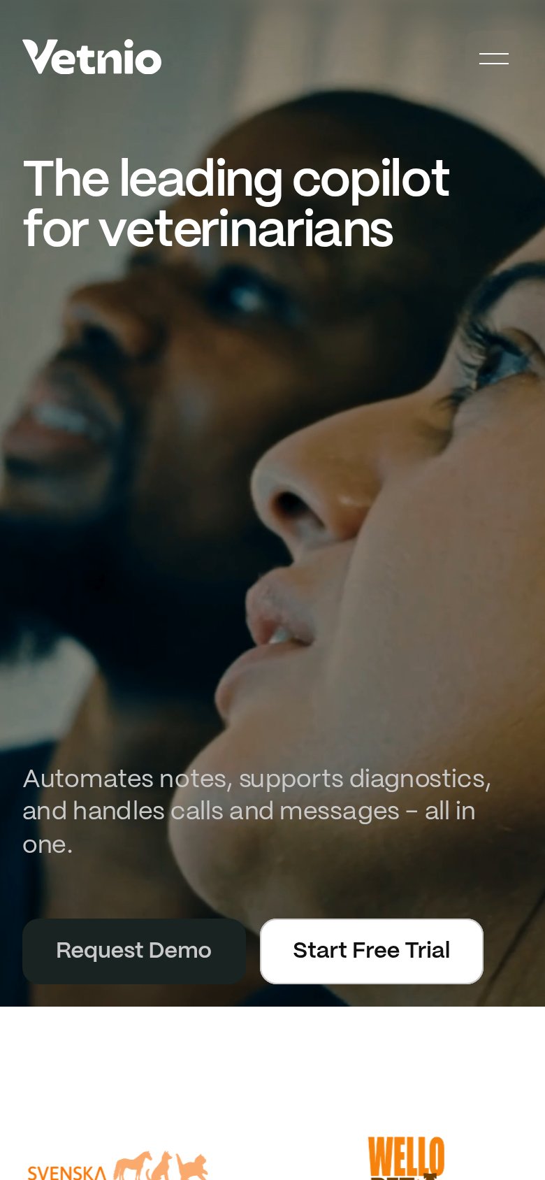 12
- Subheadline pushed low — The supporting copy 'Automates notes, supports diagnostics...' sits roughly 1100px down, separated from the headline by a full screen of hero video, breaking the value statement in two.
- Split CTA row — 'Request Demo' and 'Start Free Trial' compete side by side at the bottom edge of the fold; the low-contrast dark 'Request Demo' nearly disappears against the video.
CTA
72FairCopy, size, verb, cost-feel — does the primary CTA earn the click?
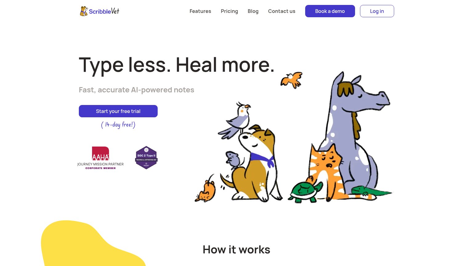
Problems
- demo CTA placed first in hero
- two competing asks split clicks
- nav pushes 'Request Demo' too