
Your landing page’s weakest score is Trust.
How Scribenote ranks
67Growth scoreupdated
category scores
category scoresShowHide
Trust
42PoorProof that the product is real, competent, and safe to try.
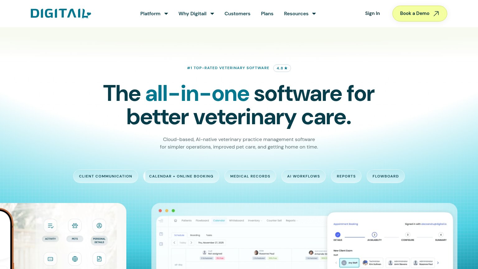
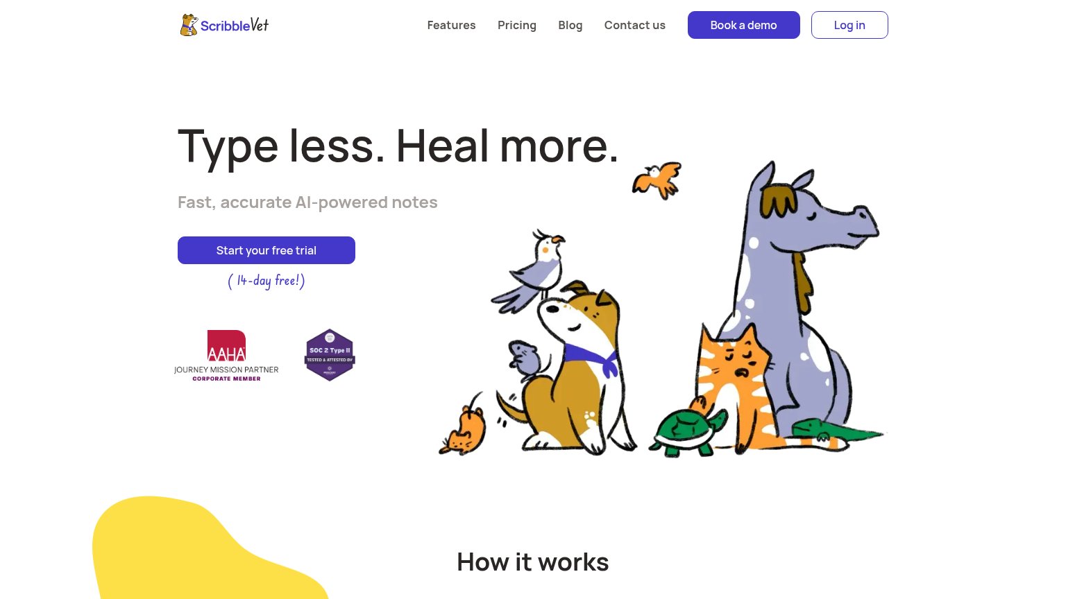
| Trust read | |
|---|---|
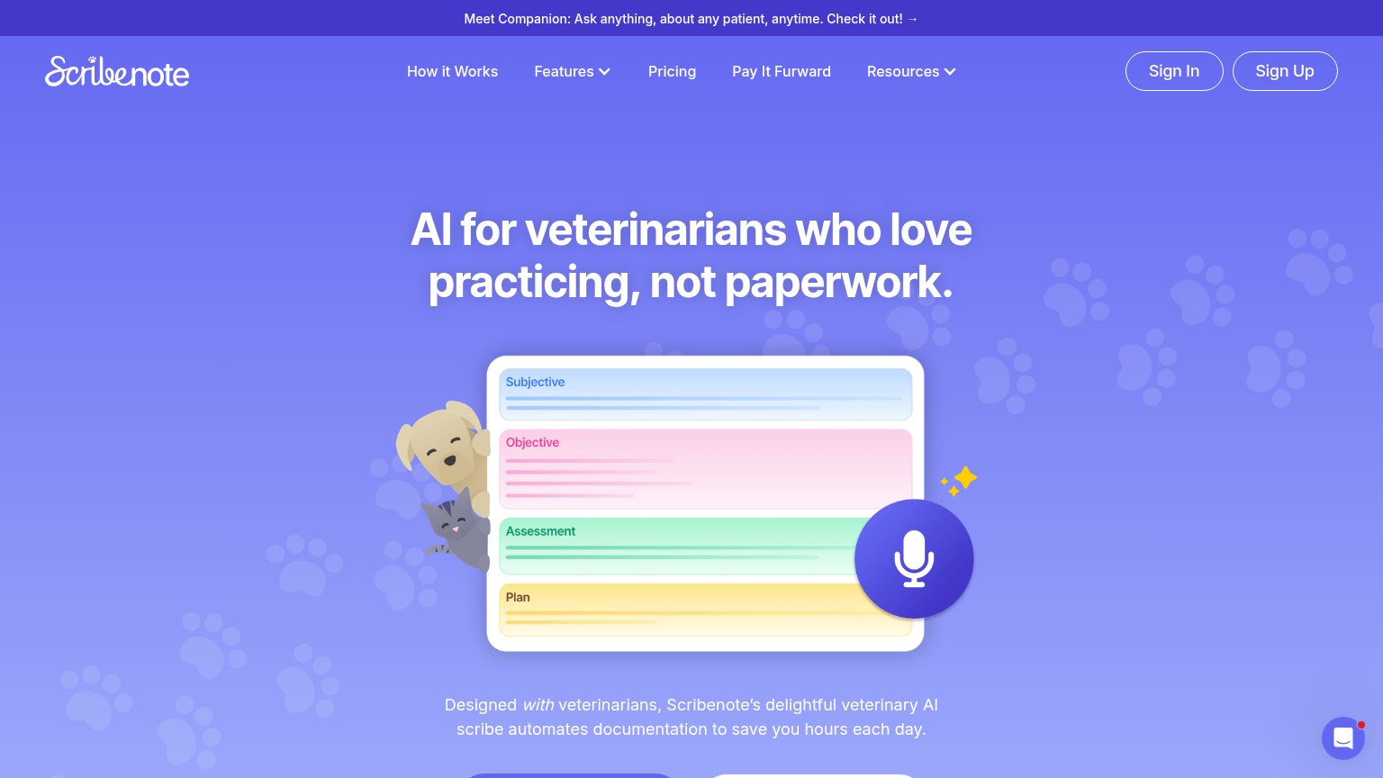
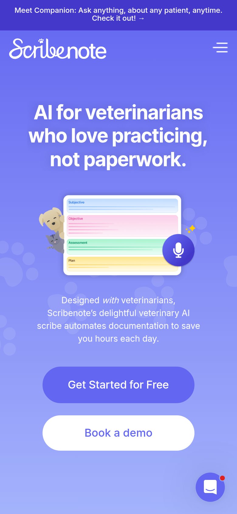
| Scribenote | Stylized SOAP-note UI (Subjective/Objective/Assessment/Plan) with recording mic in the hero |
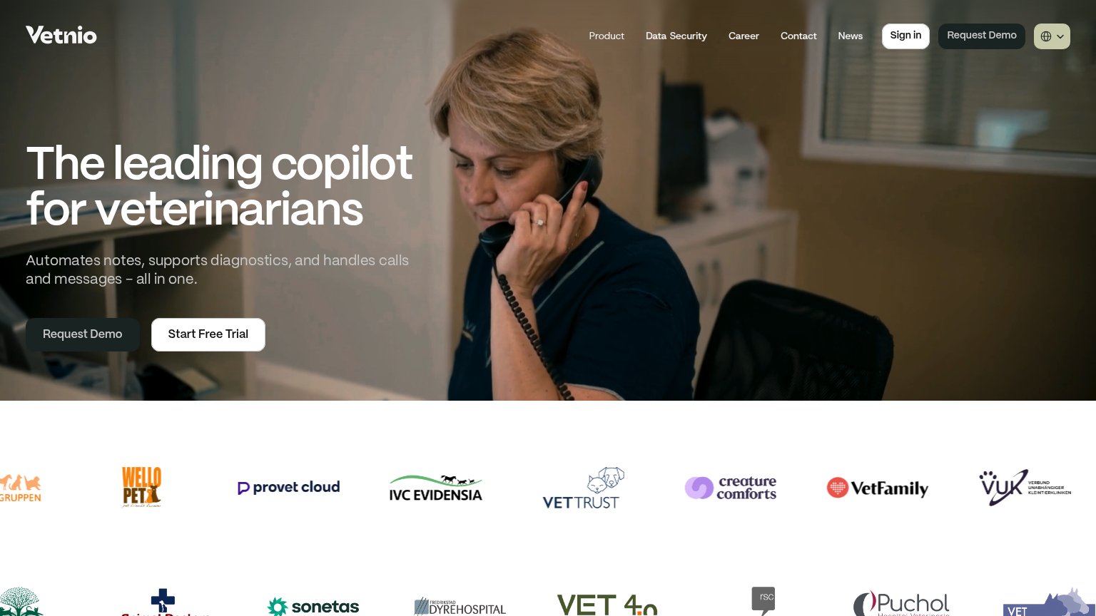
| Customer logo wall including IVC Evidensia, Provet Cloud, VetFamily, VetTrust and Creature Comforts | |
| SOC 2 Type II — Tested & Attested badge | |
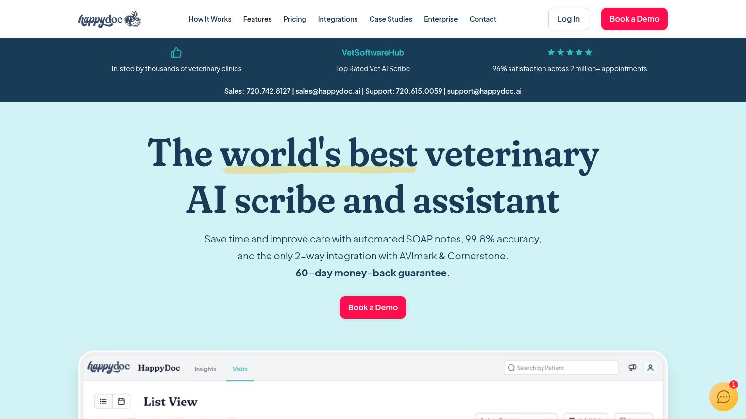
| 96% satisfaction across 2 million+ appointments | |
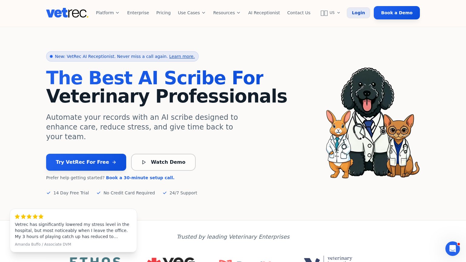
| Five-star testimonial: "Vetrec has significantly lowered my stress level in the hospital..." — Amanda Buffo / Associate | |
| Detailed real product UI: calendar/Flowboard screenshot with appointment-booking flow and mobile app screen |
Information hierarchy
64FairDoes the design help or inhibit what the page is trying to say?
12- Companion announcement banner — The top banner promotes a different feature with its own link, pulling attention away before the value prop is read.
- Sign In / Sign Up pills — Two equal-weight header buttons compete as the only fully visible actions, and 'Sign Up' outranks the actual conversion CTA below the fold.
Mobile web
72FairThe phone experience as a first-class citizen.
What works
What to improve
Value props
78FairTitle, subtitle, hero — do they sell the product's true value?
Scribenote’s headline
AI for veterinarians who love practicing, not paperwork.
Designed with veterinarians, Scribenote's delightful veterinary AI scribe automates documentation to save you hours each day.
Working
Could improve
CTA
80StrongCopy, size, verb, cost-feel — does the primary CTA earn the click?
How Scribenote compares
Recommended rewrites