
Your landing page’s weakest score is Mobile web.
How HappyDoc ranks
Mobile web
64FairThe phone experience as a first-class citizen.
 1234
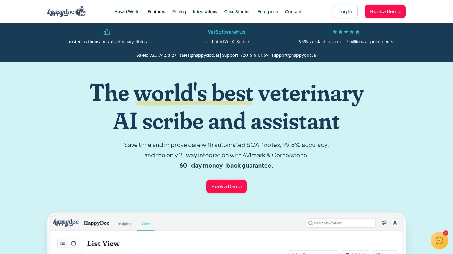
- Six-line headline — "The world's best veterinary AI scribe and assistant" wraps into six oversized lines and pushes the CTA far down the fold.
- Chat bubble badge — Chat widget with a "1" notification badge overlaps the product screenshot and adds a dead distraction near the thumb zone.
- Long subhead block — Four-plus lines of large body copy about SOAP notes and integrations stack with the guarantee line, crowding the column.
- Hero Book a Demo — Primary button sits at fixed desktop proportions instead of near-full-bleed, and lands at the very bottom edge of the viewport.
CTA
68FairCopy, size, verb, cost-feel — does the primary CTA earn the click?
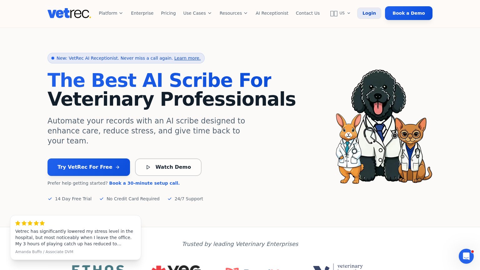
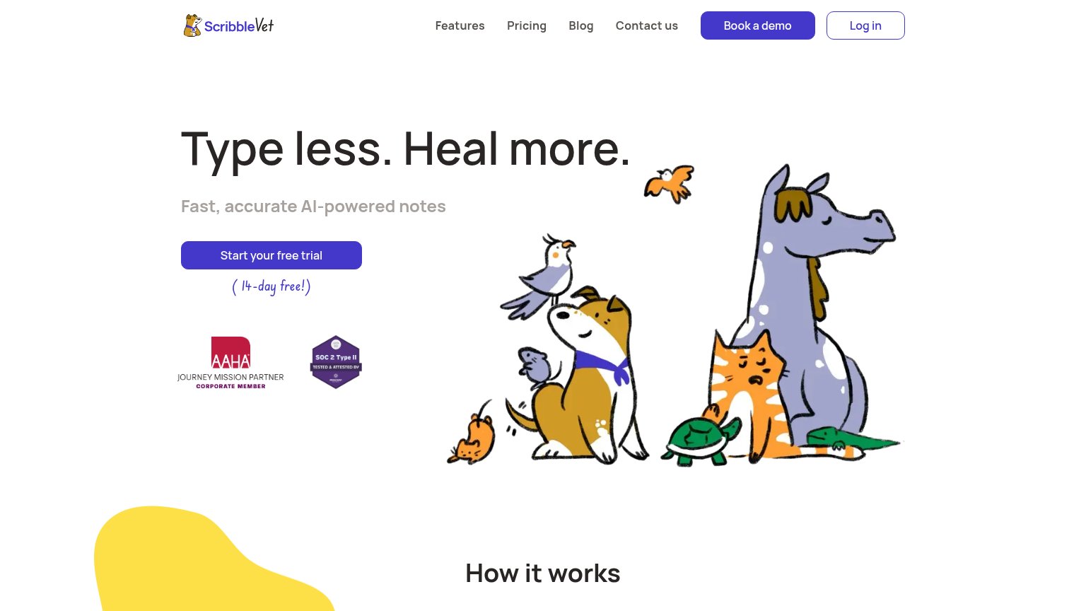
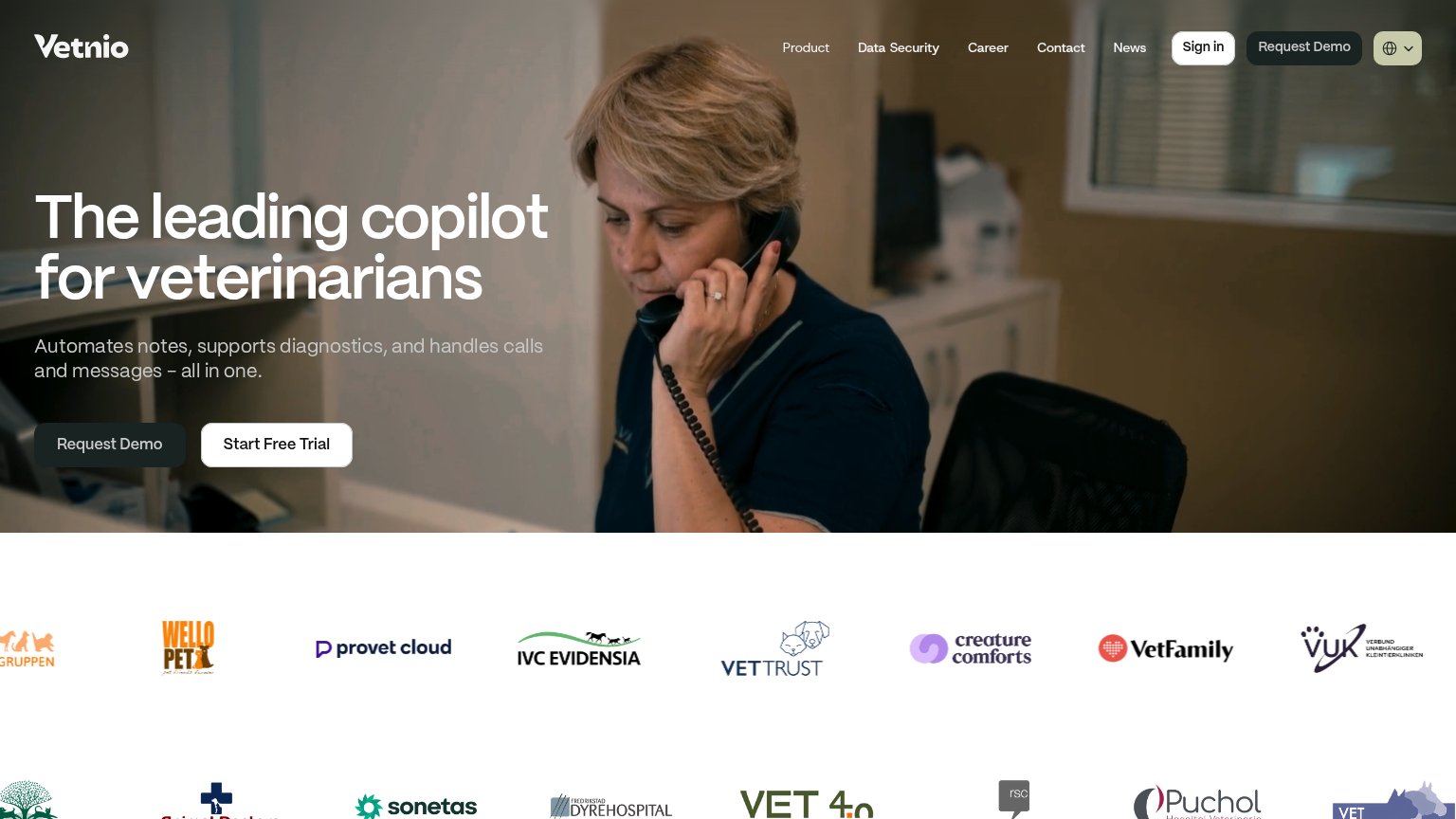
Problems
- 'Book' feels costly — a sales call
- no low-friction alternative path
- no product value in the first click
Trust
68FairProof that the product is real, competent, and safe to try.
How HappyDoc compares
Trust read
Information hierarchy
72FairDoes the design help or inhibit what the page is trying to say?
What works
What to improve
Value props
78FairTitle, subtitle, hero — do they sell the product's true value?
HappyDoc’s headline
The world's best veterinary AI scribe and assistant
Save time and improve care with automated SOAP notes, 99.8% accuracy, and the only 2–way integration with AVImark & Cornerstone. 60–day money–back guarantee.
Working
Could improve