
Your landing page’s weakest score is Information hierarchy.
How VetRec ranks
74Growth scoreupdated
category scores
category scoresShowHide
Information hierarchy
68FairDoes the design help or inhibit what the page is trying to say?
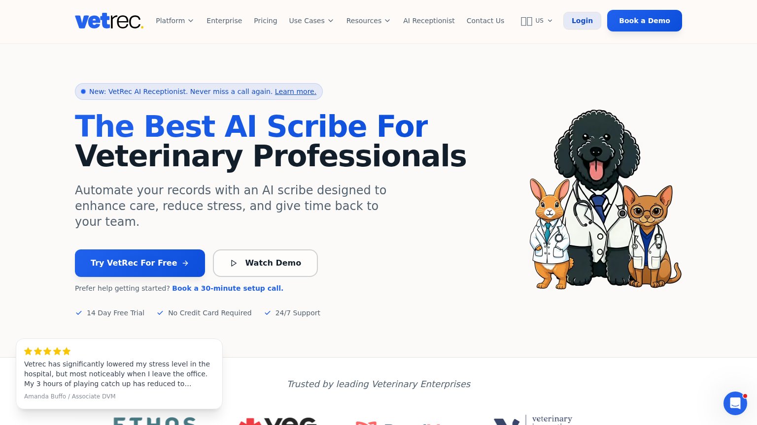 1234
- Watch Demo button — Secondary CTA sized nearly identical to the primary, splitting the click decision at the moment of action.
- Testimonial popup overlay — Floating review card covers the bottom-left fold and competes with the CTA row instead of sitting in the layout.
- Nav link row — Nine nav items plus Login and Book a Demo give eleven exits before the hero CTA is read.
- AI Receptionist banner — 'Learn more.' link sits directly above the headline and diverts the scan path before the value prop lands.
Value props
72FairTitle, subtitle, hero — do they sell the product's true value?
VetRec’s headline sells
The Best AI Scribe For Veterinary Professionals
Automate your records with an AI scribe designed to enhance care, reduce stress, and give time back to your team.
Working
- Names exact category and audience
- Emotional hooks: stress, time back
- Risk-reducers under CTA
Could improve
- No numbers in headline or subhead
- Hero art decorates, doesn't demo
- "The Best" is an unproven claim
Mobile web
72FairThe phone experience as a first-class citizen.
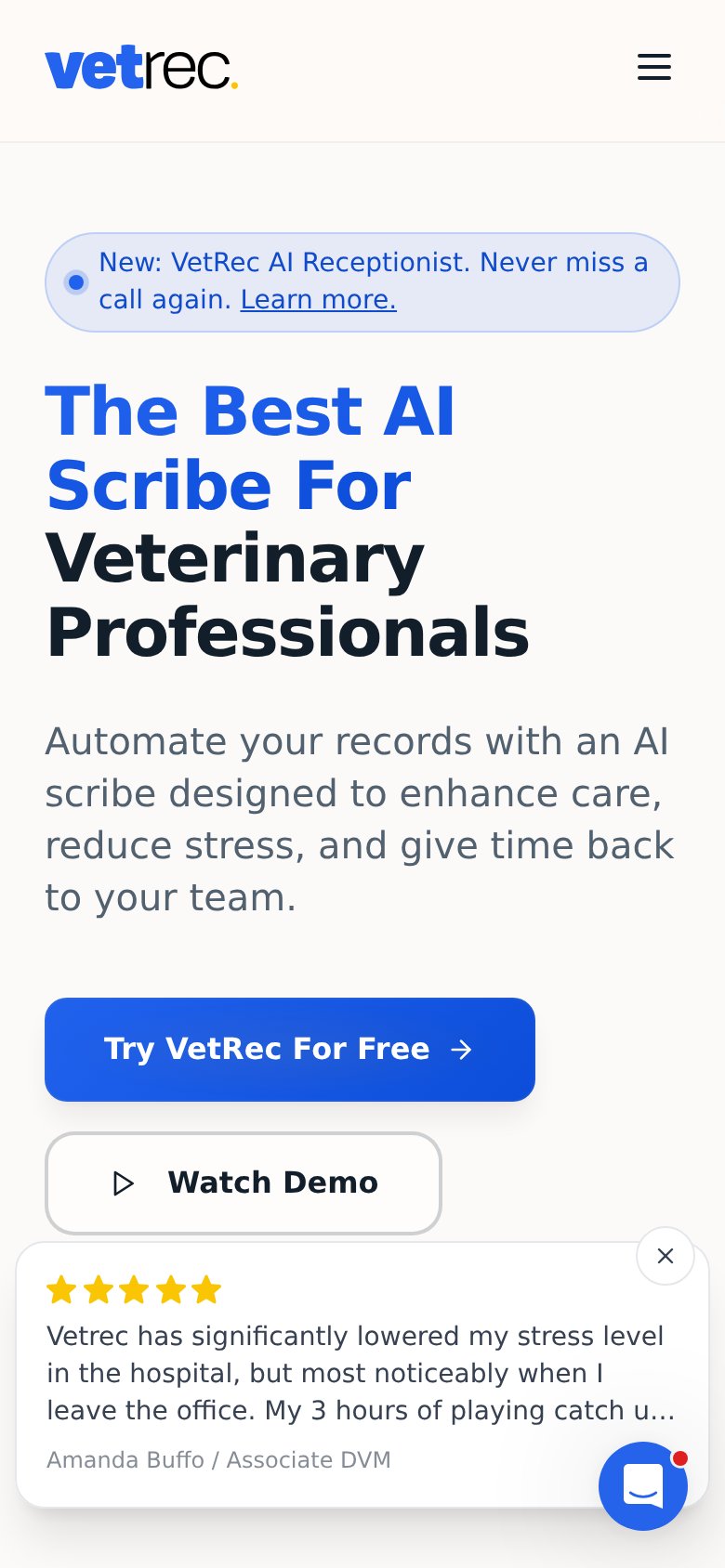
What works
What to improve
Trust
74FairProof that the product is real, competent, and safe to try.
How VetRec compares
Trust read
CTA
84StrongCopy, size, verb, cost-feel — does the primary CTA earn the click?
How VetRec compares
Recommended rewrites